Creating a simple form with CSS Grid
You learned to create a simple form with Flexbox in the previous article. Today, you’ll understand how to create the same thing with CSS Grid.
Here’s what we’re building:

Building the form with CSS Grid
From the picture above, we know the form contains two elements:
- An email field
- A submit button
Here’s the HTML:
<form> <input type="email" name="email" /> <button type="submit">Send</button></form>To build the form with CSS Grid, you need to set the parent’s display property to grid.
form { display: grid;}Here’s what you get:

Why did we get two rows?
We get two rows because we did not specify the number of columns for the grid. Browsers will always default to one column.
For this form, we need to set two columns.
- The first column should expand to fill up any available space
- The second column should be sized according to its contents
For the first column, we can use the fr unit. For the second column, we can use auto.
form { display: grid; grid-template-columns: 1fr auto;}With this, you have completed form’s layout. Here’s a Codepen for you to play:
When elements are of unequal height…
We will simulate elements of unequal height by substituting the button’s text with an SVG. This is the same as what we’ve done in the previous article.
<form action="#"> <input type="email" placeholder="Enter your email" /> <button type="button"> <svg><!-- a smiley icon --></svg> </button></form>
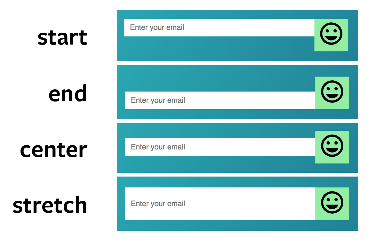
Notice the input’s height increases to fit the large SVG icon too! Once again, we don’t have to write any extra code. This happens because grid items are stretched vertically to fill up any available space.
If you want to change this behavior, you can change the align-items property to either start, end, or center.

align-items to a different value Here’s a Codepen for you to play:
Wrapping up
CSS Grid makes it easy to create layouts. It doesn’t have to be used for macro layout. It can also be used for micro layouts like the form example you’ve seen here.
Have fun with CSS Grid!
