The easiest way to use SVGs in an Astro or Svelte app
SVG is one of the most important elements in a website or web application because it provides us with scalable graphics.
They are usually used for two things:
- Icons from icon sets
- Custom graphics
Today I’m going to show you how the SVG utility from Splendid UI works, and why it’s the easiest way to use SVG to load both icons and custom graphics.
Installing the SVG Utility
First, you need to install Splendid UI.
npm install splendidlabz —saveThen you import the SVG component from splendidlabz/svelte
<script> import { SVG } from 'splendidlabz/svelte'</script>Since this SVG is a Svelte component, it can be used for both Astro and Svelte projects.
Loading an icon set with the SVG component
The SVG component uses Iconify to load icons. This lets you load icons from popular icon sets just by naming the icon set and the icon name.
Here are some examples:
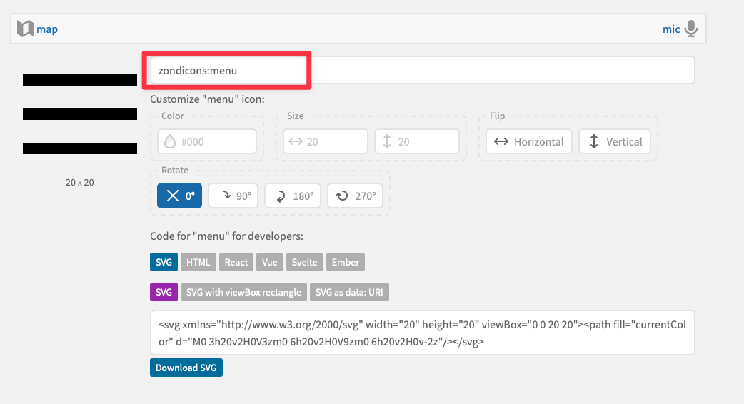
tabler:menu- Menu icon from Tablermaterial-symbols:menu- Menu icon from Material Symbolszondicons:menu- Menu icon from Zondicons
<SVG icon="tabler:menu" /> Tabler's Menu<SVG icon="material-symbols:menu" /> Material Symbol's menu<SVG icon="zondicons:menu" /> Zondicon's menuLoading icons in Svelte
You can load the icons with the following code in Svelte:
<script>  import { SVG } from 'splendidlabz/svelte'</script>
<SVG icon="icon-set:icon-name" />
Loading icons in Astro
If you’re using Astro, you must add a client:load directive or the icons won’t be loaded.
---import { SVG } from 'splendidlabz/svelte'---
<SVG icon="icon-set:icon-name" client:load />
We need a client directive when using Astro because Iconify saves icons in localStorage, which means icons will not be loaded on the server.
Unfortunately, this means you’ll see a flicker of invisible icons for a bit when the page is loaded for the first time. (On subsequent loads, the process is so quick you’ll never even notice it).
As you can see from the video above, the time taken to load the SVG icon is negligible. After seeing this, I felt that attempts to remove this tiny delay would be considered over-engineering.
That’s why I’m happy to release the SVG component as it is today.
Finding icon sets and names
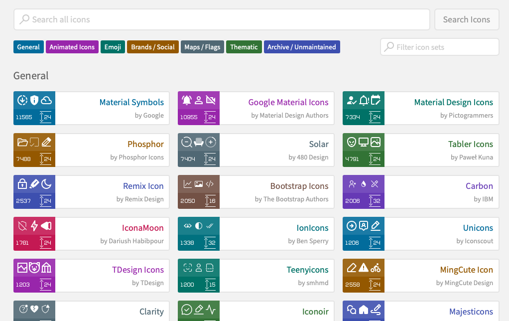
You can view all supported icon sets and their respective icons through Iconify’s icon browser, the Figma component or Icones.


Loading a custom SVG from your project files
This SVG component also supports loading custom SVGs from your project files.
To use this, you need to make sure you have two conditions fulfilled:
- There is an
svgfolder in yoursrcdirectory. - You have added your SVG into this folder.
When both conditions are fulfilled, you can pass the name of this SVG file into icon and the SVG component will do the rest.
If you use Astro, there’s no need to use the client:load directive in this case because SVG will create the necessary SVG element in the HTML right away.
For example, if you have an SVG that is called logo.svg, you only need to pass logo into icon.
---import { SVG } from 'splendidlabz/svelte'---
<SVG icon="logo" />
That’s it!
Wrapping Up
I created this SVG component to make it easier for me to load icons when I’m building Astro and Svelte apps.
I hope you enjoy it as much as I do!
And if you do, please consider checking out Splendid UI and spreading the word about it. Thank you.
Edit: I’ve divided the SVG component to Icon and SVG. Please see their respective documentation accurate information.
