A Complete Tutorial to Susy 2 (Part 2)
We went through the very basics of Susy 2 and how it could be used to quickly create very complicated layouts in the previous tutorial on Susy. In this tutorial, we’re going to dive deeper into Susy, and explore how it can be used to develop responsive websites easily.
If you have no clue what Susy 2 is all about, you might want to check out the previous article before proceeding. I guarantee it’ll be worth it.
Breakpoint Helpers
Susy Two doesn’t come with a breakpoint mixin by default. Instead, it recommends you to use the breakpoint gem to help with writing media queries.
We’re first going to install and import this gem.
Breakpoint requires Compass. To use it you’ll need to have both gems installed.
$ sudo gem install compass $ sudo gem install breakpoint
You’ll then need to require and import this plugin.
require 'breakpoint'@import 'breakpoint';Now we’re set up and ready to go.
Using Breakpoint
One thing I like about using Breakpoint is that it is super easy to make mobile first breakpoints. Let me explain.
To use breakpoint, you’ll have to call the breakpoint mixin and insert a set of arguments to it. These arguments will eventually turn out to be media queries.
@include breakpoint(<args>) { /* contents */}The beauty of this mixin is that if you pass in only one argument, it automatically becomes mobile-first oriented. This argument should be a min-width of the breakpoint you’re looking for.
.container { @include breakpoint(1200px) { /* contents */ }}This translates to
@media (min-width: 1200px) { .container { /* contents */ }}The breakpoint mixin is super flexible and you can make ultra complicated arguments if you would like to.
Using Breakpoint with Susy
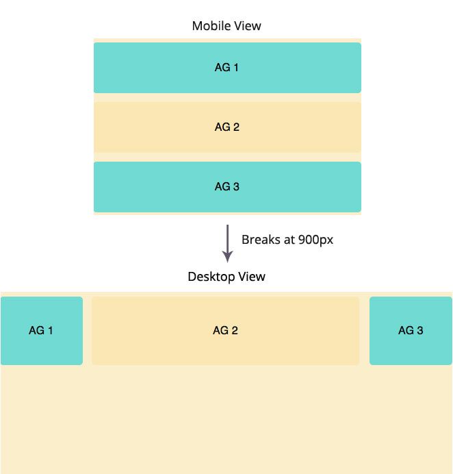
Lets say we wanted a grid that breaks like this. Initially, all divs would span the full width of the browser, and after 900px, they would be laid out in the 10 colum AG grid layout like in the previous tutorial.

To accomplish this, you just have to add the breakpoint correctly in the stylesheet. An example of AG1 would be
.ag1 { // Mobile Styles here @include breakpoint(900px) { @include span(2 of 10); }}We didn’t need add any specific styles to the mobile section. since A div would take up a width of 100% by default, At 900px, we have to add a media query (I call them breakpoints for short) , and make it float according to the susy grid.
Since breakpoint(900px) translate to min-width(900px) in media queries, span(2 of 10) will only trigger when the browser width is larger than 900px. This workflow is also perfect for mobile first styling.
By the same theory, AG2 and AG3 would use similar styles:
.ag2 {  // Mobile Styles here  @include breakpoint(900px) {    @include span(6 of 10);    @include clearfix;  }}
.ag3 {  // Mobile Styles here  @include breakpoint(900px) {    @include span(2 of 10 last);  }}
Okay thats all nice and good. But what if you wanted something slightly more complicated?
Note: If you don’t want to use breakpoint by any chance, you can still use plain old queries with the same steps.
Having Multiple Breakpoints
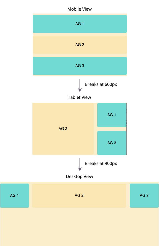
Say you wanted to have a content-sidebar sort of breakpoint before eventually transitioning to the AG10 grid layout.

This is a little more challenging compared to the previous breakpoint. Because AG1 seems to have switched positions all the way to the right! How did that happen?!
There is a little neat trick over here.
AG1 and AG3 in the tablet view takes up 2 columns of 6 while AG2 takes up 4 columns. You also know that we wanted AG1 to be above AG3 on the right column.
The trick lies with the last keyword.
Let me show you the code first.
.ag1 {  // tablet view  @include breakpoint(600px) {    @include span(2 of 6 last);  }  // desktop view  @include breakpoint(900px) {    @include span(2 of 10);  }}
.ag2 {  @include clearfix;  // tablet view  @include breakpoint(600px) {    @include span(4 of 6);  }  // desktop view  @include breakpoint(900px) {    @include span(6 of 10);  }}
.ag3 {  // tablet view  @include breakpoint(600px) {    @include span(2 of 6 last);  }
  // desktop view  @include breakpoint(900px) {    @include span(2 of 10 last);  }}
Notice that in the code above, I added the last keyword to the span mixin.
The last keyword tells Susy to float the element right instead of the default float left, hence allowing it to appear on the right since AG2 is floated left.
At 900px however, the desktop breakpoint kicks in and tells AG1 to float left instead.
@media (min-width: 600px) { .ag1 { width: 31.03448%; float: right; }}@media (min-width: 900px) { /* line 24, ../sass/styles.scss */ .ag1 { width: 18.36735%; float: left; margin-right: 2.04082%; }}Thats the trick to it! (PS, I also expanded AG2 with some paddings and added margin bottom to AG1 in the tablet view to make it look nicer).
The Susy-Breakpoint Mixin
Susy provides an additional susy-breakpoint mixin that adds onto the breakpoint mixin, allowing a DRY-er Sass if you need to include multiple span declarations within the same breakpoint and layout.
The syntax for susy-breakpoint is:
@include susy-breakpoint(<breakpoint>, <layout>);// breakpoint is the argument we supplied to the breakpoint mixin earlier.// Layout is equivalent to the contextIn this case, the following two codes are equivalent. Notice how the context (of 6) is lifted up from the span and placed into the breakpoint instead.
.ag1 {  @include susy-breakpoint(600px, 6) {    @include span(2 last);  }}
.ag1 {  @include breakpoint(600px) {    @include span(2 of 6 last);  }}
I personally prefer the second method (just using breakpoint), but you can feel free to pick either version since there’s no difference in their output.
At this point, you may have noticed that it can be a little unsightly to allow the fluid container to go full width if desktop sizes are huge. Lets fix that.
Constraining the Container
Since we’re using the fluid grid, constraining the container is super easy.
.container { @include container(1140px);}Basically this would give the container a max-width of 1140px. You could also write the same thing like this, whichever floats your boat.
.container { @include container; max-width: 1140px;}Unfortunately, we can’t do the same with a static grid, because Susy handles all the math and calculates the max width at the same time. To deal with static grids, we have to use a slightly different approach.
Lets leave that for the next tutorial.
