Common Problems With Susy Gallery And How To Solve Them
Susy has a gallery() mixin that helps us create galleries easily. It abstracts away a lot of complexity.
Because of this abstraction, it sometimes leaves people puzzled about why something isn’t working. This often boils down to two problems.
This post reveals the two problems and shows you how to solve them.
The Problems
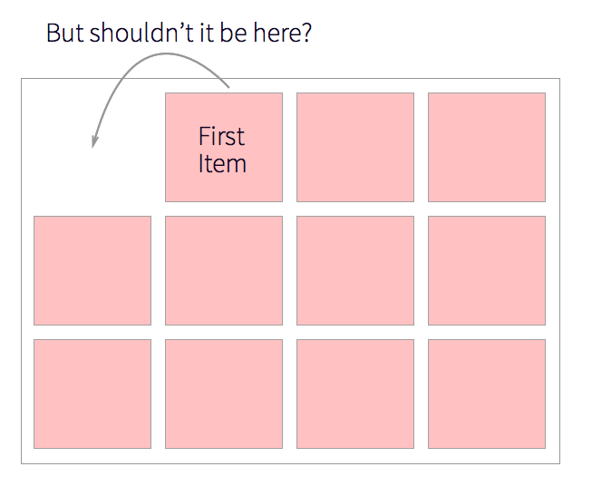
The first problem happens when you get a gallery where the first item is not positioned in the correct place.

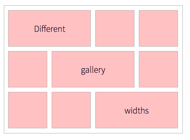
The second problem happens when you want to create a gallery of different sizes.

These two problems are relatively easy to solve once you know what goes on in the gallery() mixin. Let’s explore how the gallery() mixin works again before diving into solving these problems.
Susy Gallery
Let’s say we’re creating a gallery with 3 columns. The sass code for this gallery() will be:
.gallery__item { @include gallery(4 of 12);}The output of this gallery() mixin is as follows:
.gallery__item { width: 32.20339%; float: left;}.gallery__item:nth-child(3n + 1) { margin-left: 0; margin-right: -100%; clear: both; margin-left: 0;}.gallery__item:nth-child(3n + 2) { margin-left: 33.89831%; margin-right: -100%; clear: none;}.gallery__item:nth-child(3n + 3) { margin-left: 67.79661%; margin-right: -100%; clear: none;}There are two points of interest in this code:
- Susy uses
nth-childto position elements with the Isolate Technique. - Susy calculates and allocate the same
widthto all.gallery__items.
Each of these points is a big clue to solving one of the earlier mentioned problems. Keep them in mind as we move on.
Problem 1: The first item is not positioned in the correct place
This problem usually happens when people misunderstand how to use the nth-child pseudo class. Let’s take a look at this HTML code:
<div class="gallery"> <h2>Gallery!</h2> <div class="gallery__item">Gallery Item</div> <div class="gallery__item">Gallery Item</div> <div class="gallery__item">Gallery Item</div></div>Which child do you think the first .gallery__item is?
The nth-child selector matches elements according to its position. The first immediate tag is the first child (<h2> in this case), the second tag is the second child and so on.
Hence the correct answer to the question should be the second child. Pay attention if you got this wrong!
Now let’s take a look at the nth-child selectors created by Susy again:
.gallery__item:nth-child(3n + 1) { margin-left: 0; margin-right: -100%; clear: both; margin-left: 0;}.gallery__item:nth-child(3n + 2) { margin-left: 33.89831%; margin-right: -100%; clear: none;}.gallery__item:nth-child(3n + 3) { margin-left: 67.79661%; margin-right: -100%; clear: none;}You can see three different nth-child selectors, 3n+1, 3n+2 and 3n+3.
You can think of the n in nth-child as a multiple that goes from 0 to infinity. What this means is that an nth-child(2n) will match these children: 2, 4, 6, 8 and so on.
The + number in nth-child is an offset for child number. nth-child(2n+1) will match 3, 5, 7, 9 and so on.
Here’s what the nth-child selectors produced by Susy do if we go with the same line of thought:
nth-child(3n+1)- Targets children 1, 4, 7, 10 …nth-child(3n+2)- Targets children 2, 5, 8, 11 …nth-child(3n+3)- Targets children 3, 6, 9, 12 …
You now know the first gallery__item is rightfully the second child. The CSS produced targets the second child and places it in the second column with the Isolate Technique. That could be one of the reasons why your gallery() doesn’t seem to work correctly sometimes.
One way to solve it is to remove this <h2> tag and ensure that the intended .gallery__item matches the nth-child selector produced by Susy.
<div class="gallery"> <div class="gallery__item">Gallery item</div> <div class="gallery__item">Gallery item</div> <div class="gallery__item">Gallery item</div></div>It’ll be ideal if you can do that. Of course, there’s always going to be times when it’s a pain in the ass to change the HTML. Here’s where Susy shines, because you can change the CSS instead!
You can either:
- Make a custom gallery with your own
nth-childpatterns or - Use
span()instead ofgallery()to create the gallery.
Let’s explore these options now.
Custom gallery with custom nth-child
This option is recommended if you want to keep using the Isolate Technique. It takes more time and requires more experience with Sass.
If we have the same HTML as above, we want to make sure the first .gallery__item falls onto the first column. The fourth .gallery__item also falls onto the first column.
This means we need to use a 3n+2 to target the first column, 3n+3 for the second column and 3n+4 for the third column.
.gallery__item { width: span(4); float: left; &:nth-child(3n + 2) { clear: both; @include isolate(1); } &:nth-child(3n + 3) { @include isolate(5); } &:nth-child(3n + 4) { @include isolate(9); }}Here’s a Codepen of this method working:
Use Span instead of Gallery
This option involves less work but exposes you to subpixel rounding errors. You’re safe to use this if you don’t have a large number of gallery items on the same row.
The code for this option also changes depending on the gutter-position you have set. If you are using the default Susy settings (or the after position), you’ll want to ensure that you add a margin-right of 0 for every last item of the row.
.gallery__item {  @include span(4 of 12);
  &:nth-child(3n + 3) {    @include last;  }}
Here’s a Codepen of this:
If you use split or inside gutters though, you don’t need that. Just do use a normal span.
.gallery__item { @include span(4 of 12 split);}Here’s a Codepen of this:
We’re done with the first problem. You can use any of these methods and the results will be the same. Let’s move onto the second problem
Problem 2: Creating a gallery of with columns of different sizes.
This problem is much simpler compared to the first one. You can see that the gallery() mixin produces only one width for every .gallery__item
.gallery__item { width: 32.20339%; float: left;}The answer then, is to change the width of the gallery item when needed.
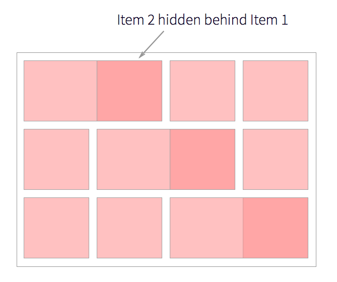
However, since the gallery() uses the Isolate Technique, we can’t simply change the width or we’ll end up with overlapping elements:

The solution for this is exactly the same as the problem from before. You can either:
- Create a custom gallery with custom nth-child and widths or
- Use the
span()mixin to create the gallery instead.
Custom gallery with custom widths
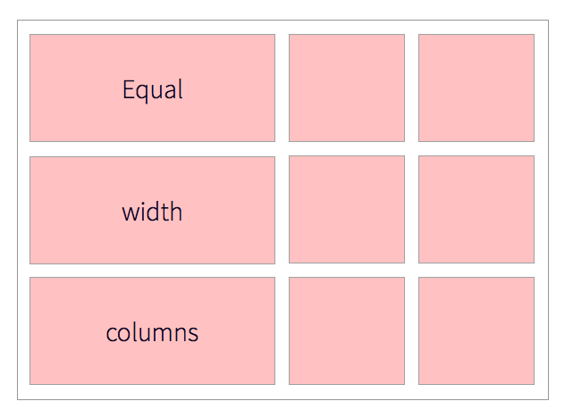
This option is preferable if you want to continue using the Isolate Technique. The limitation, however, is that you’ll need to ensure that the items within a single column are of equal widths.

Here’s what the Sass may look like:
// Assuming output is set to isolate and columns of 12.gallery__item { &:nth-child(3n + 1) { clear: both; @include span(6 first); } &:nth-child(3n + 2) { @include span(3 at 7); } &:nth-child(3n + 3) { @include span(3 last); }}Here’s a Codepen of this:
Using span to create the gallery
This option is preferable if you don’t have to worry about isolation or if you have items of different sizes at different columns. In this case, you just have to change the width of the gallery item with the span() function.
Here’s what the Sass may look like:
.gallery__item {  @include span(4 of 12 split);
  &:nth-child(4),  &:nth-child(7) {    width: span(8 of 12 split);  }}
Here’s the Codepen of this:
And we’re done with the second problem!
Conclusion
The Susy gallery() mixin is awesome for creating standard galleries. It doesn’t cut it if you need to make the gallery custom though.
But fret not! Once you understand the output from the Gallery mixin, you can always make your own custom gallery with the methods mentioned above!
Are you now able to resolve the biggest gallery problems you have when using Susy? Which of the methods in this article have you used? Let me know in the comments below!
