How to build a responsive grid system
One of the best complement for a custom web design is a custom-made responsive grid system. You can customize everything you need, including the number of columns, the size of columns and gutters and even the breakpoints you change your layouts at.
Unfortunately, many people don’t even try building custom grids for their web designs because they lack the knowledge and confidence to build one.
So, in this article, I want to help you gain the knowledge and confidence you need to build a custom-made grid. Hopefully you can break away from frameworks and try a custom grid for your next project by the end of this article.
What goes into a grid system
You need to know three things before building your grid system.
First, you need to design your grid.
Are you using equal-width or unequal-width columns? How many columns do you have? What’s the size of your gutters and columns?
You can only make the right grid calculations when you’ve answered the above questions. To help you out, I wrote an article about designing grids. Give it a read if you’re want to learn to design a grid.
Second, you need to know how your grid behaves at different viewports.
Will you resize columns and gutters proportionally when viewport width changes? Will you change your columns while keeping gutters fixed? Will you change the number of columns at specific breakpoints?
You need to answer these questions as well. They give you clues on how to calculate your column and gutter widths. I wrote about these considerations in the same article as well, so give it a read if you’re unsure.
Third, will you like to write grid classes in your HTML?.
The frontend world is split into two factions when it comes to grids systems.
One faction writes grid classes in the HTML (this is how Bootstrap and Foundation does it). I call it these HTML grid system. Their HTML looks like this:
<div class="container"> <div class="row"> <div class="col-md-9">Content</div> <div class="col-md-3">Sidebar</div> </div></div>The second faction creates their grids in CSS. I call these CSS Grid systems.
The HTML for CSS grid systems are simpler compared to the HTML for HTML grid systems. You need lesser markup for the same thing you create. You also don’t need to remember what the grid classes are:
<div class="content-sidebar"> <div class="content"></div> <div class="sidebar"></div></div>On the flipside, the CSS for CSS grid systems is more complex. You need to think through to reach a simple solution (if you haven’t created one before).
What would I choose?
Many frontend experts opt for CSS grid systems. I, too, belong to the CSS grid system faction (although I don’t dare to call myself an expert).
I’ve written about why I choose CSS grid systems over HTML grid systems in another article if you’re interested to find out why. I also wrote an article to help you migrate from HTML grid systems to CSS grid systems if you’re interested in making the switch.
(So many articles to read… 😢)
Anyway, that’s the three things you need to know before you can build your grid system. In summary, they are:
- Your grid design
- How your grid behaves at different viewports
- Whether to use HTML or CSS grid systems
We can only move forward if we have these prerequisites. For the rest of this article, here’s what we’re going to do:
- The grid has a maximum width of 1140px, with 12 columns of 75px and gutters of 20px. (Read this article for hints on how to get these numbers)
- When the viewport is resized, the columns should resize proportionally while gutters remain fixed at 20px. (Read this article for why I choose this behavior).
- I’m going to use CSS grid systems (Read this article for why I recommend them).
With that, let’s begin!
Building your grid system
There are eight steps to building your grid system. Here are the steps in summary:
- Choose a spec to create your grid with
- Set
box-sizingtoborder-box - Create a grid container
- Calculate column-width
- Determine gutter positions
- Create a debug grid
- Make layout variations
- Make your layouts responsive
Most of these eight steps are relatively straightforward once you go through them. I’ll spell out everything you need to know as we walk through each step.
Step 1: Choose a spec
Are you using CSS Grid, Flexbox, or plain old floats to create your grid? Your considerations and implementation details will be different for each spec.
CSS Grid is by far the best tool for creating grids (because grids 😎) of all three specs. Unfortunately, support for CSS grid leaves more to be desired right now. Every browser hides the CSS Grid Layout behind a flag, which is why we’re not going to touch it in this article. I highly suggest checking out Rachel Andrew’s work if you’re interested in CSS Grid.
Next, we come to Flexbox and Floats. The considerations for using these two specs are similar, so you can pick either one and follow through with this article. I’m going with Floats here because it’s easier to explain and for beginners to get.
If you choose to go with Flexbox though, bear in mind that there are slight nuances that you need to tweak.
Step 2: Set box-sizing to border box
The box-sizing property alters the default CSS Box model that’s used by browsers to calculate width and height properties. By altering box-sizing to border-box, we make it much easier to calculate column and gutter sizes. (You’ll see why later).
Here’s an image that summarizes how width is calculated at different box-sizing values.
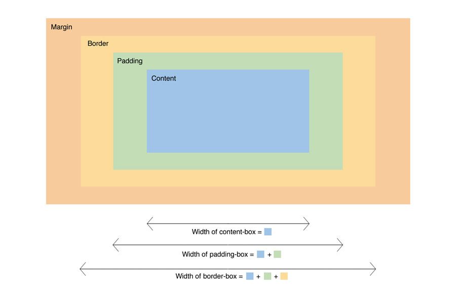
What I usually do is to set box-sizing to border-box to all elements on a website so width and height calculations remain consistent (and intuitive) across the board. Here’s how I do it:
html {  box-sizing: border-box;}
*,*:before,*:after {  box-sizing: inherit;}
Note: if you need an in-depth explanation on box-sizing, I suggest you read this article.
Step 3: Create the grid container
Every grid has a container that determines the maximum width of the grid. I tend to call this .l-wrap. The .l- prefix stands for layout, and it’s a naming convention I’ve been using ever since I read SMACSS by Jonathan Snook.
.l-wrap { max-width: 1140px; margin-right: auto; margin-left: auto;}Note: I highly recommend using relative units like em or rem instead of pixels for accessibility and responsive purposes. For this article, I’m writing everything in pixels because they’re easier to understand.
Step 4: Calculate column width
Remember, we’re using floats to create our columns and gutters. When using floats, we only have five properties to create our columns and gutters with (you get a few more if you use Flexbox); these five properties are:
- width
- margin-right
- margin-left
- padding-right
- padding-left
If you recall, the HTML for a CSS grid system looks similiar to this:
<div class="l-wrap"> <div class="three-col-grid"> <div class="grid-item">Grid item</div> <div class="grid-item">Grid item</div> <div class="grid-item">Grid item</div> </div></div>From this HTML, we know the grid has a total of three columns in a row. We also know that no extra <div>s are created for gutters. That means:
- We create columns with the
widthproperty - We create gutters either with
marginorpaddingproperties
It gets complicated if we think about columns and gutters at the same time, so let’s assume we’re creating a grid without gutters first.
The output for such a grid will resemble something like this:

This is the point where we have to do some math. We know that the grid has a maximum-width of 1140px, which means each column is 380px (1140 ÷ 3).
.three-col-grid .grid-item { width: 380px; float: left;}So far so good. We’ve made a grid that works great at a viewport larger than 1140px. Unfortunately, it breaks when the viewport is smaller than 1140px.

This means we can’t use pixels as our measurement. We need a unit that can resize according to the width of the container. The only unit that does that is per cent (%). So, we write width in percentages:
.three-col-grid .grid-item { width: 33.33333%; float: left;}What you get from the above code is simply three-column grid without any gutters. When the browser resizes, these three columns will resize proportionally.

One more thing before we move on. Whenever all children elements are floated in a container, the container’s height collapses. This phenomenon is called the float collapse. It’s as if the container doesn’t contain any children:
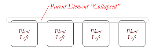
To fix this, what we need is a clearfix, which looks like this:
.three-col-grid:after { display: table; clear: both; content: '';}If you use a preprocessor like Sass, you can convert this into a mixin, which allows you to use the same code in different places
// Clearfix@mixin clearfix {  &:after {    display: table;    clear: both;    content: '';  }}
// Usage.three-col-grid {  @include clearfix;}
Once we’re done with the columns, the next step is to create some gutters.
Step 5: Determine gutter position
So far, we know we should create gutters either with margin or padding properties. But which should we use?
If you sketch around for a bit, you’ll quickly notice that you have four possible ways to create these gutters.
- Gutters can be placed on one side, as margins
- Gutters can be placed on one side, as paddings
- Gutters can be split equally on both sides, as margins
- Gutters can be split equally on both sides, as paddings
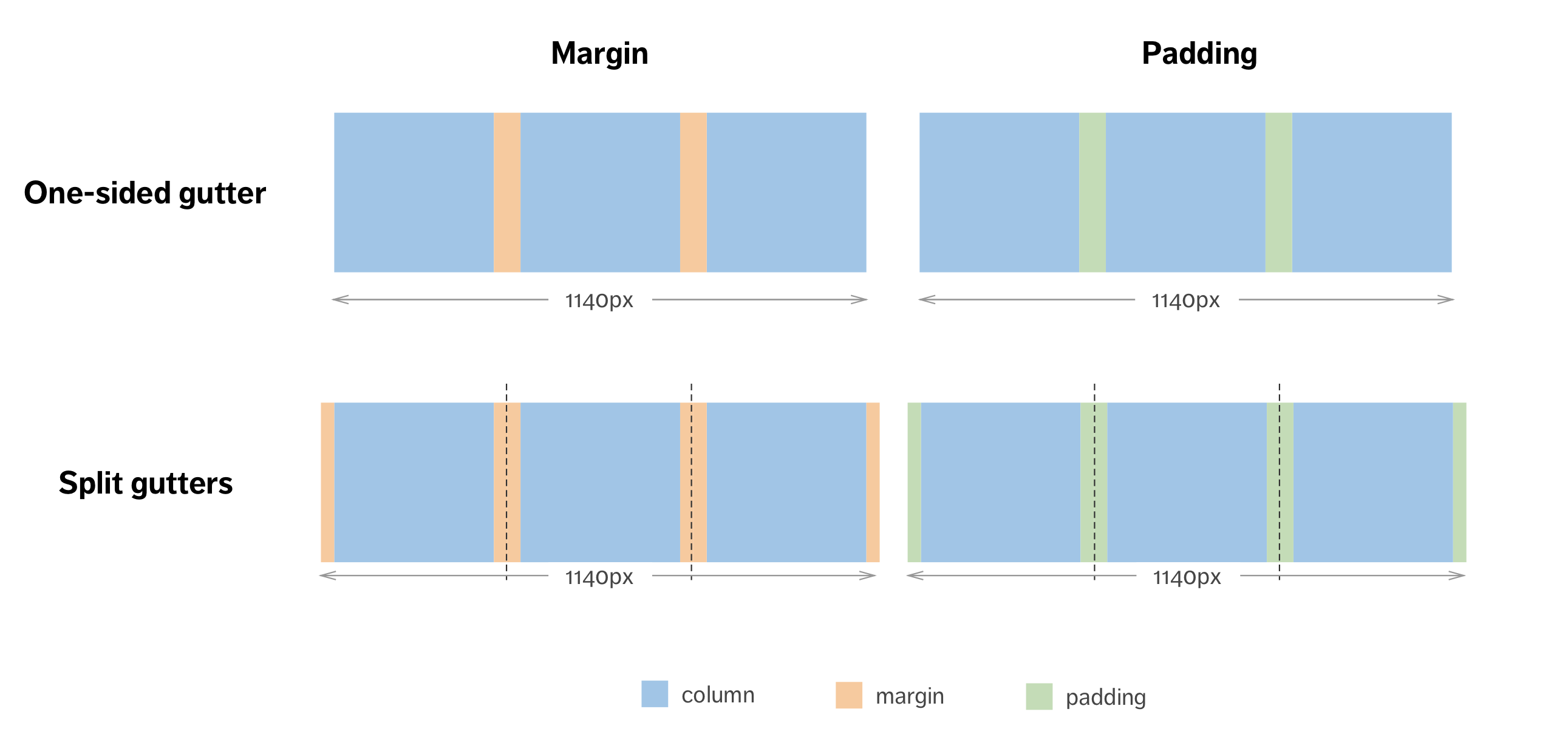
This is where it starts to get complicated. You need to calculate column widths differently depending on which method you use.
We’ll go through these methods one by one and look at the differences. Take your time as you read through them.
Here we go:
Method 1: One-sided gutters (Margin)
With this method, you create gutters with the margin property. This gutter will either be placed on the left or right of the columns; it’s up to you which side to choose.
For the purpose of this article, let’s say you chose to put your gutters on the right. What you’ll do then is:
.grid-item { /* Need to recalculate width property */ margin-right: 20px; float: left;}Then, you recalculate your column-width according to this image:
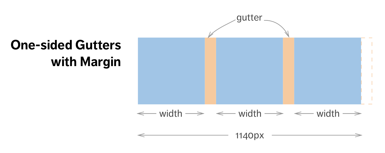
You can see from the image above that 1140px is equal to three columns and two gutters.
And we have a problem here… We need columns to be written in percentages, but our gutters are fixed at 20px. We can’t do math with two different units at once!
Well, it wasn’t possible before, but it is now.
You can use the CSS calc function to mix percentages with other units. It retrieves the unit values of the percentages to perform calculations on the fly.
What this means is you can leave your width as a function, and browsers will automatically calculate your values for you:
.grid-item { width: calc((100% - 20px * 2) / 3); /* other properties */}That’s great.
After getting the column width, you need to remove the final gutter from the rightmost grid item. Here’s how you can do it:
.grid-item:last-child { margin-right: 0;}Most of the time, when you remove the final gutter on the rightmost item, you also want to float it to the right to prevent subpixel rounding errors from messing up your grid by sending the last item into the next row. This only happens on browsers that round subpixels up.
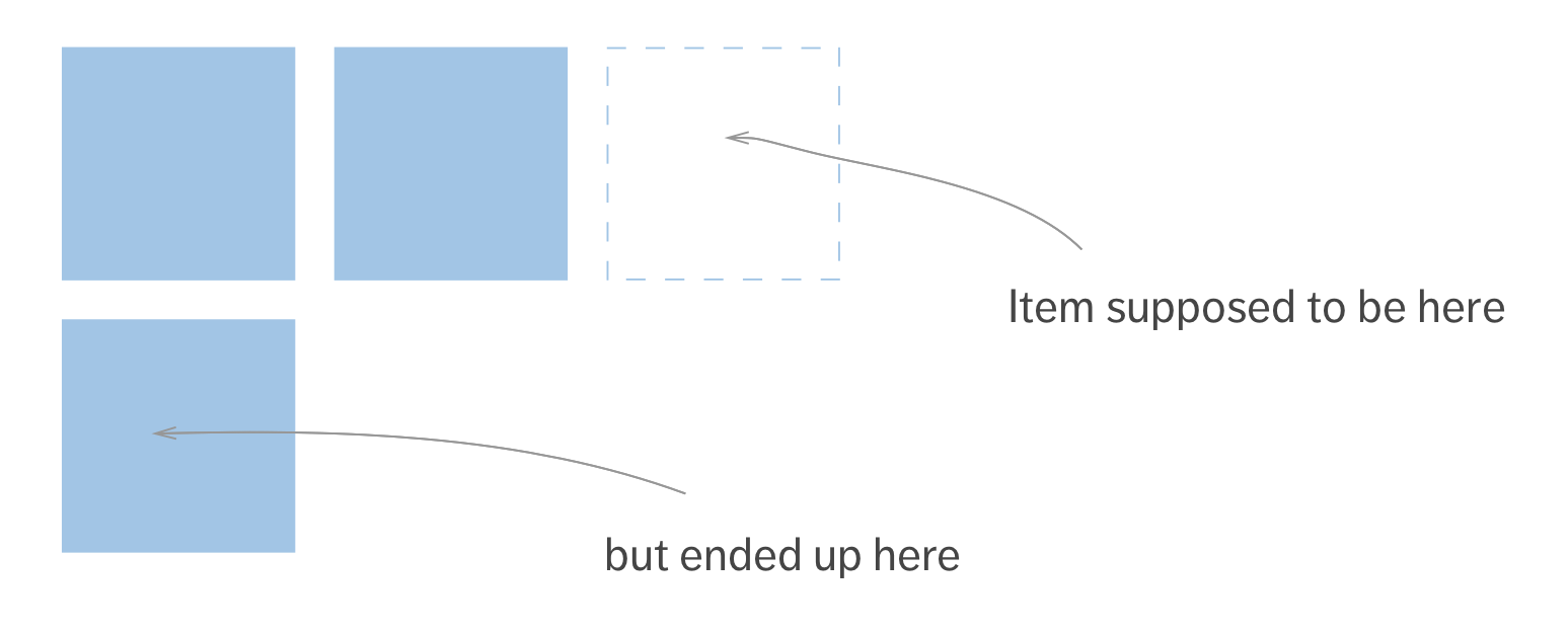
.grid-item:last-child { margin-right: 0; float: right;}Phew. Almost there. Just one more thing.
The code so far is great if our grid contains only a single row. It doesn’t cut it, however, if there’s more than one row of items 😢.

What we need to do is to remove the right margin from the rightmost item in every row. The best way to do this is with nth-child():
/* For a 3-column grid */.grid-item:nth-child(3n + 3) { margin-right: 0; float: right;}That’s all you need for a one-sided gutter built with margins. Here’s a codepen for you to play around with.
Note: Calc doesn’t work with IE8 and Opera mini. You might want to consider other methods if you need to support these two browsers.
Method 2: One-sided gutters (Padding)
Like the one-sided gutters with margins, this method requires you to place your gutters to one side of your columns as well. Let’s say you choose the right side again.
.grid-item { /* width property */ padding-right: 20px; float: left;}Then, you can recalculate your column-width according to this image:
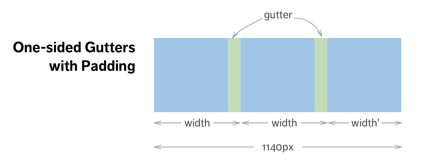
Notice the widths are different from the previous method? They’re different because we switched the box-sizing property to border-box. Now, width calculations include padding in them.
In this case, two of the three columns have a larger width than the final one, which eventually results in weird calculations and CSS code that’s hard to grasp.
I suggest not even attempting this method. (It’s going to be really ugly if you continue with it. Try it at your own risk!)
Method 3: Split gutters (Margin)
In this method, you split gutters into two and place each half on the sides of your columns. The code looks like this:
.grid-item { /* Width property */ margin-right: 10px; margin-left: 10px; float: left;}Then, you calculate your column-width according to this image:
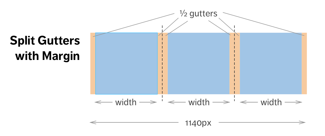
From what we know before, you need to calculate the column-width with the calc() function. In this case, you remove three gutters from 100% before dividing the answer by three to get your column-width. In other words, the column-width is calc((100% - 20px * 3) / 3).
.grid-item { width: calc((100% - 20px * 3) / 3); margin-right: 10px; margin-left: 10px; float: left;}That’s it! (Nothing extra you need to do for grids with multiple rows 😉). Here’s a codepen for you to play with:
Method 4: Split gutters (Padding)
This method is similar to the previous one. You split your gutters and place each half on the sides of your columns as well. This time, you use padding instead of gutters.
.grid-item { /* width property */ padding-right: 10px; padding-left: 10px; float: left;}Then, you calculate your column widths as follows:
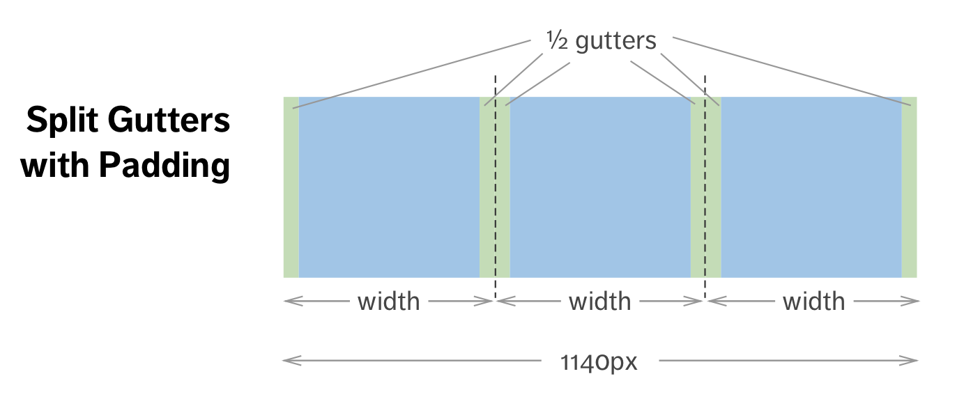
Notice the column-widths are much easier to calculate this time? That’s right; it’s a third of the grid width at every breakpoint.
.grid-item { width: 33.3333%; padding-right: 10px; padding-left: 10px; float: left;}Here’s a codepen for you to play with:
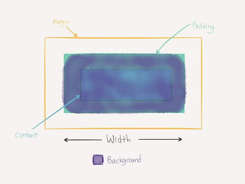
Before we move on, I want to tell you about a small caveat if you use split gutter with padding. If you take a look at the markup in the Codepen, you’ll notice that I added an extra <div> within .grid-item. This extra <div> is required if your component contains background or borders.
This is because background is shown on padding properties. This image should explain why (hopefully), by showing the relationship between background and other properties.
What would I use?
When I started to code grids about two years ago, I mostly coded grids that are designed with the top-down approach and built with a hybrid system. In that approach/system, I used percentages for both width and gutter values.
At that time, I loved the simplicity of setting gutters on one side of the grid. There was less cognitive overload for me because I’m pretty bad with math. The extra gutters ÷ 2 calculation turned me off quickly.
I’m thankful I went that route. Although the CSS seems more complicated than split gutters, I was forced to learn nth-child properly. I also learned the importance of writing mobile-first CSS, both which are still major impediments to both young and experienced developers, as far as I can tell.
However, if you ask me to choose now, I’ll go for split gutters instead of single-sided ones, because the CSS is so much simpler. Also, I prefer using margin for gutters instead of padding because of the cleaner markup. (But padding is easier to calculate, so I’ll continue the rest of the article with padding).
Step 6: Create a debug grid
When you’re starting out, it’s especially helpful to have a control grid around to help you debug your layouts. It helps ensure you’re building things correctly.
At this point, I only know a lame way to create the debug grid. That is to create HTML elements, and add some CSS to it. Here’s what the HTML looks like:
<div class="fixed-gutter-grid"> <div class="column"></div> <div class="column"></div> <div class="column"></div> <div class="column"></div> <div class="column"></div> <div class="column"></div> <div class="column"></div> <div class="column"></div> <div class="column"></div> <div class="column"></div> <div class="column"></div> <div class="column"></div></div>The CSS for this debug grid is the following (I’m using split gutters with margins to reduce markup for the debug grid):
.column { width: calc((100% - 20px * 12) / 12); height: 80px; margin-right: 10px; margin-left: 10px; background: rgba(0, 0, 255, 0.25); float: left;}(Ultra side note: Miriam and Robson are working on a SVG-background image debug grid on Susy v3. This is super exciting cause you can use a simple function to create your debug grid!)
Step 7: Create layout variations
The next step is to create your layout variations based on your content. This is where CSS grid systems shine. Instead of creating layouts by writing multiple grid classes, you can create a reasonable-sounding name for your layout.
For instance, let’s say you have this grid layout that’s only used for guest articles. The layout looks like this on desktop:

The markup for this guest-article layout can be:
<div class="l-guest-article"> <div class="l-guest"> <!-- Guest profile --></div> <div class="l-main"><!-- main article--></div> <div class="l-sidebar"><!-- sidebar widgets--></div></div>Alright sweet. So we have 12 columns now. The width of one column is 8.333% (100 ÷ 12).
The width of .l-guest is two columns. So, what you do is multiple 8.333% by two. Simple as that. Just rinse and repeat for the rest.
Here, I suggest using a preprocessor like Sass, which allows you to calculate column width easily with a percentage function instead of doing the calculations manually:
.l-guest-article {  @include clearfix;  .l-guest {    // Ahem. More readable than 16.666% :)    width: percentage(2/12);    padding-left: 10px;    padding-right: 10px;    float: left;  }
  .l-main {    width: percentage(7/12);    padding-right: 10px;    padding-left: 10px;    float: left;  }
.l-sidebar { width: percentage(3/12); padding-right: 10px; padding-left: 10px; float: left; }}You probably find that there’s a lot of code repetition about now. We can make it nicer by abstracting the common parts away into a separate selector like .grid-item.
.grid-item {  padding-left: 10px;  padding-right: 10px;  float: left;}
.l-guest-article {  .l-guest {    width: percentage(2/12);  }  .l-main {    width: percentage(7/12);  }  .l-sidebar {    width: percentage(3/12);  }}
There. Much cleaner. :)
Step 8: Make your layouts responsive
The final step is to make your layouts responsive. Let’s say our guest article layout responds in the following way:
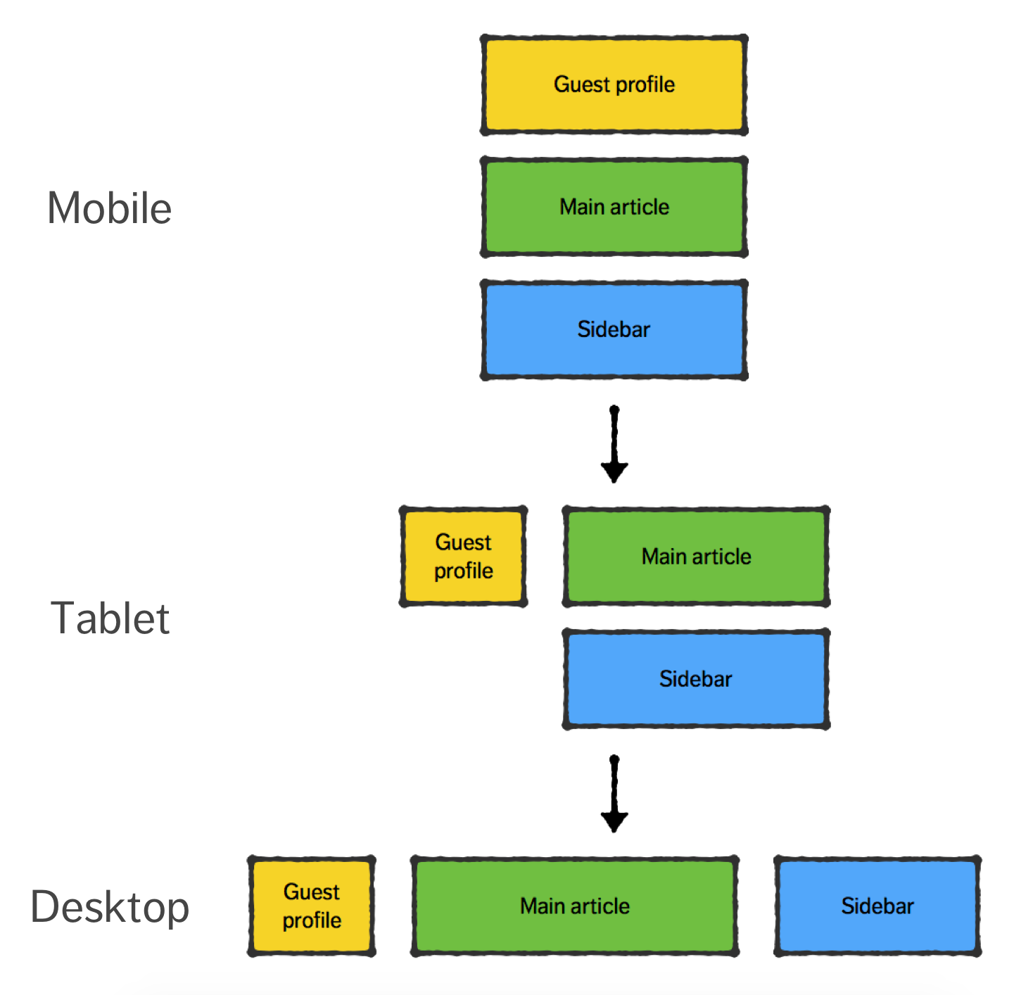
The markup of our guest article shouldn’t change. What we have is the most accessible layout we can possible have. So, the changes should entirely be in CSS.
When writing the CSS for our responsive guest layout, I highly recommend you write mobile first css because it makes your code simpler and neater. We can begin by writing CSS for the mobile layout first.
Here’s the code:
.l-guest-article { .l-guest { /* nothing goes here */ } .l-main { margin-top: 20px; } .l-sidebar { margin-top: 20px; }}There’s nothing we need to do since every component takes up the full width by default. However, we can add some margin-top to the last two items to separate the elements from each other.
Next, let’s move on to the tablet layout.
For this layout, let’s say we activate the breakpoint is 700px. .l-guest should be 4 of 12 columns while .l-main and .l-sidebar should be 8 of 12 columns each.
Here, we need to remove the margin-top property from .l-main because it needs to be in line with .l-guest.
Also, if we set .l-sidebar to a width of 8 columns, it will automatically float onto the second row because there’s not enough room on the first row. Since it’s on the second row, we also need to add some left margins on .l-sidebar to push it into position; alternatively, we can float it to the right. (I’ll float right since there’s no need to calculate anything).
Finally, since we’re floating the grid items, the grid container should include a clearfix to clear it’s own children.
.l-guest-article { @include clearfix; .l-guest { @media (min-width: 700px) { width: percentage(4/12); float: left; } } .l-main { margin-top: 20px; @media (min-width: 700px) { width: percentage(8/12); margin-top: 0; float: left; } } .l-sidebar { margin-top: 20px; @media (min-width: 700px) { width: percentage(8/12); float: right; } }}Lastly, let’s move on to the desktop layout.
For this layout, let’s say we activate the breakpoint is 1200px. .l-guest should be 2 of 12 columns, .l-main should be 7 of 12 columns and .l-sidebar should be 3 of 12 columns.
What we do is to create a new media query within each grid item and change the width as necessary. Take note we need to remove the margin-top property from ',l-sidebar as well.
.l-guest-article {  @include clearfix;  .l-guest {    @media (min-width: 700px) {      width: percentage(4/12);      float: left;    }
    @media (min-width: 1200px) {      width: percentage(2/12);    }  }  .l-main {    margin-top: 20px;    @media (min-width: 700px) {      width: percentage(8/12);      margin-top: 0;      float: left;    }    @media (min-width: 1200px) {      width: percentage(7/12);    }  }  .l-sidebar {    margin-top: 20px;    @media (min-width: 700px) {      width: percentage(8/12);      float: right;    }    @media (min-width: 1200px) {      width: percentage(3/12);      margin-top: 0;    }  }}
Here’s the codepen for the final layout we’ve created:
(Oh, by the way, you can achieve these results with Susy too. Just remember to set the gutter-position to inside-static)
Wrapping up
Wow. This is a long article. I think I died three times writing it. (Thanks for reading it all the way. I hope you didn’t die three times reading it though! 😛).
As you can see in this article, the steps to creating a responsive grid system are relatively straightforward. The parts that most people get mixed up are steps 5 (determining gutter position) and 8 (making layouts responsive).
Step 5 is simple when you think through all the possible methods, and we’ve thought them through together. Step 8, on the other hand, is solvable easily once you have enough practice with writing mobile first css
I hope this article has given you the knowledge to build your own responsive grid system, and I hope to see you build a custom grid for your next project.
Till then!
