Designing grids
I’d be telling you the obvious if I said that grids are important in web design. You already knew that. You probably have even coded a few grids with frameworks like Foundation or Bootstrap. You may even have created a custom grid manually, or using a grid layout tool like Susy.
But have you stopped to think about these questions for the grids you’ve made?
- How many columns should you have?
- Should the columns be evenly sized?
- How big should columns and gutters be?
- How does the grid respond to different viewports?
What are your answers?
I have searched high and low for answers to these questions in the past few months. Here’s an article consolidating everything I know about designing grids right now. Hopefully, it’ll help answer the questions you have as well.
Should columns be evenly sized?
That’s the first question you need to ask before creating your grid. Unfortunately, many people skip this step and head straight for equally sized columns without thinking, likely because the practice has been made popular by established frameworks such as 960 grid system (in the past), Bootstrap, and Foundation.
A grid system with equal-width columns is robust and flexible. It creates a safe and functional structure that allows you to experiment with your layouts while delivering a formal experience. You can’t go wrong with equal-width column grids.
At its worst, a site made with an equal-width grid system can feel robotic and cold. It might also feel rigid and boring.

The fundamental problem with ALL grid generators and frameworks is they assume you want columns of the same width. Mark Boulton
A grid system with unequal-width columns is the exact opposite. It’s flowy and dynamic, which results in designs that seem more creative, more human, and softer.
However, they’re also harder to create and implement. They can also be less flexible in inexperienced hands (like mine).

So, equal or unequal width?
Here are a few factors you’ll want to consider.
First, are you using any framework?
If your team is bent on using a framework like Bootstrap or Foundation, you’ve pretty much chosen a grid for yourself. It’s going to be the standard 12-equal-width-column grid (unless you decide to ditch the grid).
Second, what’s the feel you’re going for in the design?
The type of grid you choose partially determines the feel of your site, so you’ll want to keep it consistent as much as possible.
If you’re going for something that’s formal and safe, consider using equal-width columns. On the other hand, if you’re looking for something that’s bold, audacious, artsy, or dynamic, maybe an uneven-width column grid will suit you better.
Third, how complex is your website?
How many different layouts do you have? How many pages do you have? How many unknowns are there?
If your site is complicated, or if there are too many unknowns, you’ll want to consider using a equal-width column grid since its flexibility might save your ass down the road.
On the other hand, you might want to consider an unequal-width column grid if your design is simple, or if you have the luxury to be whacky without worrying too much about later designs not gelling with your initial ones.
Fourth, can your team cope with code complexity?
Many young developers that are just starting out can find grid math a huge challenge. For these developers, you might want to use equal-width grids to reduce the complexity so they don’t have to worry too much.
Grid math can still be a challenge for experienced frontend developers if they have not dived into it much. However, it can become simple once you have the right tools. Susy is an example of a tool that helps you create custom-made grids easily without doing all the math yourself. If you need help with Susy, go grab some free chapters of Learning Susy, a book I wrote to help you learn Susy properly.
So, go ahead and design whackier grids if your team can handle the grid math. Do check with your frontend developers if they’re comfortable with it though!
What would I use?
That’s a good question.
If I were to work with a designer, I’d talk to them to see what kind of grid makes more sense, and what they’re comfortable with. It’s going to be an equal-width column grid most of the time.
But for my personal side projects, I usually go for unequal-width columns because they appeal to rebel in me. 😉
Unfortunately, I have yet to explore unequal-width columns to a point where I can explain the underlying mechanics. So, for the rest of this article, I’ll only talk about what I’ve discovered with equal-width grids.
Don’t be disappointed if you’re looking for hints to building good unequal-width grids. I believe the same mechanics can be used to create one as well, and I’ll write a separate article when I’ve explored the topic more.
For now, let’s move on to the next question.
How many columns should you use?
Before deciding on the number of columns, you should have sketched out (on paper at least) possible layouts and content types you have in your design. Does your design only contain a single-column layout? Does it contain a content-sidebar layout? What about a three-column layout?
Once you have these sketches, you’re better informed about the number of columns you need. For example, let’s say you’ve decided on the following layouts:
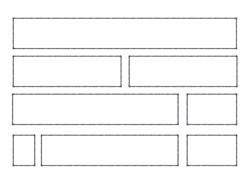
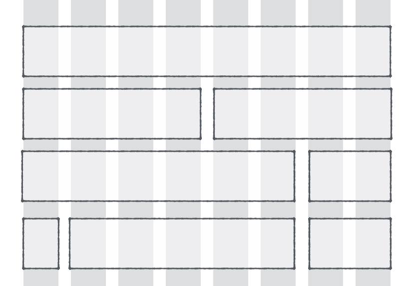
These layouts can be created with eight columns, like this:
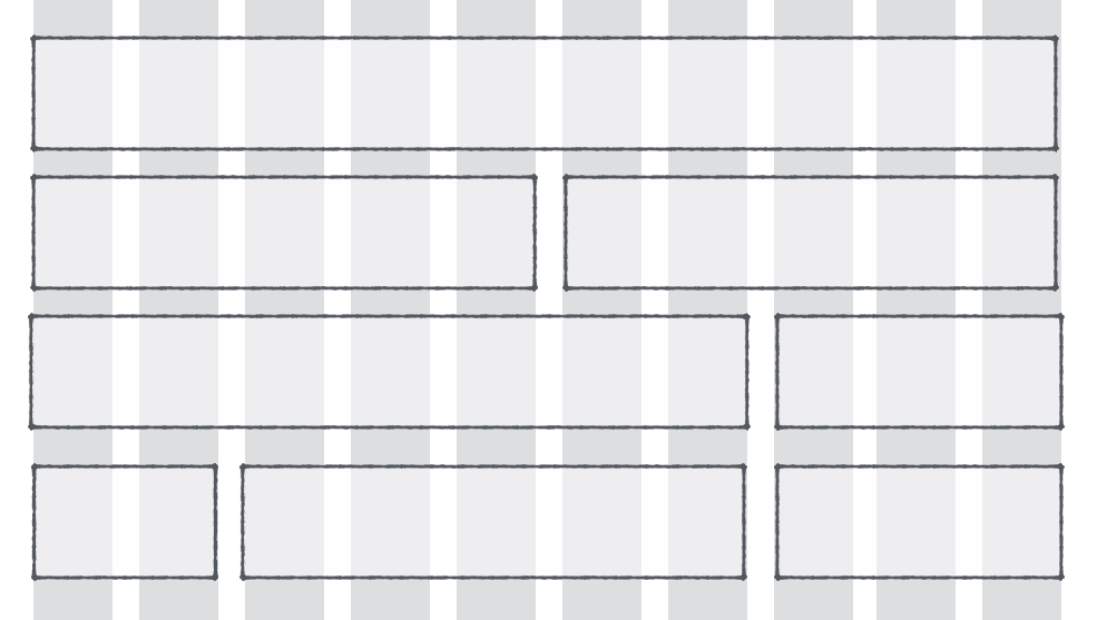
It can also be created with ten columns, like this, depending on the content and your proportions:
Of course, it can also be created with a 12-column grid, like this:
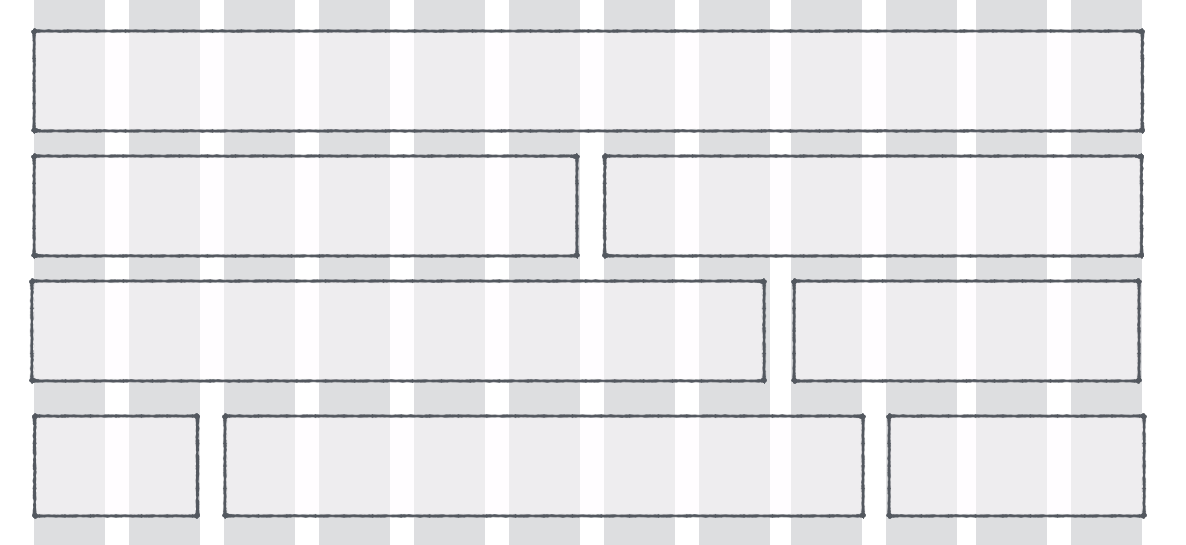
There’s no correct answer to the number of columns you should use. You have a well-designed grid as long as your components fit well into the grid.
If you have no clue about the type of content or layout that you’re creating (which I sincerely hope that’s not the case), the best way is to start with an extremely flexible grid that contains 12 columns.
This is because 12 columns can be split into six possible symmetric layouts:
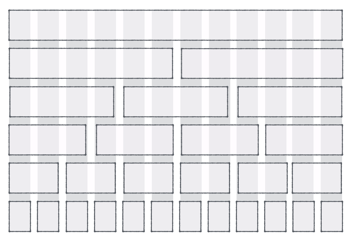
It also allows you to split into any of the following possible combinations:
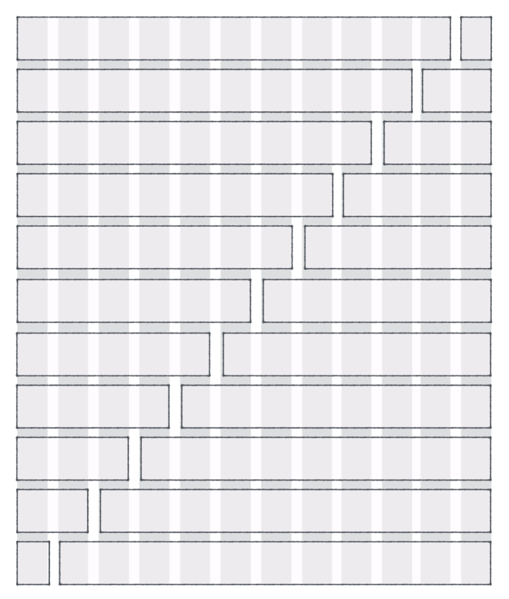
The flexibility provided by 12-columns is the reason why popular frameworks like Bootstrap and Foundation use 12 columns for their grid.
Once again, there’s no perfect answer to the number of columns you use. You have a well-designed grid as long as your components fit well into your grid.
One more thing. The number of columns you eventually work with might also change depending on how you choose to size columns and gutters, and how your grid respond to different sizes. So, let’s move on and consider these factors before deciding.
How big should columns and gutters be?
There are two ways you can choose the sizes of your columns and gutters.
The first way is the top-down approach. Here, you start by deciding the size of your grid on a desktop. Let’s say it’s 1140px (or 960px). The number you choose should be divisible by a lot of numbers (2, 3, 4, 5, 6, 8, 10, 12), which makes it easy to calculate the size of your columns and gutters.
Once you have decided on your grid size, you decide on the column or gutter width (whichever your fancy pants likes more). You get the other number by dividing the grid size by your gutters or columns.
Say you have a grid of 1140px, 12 columns and a gutter-size of 20px, you’ll get a column-size of 75px. (1140 ÷ 12 - 20).
Sketch has an excellent tool that helps you create grids like this easily. (Note: allowing gutters on the outside of your grid makes math much easier):
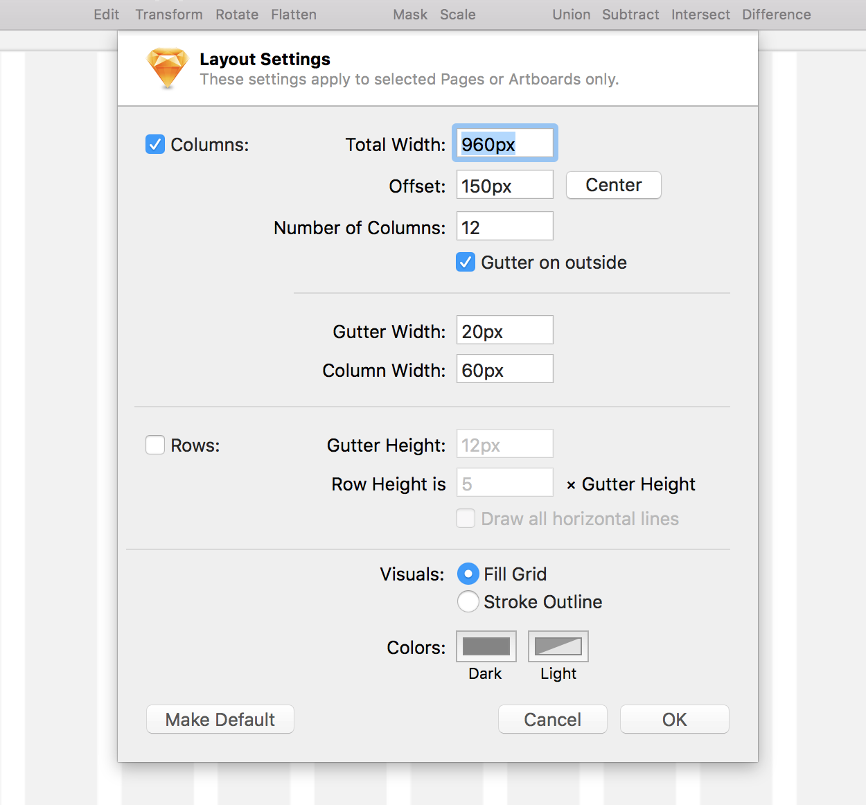
The top-down approach is easy. We’ve been creating grids like this for years. Common numbers you can use are 960, 1080, 1140, 1440, 1560. (Hint: begin with any of these numbers and add 60px or 120px and you’ll end up with a decent size).
A downside to the top-down approach is what it’s name suggests. It’s top-down. Imagine a manager handling down instructions from above. Sometimes these instructions don’t make sense and don’t fit well with the design. Be prepared to make small tweaks or sacrifices on the component level in your design.
I’ve used the top-down approach a lot when I began designing websites because that’s the only method I know. However, I didn’t like it because I feel like I’m working from a magic number I picked from thin air. So, this approach speaks little to my developer instincts.
The second way is the bottom-up approach. Here, you first decide on your columns or gutter sizes, then calculate the total size of your grid.
The crux of this approach lies in how you decide your gutter and column sizes. Just like with the top-down approach, you can decide on either one first.
Some designers choose to use an easy-to-use number like 10px or 20px for their gutters. They then extrapolate and create column sizes that are maybe 3 or 4 times that of their gutters.
Say your gutters are 20px and your columns are 3x your gutters, you’ll eventually create a grid that’s 960px (20px _ 12 + 60px _ 12).

There’s nothing wrong with using easy-to-use numbers as the columns or gutters of your grid. However, to me, they also feel like magic numbers that are derived from thin air.
So, instead of picking these magic numbers, I prefer to use a number that’s derived from the typography on the site. That number is the line-height of the body text since it’s the baseline for Vertical Rhythm
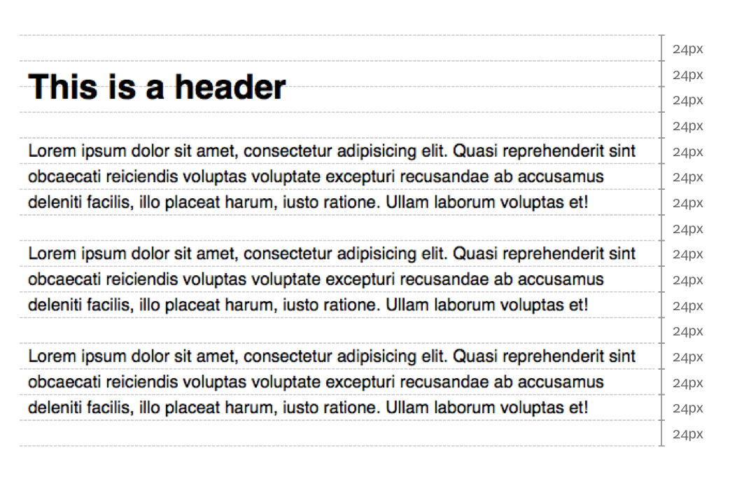
(If you didn’t know already, I’m prrreeetty big on typography 😏). I highly suggest you read this article if want to understand why I choose this number.
Once the gutters are determined, I’ll multiply if by 2, 3 or 4 times to get the size of my columns. Then, I’ll calculate the size of the grid.
Note: both methods are valid. Countless of well-designed sites have began with either of these approaches. So, choose what you’re comfortable with, have your reasons, and move on.
How the grid responds to different viewports
Whenever you build a responsive website, you need to think about what happens to the columns and gutters on mobile, on tablet and on a multitude of devices. Basically, you need to think about what happens to the columns and gutters at every possible breakpoint.
Before we talk about how columns and gutters should change, it might be beneficial to bring in two buzzwords that the industry have been using for years whenever we think about responsive grids. The two big words we use are “adaptive” and “fluid” grids.
Let’s take a look at what these two buzzwords mean.
Adaptive grids are grids that “adapt” to different breakpoints. It means you keep the columns and gutter sizes fixed, and you change the number of columns when the design calls for it. In practice, it behaves like the following gif when browsers are resized.

The adaptive approach allows you to control the width of your grids by controlling the number of columns used. It ensures that everything within the grid will always look its best since you can carefully craft the design according to the number of columns available.
The downside to this approach is that you might need to change your code a lot to make sure there’s no excessive whitespace between at the sides of your design, which, can be a huge chore.
On the other hand, fluid grids means that grids are coded in a way that it automatically increases in size whenever the browsers are resized. In practice, a fluid grid looks like this:

Here, you’ll notice that both columns and gutters are resized whenever the browser width changes. Your design will always be a specific number of columns (12 in this case), and the maximum width of your grid is determined by the viewport size.
The fluid approach allows you to write code that’s easier to manage. You don’t need to change the number of columns at every possible breakpoint to ensure site looks okay. You just need to tweak the layout at a few breakpoints.
Unfortunately, a pure fluid grid has a big downside. If you resize the viewport downwards proportionally, you’ll eventually reach a point where the gutters are too small to separate the layout into different columns.
The flipside is true. If you resize the viewport upwards, you’ll get to a point where columns and gutters become too large. (Imagine a 2560px display that has a grid container of 90% width. *Shudders to think*).
Because columns and gutters can get huge, many people force a max-width at the desktop layout to ensure their design doesn’t go out of whack. If you do the same, you’ll end up with a design with equal whitespace on the left and right, like this:
.container { max-width: 1140px; margin-right: auto; margin-left: auto;}By now, you might have noticed that both buzzword-filled approaches suck. So don’t get suckered into either of these. There are two approaches that actually work.
The first approach is to combine the plusses from both adaptive and fluid approaches. That means you resize columns and gutters proportionally while viewport width changes. Then, at a specific breakpoint where your design fails, you change the number of columns and correct your design accordingly. For the lack of a better word, let’s call this the hybrid approach Here’s what it looks like:

Recalculating the number of columns at different breakpoints can be difficult if you’re creating your grid from scratch. Susy can help you make things easier, like this:
$susy: (  columns: 4 // Starts off with 4 columns  , // Other properties,,,,,,);
.content-sidebar {  // Changes to 8 columns at 600px  @include with-layout(8) {    @media (min-width: 600px) {      .content {        @include span(6); // 6 of 8 columns      }      .sidebar {        @include span(2 last); // 2 of 8 columns      }    }  }}
Notice how you don’t have to calculate column or gutter sizes? Susy does it for you automatically. I go in-depth about how it does so, and how to use Susy in Learning Susy if you’re interested to find out more.
The second approach is to your resize your columns while keeping your gutters sized fixed. Let’s call it the fixed-gutter approach. Here’s what you get from using this approach:

Did you know that Bootstrap and Foundation uses the fixed-gutter approach with their grids? If you look at the source code for either framework, you’ll see that the column-width is set in percentages while gutters are fixed with px or rem.
/* Bootstrap */.col-md-4 {  width: 33.33333%;  padding-left: 15px;  padding-right: 15px;  float: left;}
/* Foundation */.large-4 {  width: 33.33333%;  padding-left: 0.9375rem; // This means 15px  padding-right: 0.9375rem; // in Foundation  float: left;}
Which approach should you use?
Both are valid methods, so choose whatever that feels right for you.
When I began to design websites, I used the top-down approach to sizing my gutters and columns. Consequently, I went with the hybrid approach for coding the responsive grid.
Now, after learning more about design and typography principles, I prefer the fixed-gutter approach instead. One of the things I learned from typography was the importance of ensuring whitespace remain consistent. This leads me to believe that gutters, which are whitespaces that separate columns of content, should be kept the same.
Even though I prefer the fixed-gutter approach, I disagree with the way Bootstrap and Foundation creates their grids. I wrote about why in a previous article so I’ll not harp on it here.
Also, I’ll share how I create grids with the fixed-gutter approach in the next article since the article is primarily about the designing grids.
Wrapping Up
Grids are a best practice in web design. You have probably created a ton of them over the last few years. Unfortunate that many people don’t think about how the grids were formed in the first place.
If you have thought long and hard about creating custom grids for your design, I hope this article has shed some light on how to choose columns, gutter and grid sizes, along with how grids should respond to different viewports.
On a final note, you have to come to terms that grids are subjective. It’s probably the hardest thing to do when creating grids. Don’t get stuck trying to find the perfect sizes (like I once did), but go ahead and use any of the principles above to begin creating your grid!
