Designing Learn JavaScript's course portal (Part 2)
This is the second article where I explain how I designed Learn JavaScript’s course portal.
If you missed the first part, you’ll want to read it first.
Content page
After I finished with the lessons page, I began work on the content page. I designed the contents page next because students need this page to access lessons.
Most courses choose to use a sidebar or off-canvas menu for their content. But I can’t because Learn JavaScript is huge. When I designed the course portal, I already have 150+ lessons. (Today, I have 250+ and I’m still writing the course).
If you see 150+ lessons in a sidebar, you’ll definitely get overwhelmed. So I chose to create a dedicated content page for the course. It’s still a ton of lessons, but it feels more manageable.
I figured the best way is to present lessons is with a list.

Two points to note here.
First: Learn JavaScript is split into 20 modules. I styled each module like h2. This style allows students to quickly understand which lessons are inside each module.
Using h2 also means I added a second layer of repetition across the page. This increases familiarity and unity in the design.
Second: I removed underlines from each link. Why? Because it’s hard to read when everything is underlined. Ease-of-reading is always a priority.
The unfortunate side-effect is it makes links harder to spot for color-blind users. There’s not enough contrast between normal text and links. But since this is a page of links, I don’t think it’s too much of a problem.
Login page
I designed the login page next. Why? Because I need students to log in to enter the course.
I got stuck at the login page at first, so I searched the web for inspiration. I found that most login designs include a Modal window of some sort.

I didn’t want to use a Modal window for the login page. Modals make logins unnecessarily complicated. I wanted it to be clean and simple like Wordpress’s login page.

But I also found the Wordpress’s page boring. I wanted my login page to be beautiful. It should also speak boldly about the course. This meant I had to design the login page from scratch.
I realised that five elements were critical for a login page:
- A logo (so people know which course they’re logging into)
- An email field
- A password field
- A password reset link
- A login button
The logo
I chose to work on the logo first.
Ironically, learn JavaScript doesn’t have a logo. All I have is an animated visual I use to describe the course.
The animating text doesn’t suit the login page. I don’t have to convince anyone to invest in the course anymore. So I removed the animated words and shifted the brackets up.
Deleting the text makes the visual lose the feel of a “brand”. The words “Learn JavaScript” is too plain and cold, so I added the yellow highlight back.
Here’s what I ended up with after tweaking typography, sizes, and positioning.
Email and password fields
Both email and password are text fields. When I design text fields, I start by inheriting typography from the rest of the page. This is as easy as setting font and line-height to inherit.

Each text field needs something to define its boundaries. There are three ways to create a boundary:
- With background-color
- With shadows
- With borders
I started with a 2px border first because I like well-defined boundaries. I tried playing around with different border colors and eventually settled with a light grey border.
I also rounded the borders to make inputs feel friendlier.

Buttons
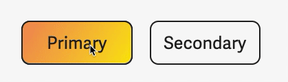
At this point, I knew I had to make two buttons:
- A primary button for the call to action
- A secondary button for less important actions
Most primary buttons contain a solid fill. This solid fill draws attention to the button. On the other hand, secondary buttons are usually ghost buttons (buttons with a transparent background).
Sometimes, secondary buttons have a white fill.

I decided to go for a solid yellow fill for the primary button.

Button hover and focus states
Buttons are interactive elements. They need a hover state and a focus state. Both states need to be distinct because they represent different actions.
For hover, I decided to change the background of the button to the orange-yellow gradient. This reuses another element so it unifies the design even more.
For focus, I added a blue outline around the button. This outline stands out when you Tab onto it. I wrote an article about creating these kinds of outlines. You can find out more about the technique here.

Focus on email and password fields
I decided to use the same focus state on email and password fields. The difference is: I changed the border color to a dark blue to match the focus.

Bringing the login form together
If I bring the elements together for the login page, they look like this:

It works, but it doesn’t look great.
I tried to center-align every element, but it doesn’t look great either. Something seems to be missing.

I was stuck for a long time. Around this period, I came across Paul Jarvis’s Chimp Essentials course again.
Here, I noticed Paul accentuated his login form with a thick border. This helps me focus on the text fields and login button.

So I stole this idea.

Then, I accentuated my form by adding a light yellow background. This allows the form to draw more attention.

Finally, I wanted to emphasize the login button more. It looks receded in the login form right now. I played around with a few options and chose to increase the border-width from 2px to 4px.

Login states
When a user clicks the submit button, I log them into the course with JavaScript. (Read more about the login process here). This can take a while if they’re on a slow connection.
I wanted to give users feedback that they’re logging into the course. The simplest way to do this is to add a status message that says “Logging in”. I decided to add this status message to the bottom of the form.

This message can be easily changed to a failure message if the login fails.

That’s all the considerations I made for the login page. Next week, I’ll end the series with the Accounts and Components page. I’ll also share some of my learnings from this experience.
