Creating a custom focus style
When you create a custom focus style, you want to think about four things:
- Adding an outline
- Creating animations that contain movement
- Changing the background color
- Changing the text color
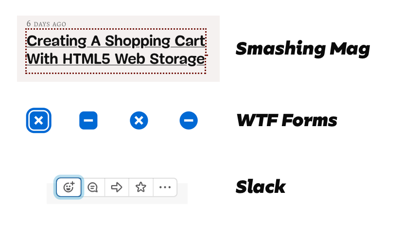
I wrote more about this in my article on designing focus. During my research, I found three kinds of focus style I liked.
- The one on Smashing Magazine
- The one on WTF Forms
- The one on Slack

Today, I want to show you how to create these focus styles and use them effortlessly across your website.
Creating the focus for Smashing Magazine
Smashing Magazine uses a large dotted outline for focus. To create this focus style, you set the outline property to 3px dotted.

*:focus { outline: 3px dotted #761b15;}See the Pen Focus style Smashing Mag (default) by Zell Liew (@zellwk) on CodePen.
If you want to change the color of the outline, you can change the outline-color property.
.red-background *:focus { outline-color: white;}See the Pen Focus style Smashing Mag (changing outline colors) by Zell Liew (@zellwk) on CodePen.
Alternatively, you can use CSS Variables.
:root {  --outline-color: #761b15;}
*:focus {  outline: 3px dotted var(--outline-color);}
.red-background {  --outline-color: white;}
See the Pen Focus style Smashing Mag (with CSS Variables) by Zell Liew (@zellwk) on CodePen.
Creating focus styles for WTF Forms
The focus style for WTF forms contains two parts:
- A white border
- A blue border

This style can be created with box-shadow. The idea is you create two shadows:
- The first shadow with the background’s color
- The second shadow with the focus’s color
*:focus { outline: none; box-shadow: 0 0 0 .075rem #fff, 0 0 0 .2rem #0069d4;}If you want to change the focus color, you need to rewrite the entire box-shadow.
.blue-background *:focus { outline: none; box-shadow: 0 0 0 .075rem #0069d4, 0 0 0 .2rem #fff;}Note: WTF Forms does not have styles for links and buttons. Only form elements. It doesn’t have styles for a darker background either. I created this demo according to what I thought looks okay.
See the Pen WTF Forms focus style by Zell Liew (@zellwk) on CodePen.
There’s an easier way. If you used CSS variables, you only need to switch the colors.
:root {  --focus-inner-color: #fff;  --focus-outer-color: #0069d4;}
*:focus {  outline: none;  box-shadow: 0 0 0 .075rem var(--focus-inner-color),              0 0 0 .2rem var(--focus-outer-color);}
.blue-background {  --focus-inner-color: #0069d4;  --focus-outer-color: #fff;}
See the Pen WTF Forms focus style (with CSS Variables) by Zell Liew (@zellwk) on CodePen.
Creating focus styles for Slack
The focus style on Slack contains two parts:
- A dark blue outline
- A light-blue border

This focus style can be created with the same technique as WTF Forms.
*:focus { outline: none; box-shadow: 0 0 0 2px hsla(210, 52%, 42%, 1.00), 0 0 0 .6rem hsla(200, 72%, 83%, 0.75);}The CSS Variables trick works wonders if you need to change colors.
:root {  --focus-inner-color: hsla(210, 52%, 42%, 1.00);  --focus-outer-color: hsla(200, 72%, 83%, 0.75);}
*:focus {  outline: none;  box-shadow: 0 0 0 2px var(--focus-inner-color),              0 0 0 .6rem var(--focus-outer-color);}
.dark {  --focus-inner-color: hsla(0, 0%, 100%, 0.75);  --focus-outer-color: hsla(0, 0%, 100%, 0.25);}
See the Pen Slack Forms focus style (with CSS Variables) by Zell Liew (@zellwk) on CodePen.
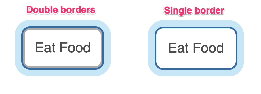
If you use this technique on elements with borders, you might want to remove the borders. It’s not pretty to see two stacking borders.

button:focus { border-color: transparent;}See the Pen Slack Forms focus style (improved border) by Zell Liew (@zellwk) on CodePen.
Combined demo
I combined the different methods onto one demo for you to play with. Here it is:
See the Pen Focus style by Zell Liew (@zellwk) on CodePen.
