Fix 90% of Your Problems With Susy by Getting This One Concept Right
In the last month, I had the privilege of helping a few people find out what went wrong with their Susy code while suggesting a few areas of improvement.
I noticed one problem kept popping up in the questions I answered. People find it difficult to get Susy to work correctly in nested grids. They sometimes employ workarounds that tweak Susy so badly that it hinders instead of helps.
Even though Susy is built to be extremely flexible and easy to use, it has its own key concepts and rules like all other frameworks. You will need to understand these concepts to get Susy to work for you properly.
I’ll like to share one of these concepts with you today to help you overcome a large majority of your Susy problems.
The Questions I Received
Most of the questions I receive boil down to these two different variations:
(1) How to create a uniform spacing between the edges of grid elements and their parent containers? In other words, how do I make the layout in this image?
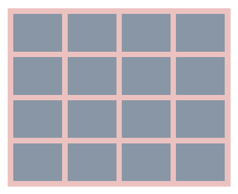
(2) Why are the gutters of elements within the nested grid different from the ones outside? In other words, why does this happen?

People have a variety of ways to deal with these two situations, most resorting to a trial and error method that eventually lead to super complex span() mixins like span(15 of 27). Some others tweak the gutter ratio within the nested grids to balance out these situations.
The best way to overcome these questions isn’t any of the methods above. There is a clear and direct way to solve these issues. To do so, you’ll have to understand a fundamental concept within Susy. You’ll have to know how to identify the “context”
What is Context?
Context is present in every single line of Susy code. You can find it if you look out for the of keyword. Here’s an example:
.content { @include span(8 of 12);}There’s no way to miss the of keyword in this example. What follows the of keyword is the context. In this case, we are specifying that the .content element has a context of 12 columns.
This is what happens if we translate the above code into an image.

We can clearly see that .content takes up 8 of 12 columns in the image. You could also say that context is the number of columns in the parent element.
Sometimes the of keyword is deliberately left out of the mixin so we coders can write less. There is no way of knowing what the context is without more information.
.content { @include span(8);}In these cases, you’ll have to look upwards to find the context.
Susy will look for a nested() mixin or a with-layout() mixin that the span() function is nested in. If it finds either of these mixins, Susy will take the context passed into them as the context of span().
@include nested(12) { // This is equivalent to @include span(8 of 12); .content { @include span(8); }}Fret not if this is the first time you are seeing the nested() or with-layout() mixin. It is perfectly fine not to use nested() or with-layout() in your code.
These mixins are not talked about often because they are built to help reduce repetition when coding large websites. I would argue that the use of nested() or with-layout() is a best practice, but I’ll leave that for the next article.
Let’s continue with context for now.
If Susy doesn’t find any nested() or with-layout() mixins that wrap around the span() mixin, it will use the columns setting found within the $susy map as the context.
$susy: (  columns: 12,);
.content {  // This is equivalent to @include span(8 of 12);  @include span(8);}
Let’s take it a step further and identify the context within nested grids. If we wanted to build something like this:

The HTML should be straightforward. .nested-item will be nested within .content.
<div class="content"> <div class="nested-item"></div></div>To write the Sass, we need to know the contexts of both .content and .nested-item.
Since context is the number of columns in the parent element, the context for .nested-item is the number of columns in .content.
The parent element for .content is wrap, and wrap uses the number of columns declared in the $susy map.
So context for .content is 12 while context for .nested-item is 8.
It’s easy to write the Susy code for both .content and .nested-item once we know the context.
.content {  @include span(8 of 12);}
.nested-item {  @include span(4 of 8);}
Say you wanted to center .nested-item within content.
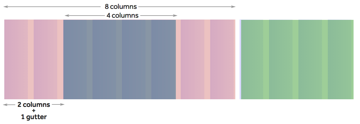
One way to do so is to offset the .nested-item by 2 spans and one gutter from the left. You have to make sure you use the correct context when offsetting the .nested-item element.
The way I prefer to offset is to use the span() function instead of pre() or post() mixins.
.nested-item { @include span(4 of 8); margin-left: span(2 of 8) + gutter(8); // Alternatively, you can write margin-left: span(2 wide of 8)}And with this, the .nested-item is centred within .content.

You can see that context is used in almost every single function and mixin in the examples above. Susy becomes super easy, once you understand context.
There is just one more small thing that you might want to keep in mind.
Susy calculates the width of columns and gutters in percentages. The exact width of the columns and gutters are affected by the available width of the element.
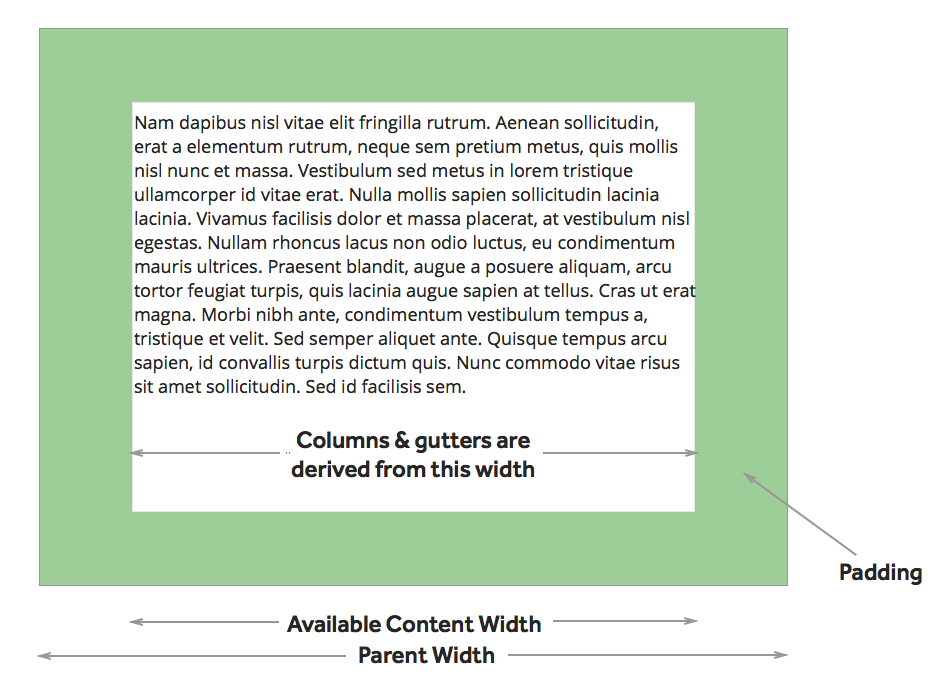
When we add padding to the parent container (assuming you are on border-box sizing), we push the content within inwards. The column and gutter sizes will not be exactly the same as the ones we used in the outer content. Most of the time though, this effect is negligible at about a 1px difference.
That’s everything you should know about context.
Now let’s take it up a level and answer one of the most popular questions: “How do I make top and bottom margins between each item equal?”
How To Make Equal Spaces with Galleries
Let’s revisit what we have to make first.

We know that this is a gallery and each of these gallery items can found within a .content div.
<div class="content"> <ul class="gallery"> <li class="gallery-item"></li> <li class="gallery-item"></li> <li class="gallery-item"></li> <li class="gallery-item"></li> <li class="gallery-item"></li> <li class="gallery-item"></li> <li class="gallery-item"></li> <li class="gallery-item"></li> </ul></div>We can use the gallery() mixin to quickly create the gallery. Since there are four items on each row, and the context is 8 columns, we know that each gallery item will take up 2 columns.
.gallery-item { @include gallery(2 of 8);}Take note that the gallery() mixins use floats. We have to add a clearfix to force the gallery to clear its children.
.gallery { @include clearfix;}
We can provide an equal vertical space between each gallery item by adding some margins to the bottom of each item. We can use the context again to create the exact amount of margins we need.
.gallery-item { @include gallery(2 of 8); margin-bottom: gutter(8);}
Now we need to add the left, top and right spaces to reach our end goal.
The simplest way to get to it is to add paddings that are worth a gutter size to the left, top and right to the parent element.
.gallery { padding: gutter(8); padding-bottom: 0;}
The final step of this method isn’t perfect. Since we are adding padding to the parent element, we have reduce the total available width for its child elements. Because of this, the widths of columns and gutters will be slightly smaller. It isn’t much of a problem because the difference is at most 1px in this case.
There is another method to create paddings that are equal on all sides if you dislike having this small error. The method involves bleeding the parent’s background out of its boundaries instead.
.content {  @include span(8 of 12);  @include bleed(gutter(12));  margin-bottom: 0;  padding-bottom: 0;}
.gallery-item {  @include gallery(2 of 8);  margin-bottom: gutter(8);}
And you will get a similar result, with the exception that the parent container is pushed off the grid instead.
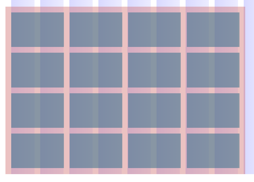
See how with an understanding of the proper context, things become more intuitive? :)
What’s Next?
Context is incredibly important when it comes to Susy. You can solve almost any Susy problem in a quick and elegant manner once you understand context.
If this concept is new to you, take some time and go back to your code to see how you could potentially refactor it and make it better with the proper use of context.
Let me know in the comments how this has helped :)
