A Sexier Float Label Pattern
Its tough to create forms that are both clean and have great user experience at the same time.
In an effort to make forms look nicer visually, designers and developers have sacrificed usability by replacing field labels with placeholders. I’ve been guilty of that as well.
There has been a new convention lately. The Float Label Pattern introduced by Matt D. Smith for an iOS app spread like wildfire and almost everyone is using it now.
I’ll like to introduce an implementation of my own, and talk about how I came to create this.
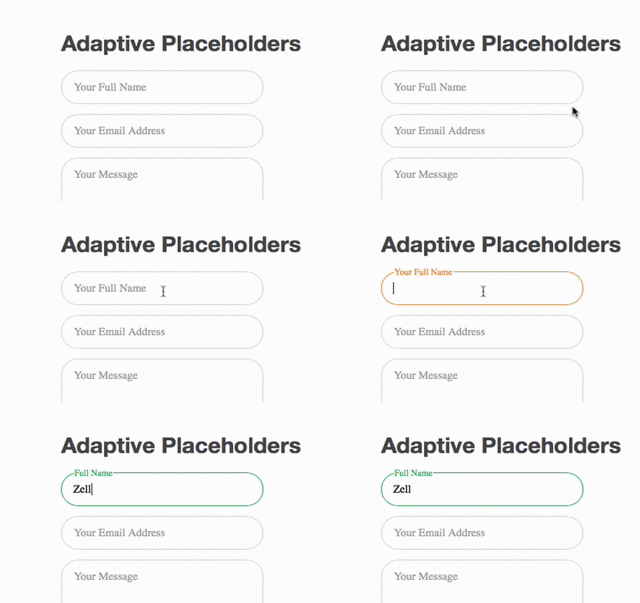
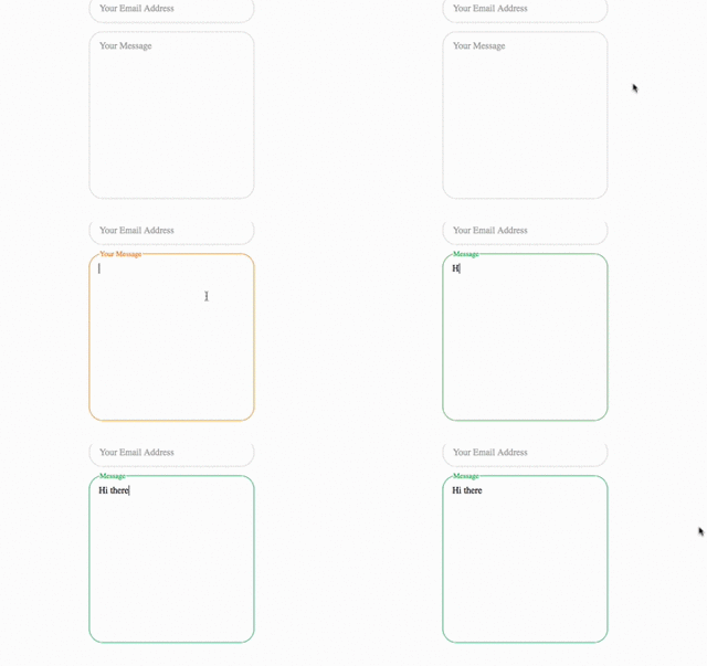
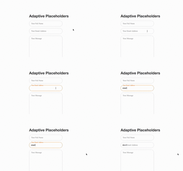
Adaptive Placeholder Demo
Here’s a quick demo of the project. I’ve named it Adaptive Placeholders because it’s being remodelled after the same concept made by Danny King.


And here’s the repo if you’re interested.
What Prompted The Project?
Matt’s floating label pattern opened up my horizons the first time I saw it. It was awesome. Because it was such a great user experience, I begun searching online for a implementation that I could use in my own project.
The ones I’ve found were mainly Javascript based. Although they did the job nicely, I didn’t really liked the idea of adding Javascript unnecessarily.
On searching further, I found a few CSS implementations that got me totally excited. Here are some examples by Chris Coyier, Jonathan Snook and David Bushell.
Then I found the almost perfect one. That was Adaptive Placeholders by Danny King. Unfortunately, it was in LESS. I needed this in Sass. That prompted the whole project.
Seriously if you haven’t checked it out yet, I highly recommend that you download the repo and play around with it.
What’s Special About This Project
Because this is my first project! (Just kidding :))
I wanted to let you use adaptive placeholders as painlessly as possible, and yet at the same time, allow you to be able to customize it so much that you can fit this into almost any project you desire.
I’ll go as far as saying that I’ll want this project to be the new standard for form fields.
Because of that vision, there were a few criteria that this project has to meet.
- It has to be usable with both input and textareas
- It has to allow users to change its variables easily
- It has to have built in defaults for users to use it out of the box.
- It has to be super simple to use
The Adaptive Placeholder now fulfills all these criteria. Have a look at the the usage guidelines on the repo to understand how to use it.
Adaptive Placeholders Can Still Be Improved.
This project is still far from completion. There are still many various ways to improve its implementation and I’ve yet to find the time to do so.
Here are just some possibilities in future:
-
Addition of help text. Usability can be improved greatly if there were help text added to each label. One obvious use case would be passwords that require interesting combinations for it to be validated.
-
Adding Good Form Validation. At this point, complex form validation is impossible. Even validating a simple email could be a disaster.
If the field is not validated, the user experience fails horribly because the label falls back to being a “placeholder”.

It might be possible to add solid validation with the use of Javascript. One example I thought of is to use Parsley.js to validate the fields.
If You Use This..
Leave a comment and let me know! I’d love to group all your implementations into a large collection for everyone else to see!
And finally, here’s the repo again :)
