Responsive Modular Scale
Do your font-sizes look gigantic on the mobile? You’re not alone. It’s a common problem many people have when using Modular Scale for responsive websites.
In this article, I want to share with you how this problem arises and how to fix it so you no longer have font-size woes.
Ready? Let’s go.
What Caused the Problem
This problem happens a lot because people want to use the golden ratio for their Modular Scale. We are all brainwashed into thinking that the golden ratio is the most beautiful number on the planet.
Unfortunately, the golden ratio isn’t ideal for creating a Modular Scale because it’s large ratio creates large changes in font-size between each step of the scale.
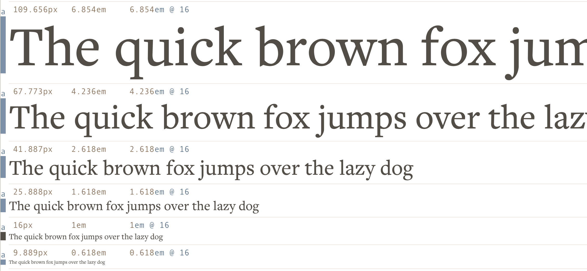
If you used 16px as your base for the golden ratio, it’s likely that you used the following sizes for you h1-h3 elements:
h1: 67.773pxh2: 41.887pxh3: 25.888px
Both 67px and 42px are HUGE on the mobile. It’s as if we’re looking at giants through our puny screens when we’re on the mobile.
Here’s the dilemma. You know the sizes are too big, but you can’t decrease them because there aren’t any smaller sizes you can use in the scale.
Crap :(
It’s not the golden ratio’s fault. It’s because we’re using a large ratio to produce the modular scale, which results in a scale with limited number sizes for you to play with.
Now that we know where the problem came from, let’s dive into the possible solutions.
The Solutions
The problem arises because we don’t have enough font-sizes to play with. The solution, then, is to make more numbers!
There are four possible solutions:
- Use a smaller ratio
- Add a second base
- Add a second ratio
- Change the ratio at different breakpoints
Solution 1: Use a Smaller Ratio
The first way to fix the problem is to use a smaller ratio for the Modular Scale.
This method works because a smaller ratio produces a scale with smaller differences between font-sizes at each step. It gives us more sizes that are acceptable on a mobile device.
Just take a look at the difference in sizes between these two scales and you’ll see what I mean:
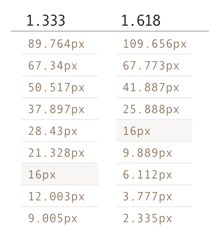
The 1.333-ratio Modular Scale has more font-sizes you can work with. If you used this ratio, you can set the h1 size to 38px, h2 to 28px and so on. When the viewport allows, you can also choose to increase the heading sizes by any number of steps with a media query:
h1 {  font-size: 37px;}
@media (min-width: 1000px) {  /* increases size by 2 steps */  h1 {    font-size: 67px;  }}
The great thing about a smaller ratio is that it gives you more flexibility without adding complexity to your code. It’s easy to use this method even if you don’t use a preprocessor like Sass. Of course, it gets way easier if you do.
The downside though, is that you don’t get as much flexibility as you will with other methods. You also lose the chance to work with the golden ratio. Booooo 😭
Don’t be upset about discarding the almighty ratio. It’s not as beautiful as you think it is (I’ll share why another time). You can still create a great design without using the golden ratio for your modular scale. For example, this little site you’re reading uses 1.2 as the ratio :)
Let’s look at the second method next.
Add a Second Base
The second way to fix the problem is to add a second number to the base-font-size of your modular scale. It can be any number (don’t try to be funny and use 1px…).
Let’s say you somehow decided that 36px would make a great heading size on the mobile. All you do is to add 36px as the second base number to the scale:
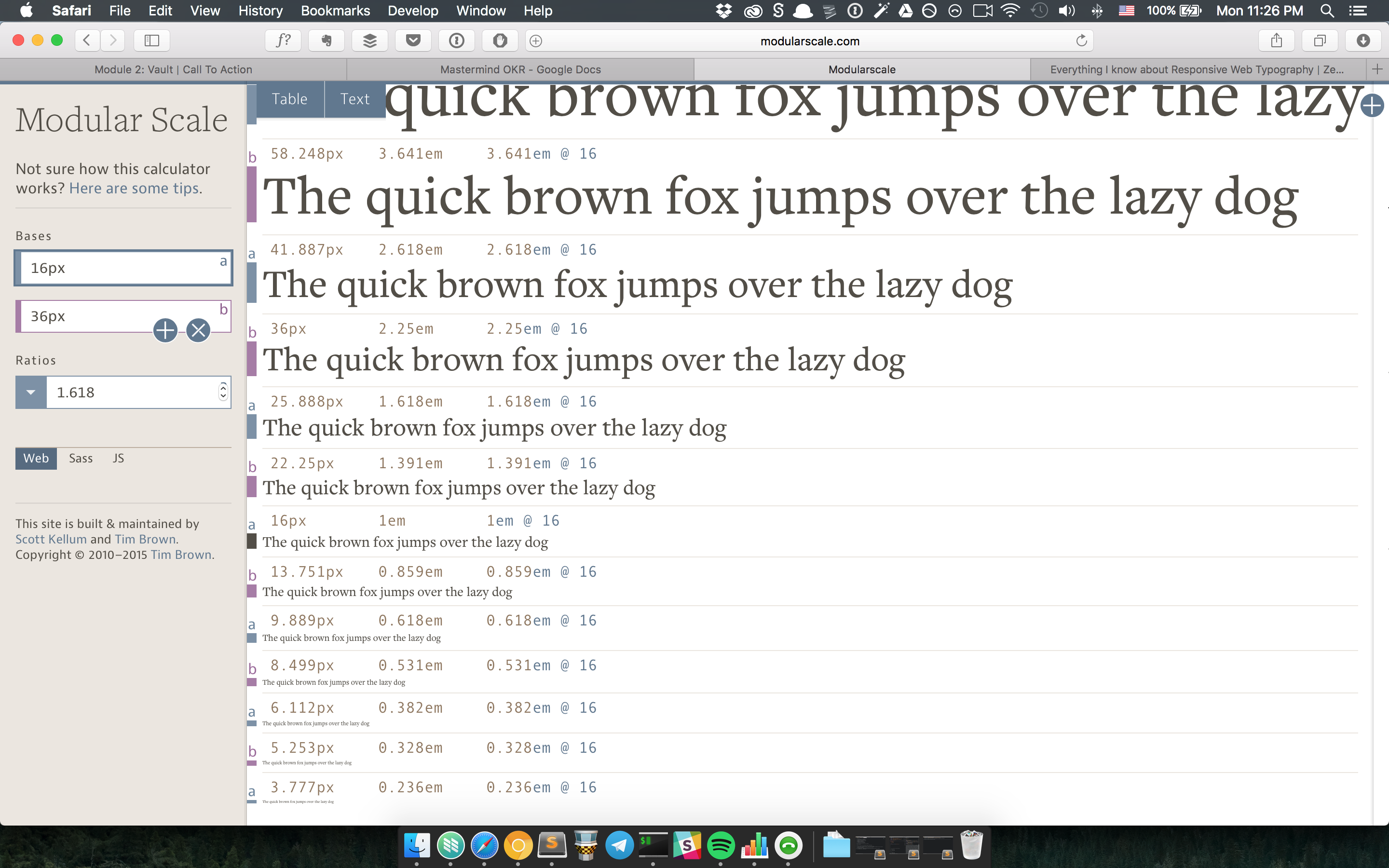
With this small change, you can already see that your header sizes could be 22.25px, 25.888px and 36px. There’s so much more flexibility compared to before. The best part? You still get to use the golden ratio. Yay! 😄
The downside is that we’ve threw an arbitrary number into the design, which can lead to a less harmonious flow if you’re not careful.
If you choose to go with this method, make sure you understand why you chose that magic number as your second base. You’ll also want to ensure you only add a maximum of one extra base (no, don’t add a third number) to avoid diluting the Modular Scale too much.
Let’s move on to the next method.
Add a Second Ratio
The third method is to add a second ratio to your modular scale. This can be any ratio you want.
Let’s say you decided to use a ratio of 1.25 in addition to the golden ratio. Your Modular Scale will become:
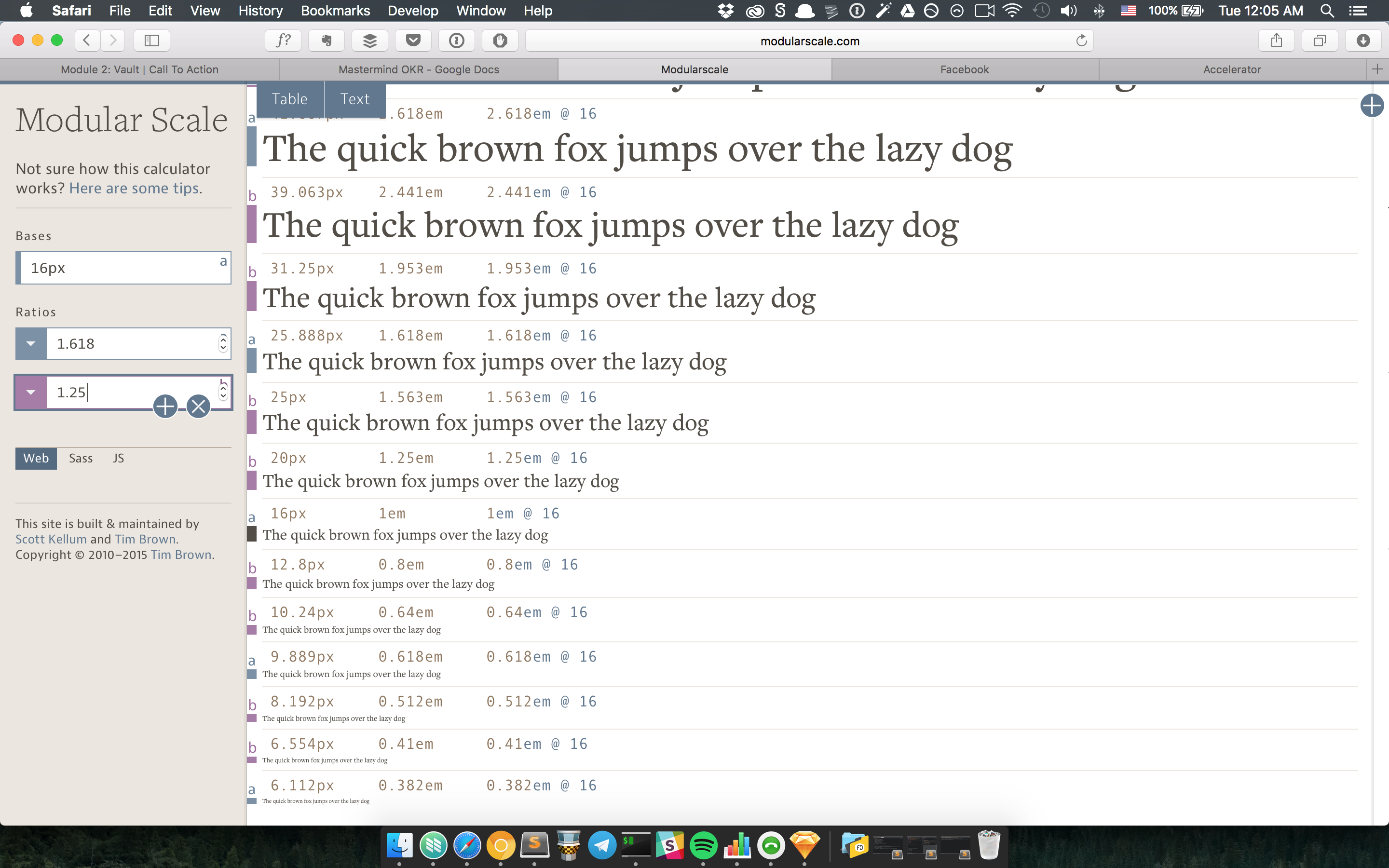
Adding a ratio allows you to have even more flexibility compared to adding a base. In this new scale, you have four helpful sizes you can use to create your headers---20px, 25px, 31px and 39px.
Although using a second ratio gives you much more flexibility, I refrain from using it because of two reasons.
First, a second ratio disrupts the repetition between steps of the modular scale more than using a second base, which results in a greater loss in harmonious relationship.
Second, you may get numbers that do not fit well into the scale (like 25px and 25.888px). You have to be careful not to choose sizes that are so similar that they conflict with each other (principle of contrast; more on that another time).
Finally, let’s move on to the last method.
Change the Ratio at Different Breakpoints
The fourth method is to vary the Modular Scale ratio at different breakpoints. We’ll use a small ratio on a small device, and as the viewport increases, we increase the ratio to match to match the new viewport.
Here’s how it might look; notice how the sizes of headers change while the size of the body text remains the same.
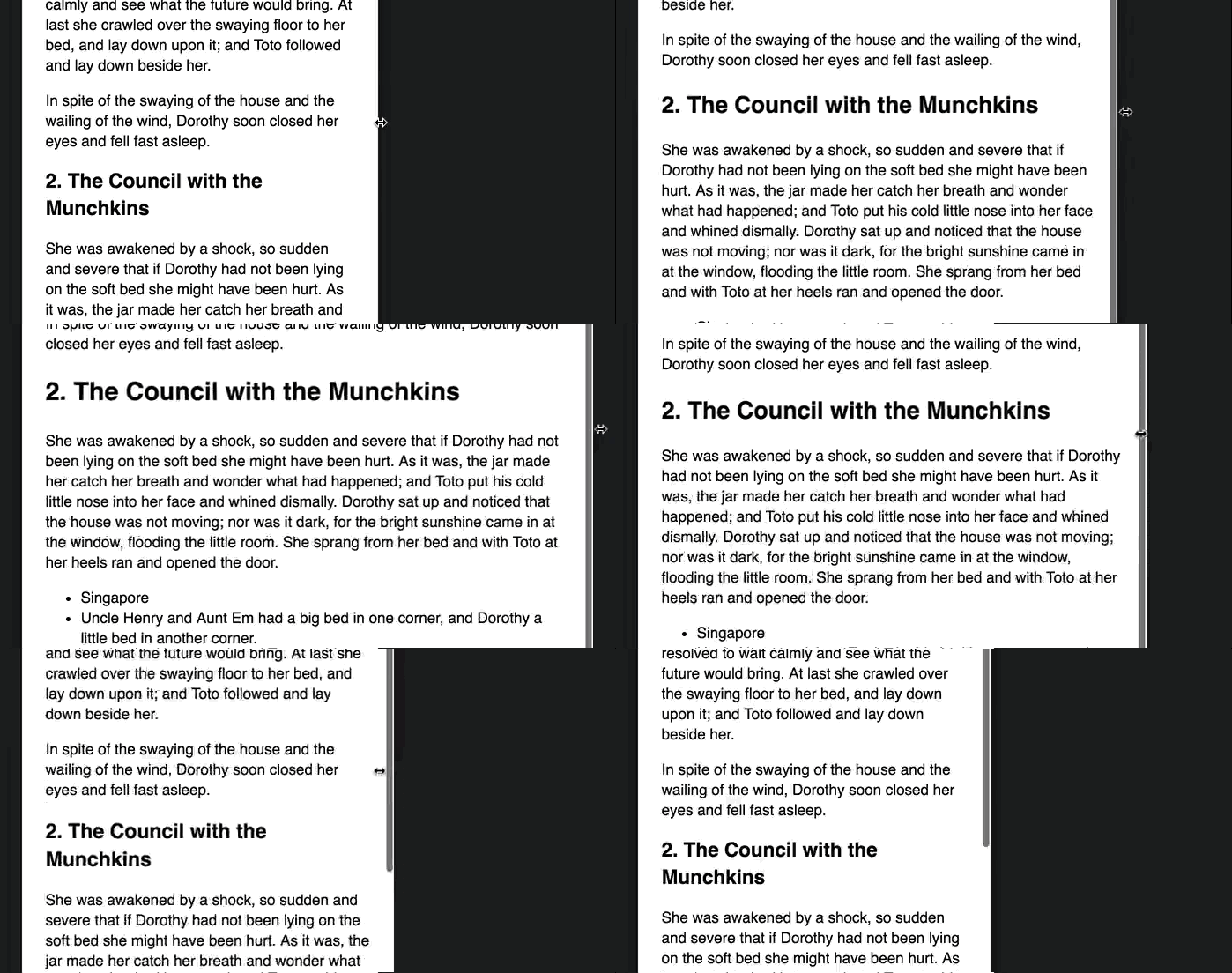
This method is less intuitive compared to the previous three methods. Let’s run through why it works.
First, we know the purpose of a title or subhead is to grab attention and make a visitor read on. They also act as sectioning elements that allow people to organize information on a page.
There’s very little screen real-estate on a mobile. Visitors can only scroll upwards or downwards. There’s nothing much that can distract a reader from the text (provided the text is good enough).
Since there’s little distractions, we can use a subtler contrast with subheads and they do their job perfectly.
On the contrary, there’s a lot more screen real-estate on a larger viewport. Designers may choose to add multiple columns of text, more whitespace or other elements. Visitors may get distracted by excessive whitespace, multiple columns of content, ads, etc.
Every element has the ability to distract visitors from reading the intended content, which means our headers need a larger contrast to grab the same amount of attention on a large viewport compared to a smaller viewport.
A great example of a large and beautiful attention-grabbing title is on Trent Walton’s blog:

Implementing this method is slightly more difficult compared to the previous three methods. The article is getting long, so I’ll cover the how-to in the next one. Stay tuned!
Wrapping Up
In this article, we uncovered why people have problems sizing their headers on the mobile. The culprit is usually a forceful use of the golden ratio since it produces a scale with a small number of usable sizes.
There are four solutions to this problem. They are:
- Change the ratio
- Add a second base
- Add a second ratio
- Change the ratio at different breakpoints
Which method do you prefer? What have you learned in this article? Share them with me in the comments below! :)
