Were We Wrong About Vertical Rhythm All Along?
Just a few days ago, I received a design critique from Aurobind (a font, newspaper and magazine designer) regarding my website. He specifically pointed out that the spaces between my paragraphs could be reduced to achieve a better effect.
I was dumbfounded. I didn’t believe him at first since I was already using Vertical Rhythm. If I were to reduce the amount of space between paragraphs, wouldn’t I be breaking the Vertical Rhythm?
Even though I don’t believe it, I decided to try it out since I respect his expertise and the feedback he’s willing to give. And boy, I’m utterly convinced.
Let me show you the before / after pictures of the change and I’m sure you’ll be convinced as well.
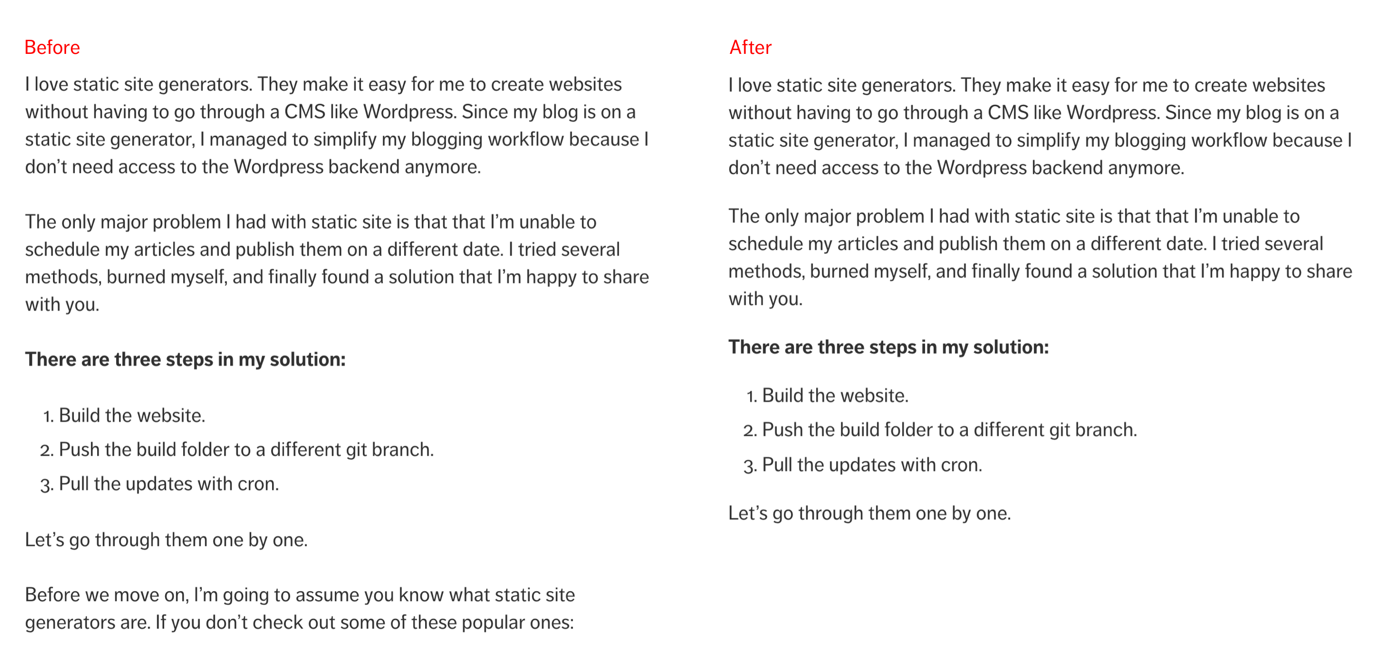
In the “after” image, you can see that the spaces between paragraphs are decreased. Yet, the three paragraphs gels together as if they’re one block of content.
On the contrary, before reducing the spaces, each paragraph of text reads like a standalone block of content. It feels like there’s a small break between the end of one paragraph and the start of the next one.
But why is this the case? Aren’t I using Vertical Rhythm already?*Am I getting Vertical Rhythm all wrong?
Nope, There’s nothing wrong with Vertical Rhythm. The principle of Repetition (that Vertical Rhythm is derived from) still stands.
The reason why we need to reduce the amount of whitespace between paragraphs is because of the principle of Proximity.
The Principle of Proximity
Proximity refers to the physical closeness between two objects. The human brain relies on proximity as a shortcut to judge the closeness of things. The closer the distance, the closer the relationship. If you see two people holding hands on the road, you’ll think that their relationship is much closer compared to two random strangers on the road, wouldn’t you?
We rely on proximity as a shortcut to help organize content on the web as well. Take for instance, you have two groups of circles like this:

Don’t you think the circles on the left seems closer compared to the circles on the right? That’s proximity at work! :)
As you can see, we determine the relationship between things subconsciously. This means there’s a high chance that someone may confused about the content organization if we didn’t think about proximity when we design our websites.
Proximity in Typography
There are many ways to apply proximity when designing. Today, I’ll like to focus on showing you how to use proximity in Typography with three examples (which is the case I’ve shown you above).
The first example is to reduce the amount of space between paragraphs as you see above.
Remember the before / after image I showed you right at the start of this article? The reason the “after” one is better is because it helps fulfill the purpose of typography---to help readers immerse themselves into the text. There are lesser obstacles to stop people while they read from one paragraph to another.
If you look at printed books (or even on the Kindle), you’ll notice that paragraphs aren’t separated by whitespace. Instead, we know that a new paragraph has began whenever the first line is indented to the right:
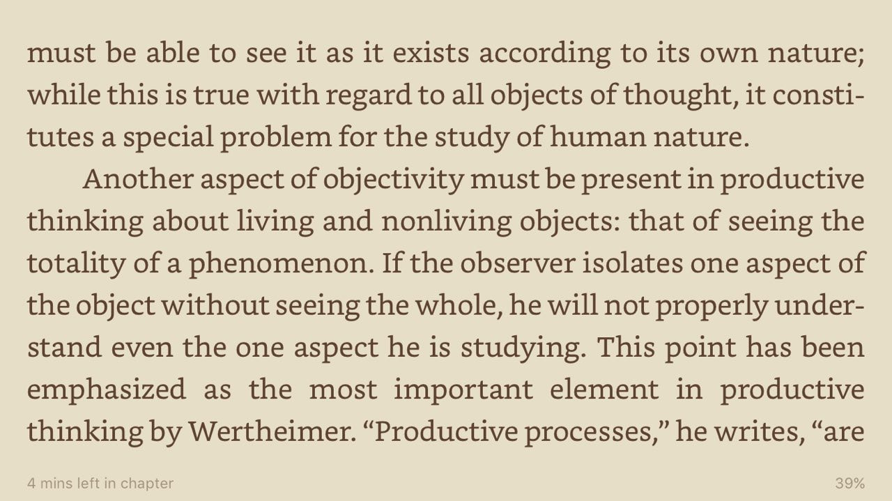
Notice how flawless the reading experience is when you transit from one paragraph to the next as you read through the image above.
Notice how the reading experience gets disrupted when you transit from one paragraph to the next as you read the image below (it’s the before image):
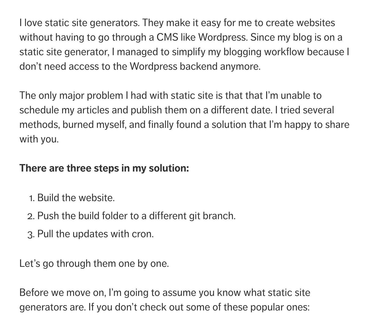
See the difference?
There’s this big difference because of the space between paragraphs. Right now, the spaces are set to one baseline since we followed the concept of Vertical Rhythm.
If you noticed, one baseline is the amount of space that one line of text takes up. It is also used as a common separator between parts of the design.
By separating paragraphs by one baseline, we’re essentially splitting the paragraphs up into multiple small blocks of content that has nothing to do with each other. How can we expect people to continue reading since we, as designers, are separating the content unconsciously?
Realizing this was a mind-blowing moment for me.

So, what should the whitespace be between paragraphs?
From our arguments above, we know that the whitespace between paragraphs should be lesser than one baseline. It should also be large enough to provide a clear distinction between paragraphs.
One way to figure out the whitespace is to rely on the principle of repetition again. If we do so, we can try values like 0.5, 0.66 or 0.75 baselines depending on how you have chosen to vary the repetitions.
On this site, I’ve chosen a value of 0.75 baselines as the whitespace between paragraphs.
* + p {
  margin: 1.05rem; /* 0.75 baselines  */
}
In case you were wondering, Medium uses a font-size of 21px and a line-height of 33px. The space between paragraphs is set at 29px, or about 90% of the baseline.
* + p {
  margin: 0.878787em;
}
By the way, I’m using the a custom version of the lobotomized owl selector in this example. Learn it, because it’s super useful when you need to style margins like this.
Anyway, that’s the end of the first example on using proximity in typography. Let’s move on to the next one.
Proximity in Typography (Subheads)
The second area you can apply proximity to is to differentiate the amount of space between subheads and paragraph text. If we used the same amount of whitespace above and below a subhead, it would look like this:
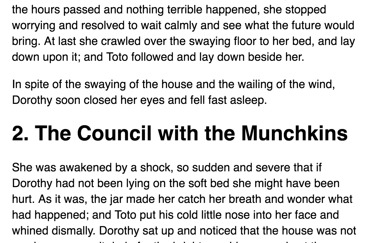
Logically, we know that a subhead is the start of the next block of content. However, this relationship isn’t pronounced since whitespace above and below the subhead is exactly the same.
We can improve the relationship between subheads and paragraph text by adding more space to the top, and reducing the space from the bottom of the subhead.
p + h2 {
  margin-top: 2.1rem; /* 1.5 baselines */
}

h2 + p {
  margin-top: 0.7rem; /* 0.5 baselines */
}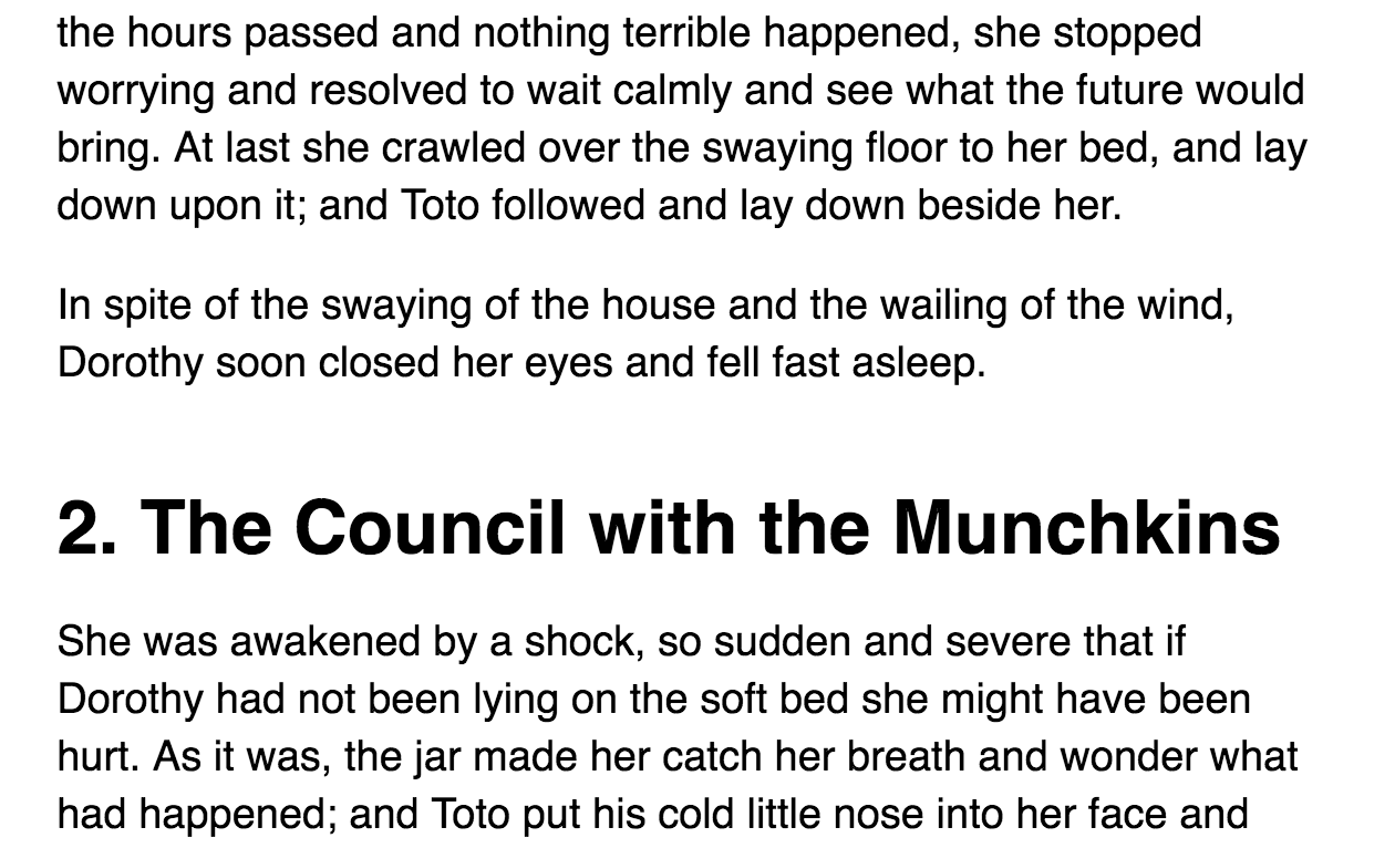
Don’t you think the relationship between subheads and paragraphs are more congruent with the content now?
Although this change is tiny, you can already see how big of an impact it has on the overall design. Typography is all about these small details and how they affect the larger picture.
Next, let’s move on to the third example
Proximity in Typography (Lists)
The third example I want to talk about is to style a list. Lists are often overlooked by developers because they seem simple. We just need a few bullets, some paddings and they look alright (err maybe?).
If you pay attention, you can apply 4 design principles (repetition, alignment, contrast and proximity) when designing a list. Let me walk through an example with you on designing a list and you’ll see how they come together.
First, let’s assume that we’re building a bullet-point list that exists within an article. Since the list part of the content, I’ll create a paragraph of text before and after the list to have a sense of the actual content.
I’ll also think about what the list items. They can be single words, a phrase or even a paragraph of text. I’ll also create these elements and I’ll use actual content as much as possible.
<p>Paragraph of text</p>
<ul>
  <!-- please replace with actual content -->
  <li>List item</li>
  <li>List item</li>
  <li>List item</li>
  <li>List item</li>
</ul>
<p>Paragraph of text</p>
The list element (<ul> in this case) should act like a paragraph. We want readers to transit from paragraphs to lists and lists back to paragraphs with as little distraction as possible. This means the whitespace above and below the list should be equal to the whitespace above and below paragraphs.
ul,
ol {
  margin-top: 1.05rem; /* 0.75 baseline */
}
Let’s look at the indentation of each list item next. Here, we can see that the browser has already indented items inward for us.
It’s great that browsers took the initiative to indent list items because it shows readers that list items are different from paragraphs (proximity) The bullet points also shows them that list items are different from paragraph text (contrast). Each list item however, is the same (repetition).
Unfortunately, the indentation feels weird. It doesn’t follow the rhythm we’ve set on the page. To correct the rhythm, I’ll start by resetting the paddings on the list so I can re-indent them to a multiple of the baseline:
ul,
ol {
  padding: 0;
}
When the padding is removed, we can see that bullet points lie outside of the text. Text within the list items are aligned to the paragraph text:
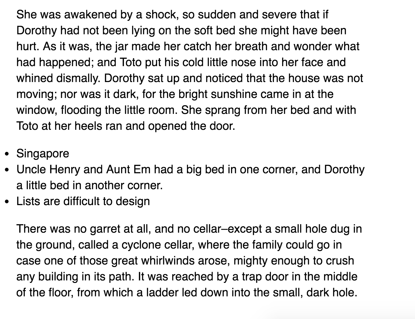
If we want to make sure the list indentation follows the rhythm we’ve set on the page, we need to first align the edges of the bullets with the edges of the text paragraph text (alignment).
A simple way to do so is to change the list-style-position from outside to inside.
ul {
  list-style-position: inside;
}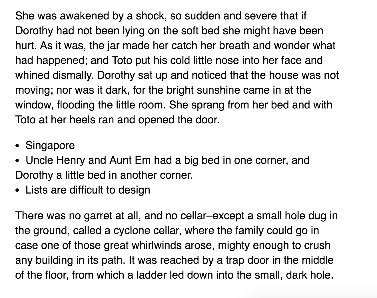
The alignment looks much better straight away.
However, it isn’t ideal because we can see that the second line of the text item begins at the start of the bullet point. This makes multiple lines of text on a list much harder to read (alignment).
So, instead of taking the easy path and doing list-style-position: inside, we can set list-style-position to outside and set a correct margin-left property such that the bullets are aligned to the paragraph text. Turns out, this margin-left value is equal to the font-size:
ul {
  margin-left: 1rem;
  list-style-position: outside;
}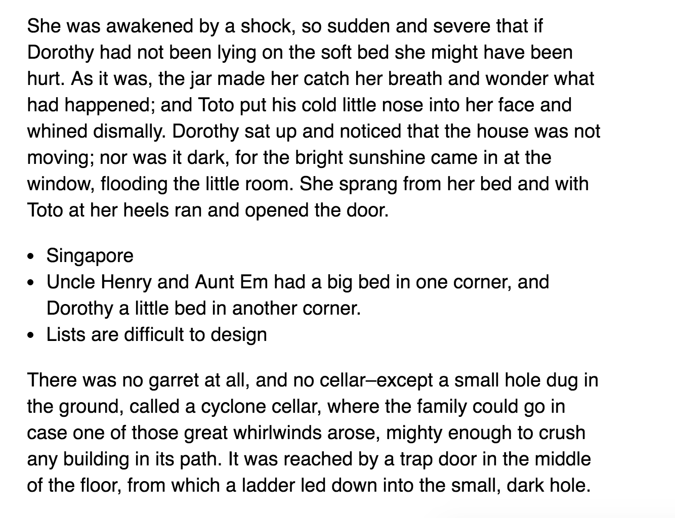
Now, we can indent the list items to the right by a multiple of the Vertical Rhythm. I’ve found that half a baseline works best for most situations:
ul {
  margin-left: 1.7rem; /* 1rem + 0.5 baseline */
}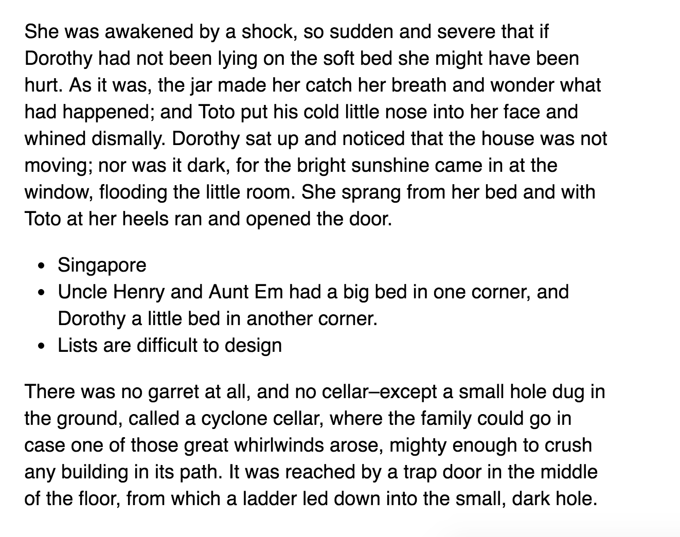
Much better, once again.
The overall structure between paragraphs and list items are set now. The next step is to make sure items within a list are distinguishable from each other. The best way to determine if items are distinguishable is to read text within each list item.
Read it and notice how you feel.
Feels like the list items are just one big paragraph of text, doesn’t it?
It’s normal to feel this way because whitespace between each line in the list are exactly the same as whitespace between each line in a paragraph. We’re already conditioned to think this whitespace means a paragraph (repetition).
One way to differentiate list items from paragraph is to vary the whitespace (proximity) between list items. These spaces should be smaller than 0.75 baseline or each list item would feel like a paragraph instead (proximity).
Hence, the amount of space between each list item should either be 0.25 or 0.5 baseline. A baseline of 0.25 works much better than 0.5 in implementation because we just need a slightly change in whitespace to distinguish between list items. Any more would be an overkill.
li + li {
  margin-top: 0.35rem; /* 0.25 baseline */
}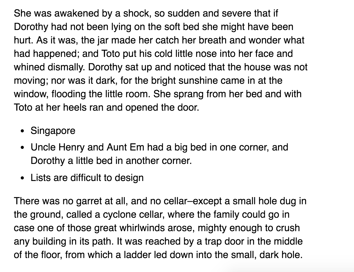
How does this list compare with the one with started with? Much better, isn’t it? :)
Of course, changing the amount of space between each list item is just one way to design the list component. You can also choose to use a combination of other methods if you wish to.
Wrapping up
So, in summary, Vertical Rhythm works. It isn’t broken. The key is to learn the design principles behind Vertical Rhythm instead of relying on the best practice itself.
In this article, we also discussed a lot about the principle of proximity (the second design principle I covered on the blog) and how to use it in Typography. You’ve also seen how other different design principles come together when we designed a list.
There’s more I can share with you about how design principles affect typography. If it interests you, do leave your email below and I’ll share more information with you as soon as I can! (You’ll also get 6 lessons on my course on Responsive Typography for free when I’m done writing it).