How I remember CSS Grid properties
The syntax for CSS Grid is foreign and hard to remember. But if you can’t remember CSS Grid’s syntax, you won’t be confident when you use CSS Grid.
To wield CSS Grid effectively, you need to remember its properties and values.
I want to share how I remember the most common CSS Grid properties today. This will help you use CSS Grid without googling like a maniac.
Groups of properties
I remember CSS Grid according to four groups of properties:
- The explicit grid
- Gaps
- Aligning things
- The implicit grid
The explicit grid
Let’s say you want to make a grid with 4 columns and 3 rows. You say this 4 columns and 3 rows out loud. It’s explicit.
If you declare the number of rows and columns in your grid, the grid is explicit.
You can use two properties to make an explicit grid:
grid-template-columnsgrid-template-rows
grid-template-columns lets you define the number of columns. grid-template-rows lets you define the number of rows.
.grid {
  display: grid;
  grid-template-columns: 1fr 1fr 1fr 1fr;
  grid-template-rows: 3em 3em 3em;
}
This creates a grid with four columns and three rows.
See the Pen XPyGZpby Zell Liew (@zellwk) onCodePen.
How do you know there are four columns and three rows?
grid-template-columns creates a new column for each length value you add to it. In the grid-template-columns declaration above, we have four 1fr values. This means four columns.
grid-template-rows work the same way. The grid above has three 3em values, which means it has 3 rows.
grid-template-columns and grid-template-rows can also take in values like repeat, autofill, autofit, minmax. We won’t go into these values in this article.
What you need to know now is how you can create an explicit grid with two properties:
grid-template-columns: creates columnsgrid-template-rows: creates rows
Positioning items in your grid
You can control the position of items in a grid with two properties:
grid-columngrid-row
These two properties can only be used on a grid item.
grid-column lets you choose which column(s) you want to place your grid item in. It is a shorthand for grid-column-start and grid-column-end.
It works this way: grid-column-start / grid-columns-end.
/* Using the longhand */
.grid-item {
  grid-column-start: 1;
  grid-column-end: 3;
}

/* Using the shorthand */
.grid-item {
  grid-column: 1 / 3;
}
Note: You can also use the span keyword to tell CSS Grid how many columns you want your item to take up.
/* Using the longhand */
.grid-item {
  grid-column-start: 1; /* Start at column one */
  grid-column-end: span 2; /* Width is two columns */
}
See the Pen Explicit Grid properties by Zell Liew (@zellwk) on CodePen.
grid-row lets you choose which row(s) you want to place your grid item. It is a shorthand for grid-row-start and grid-row-end.
It works this way: grid-row-start / grid-row-end.
/* Using the longhand */
.grid-item {
  grid-row-start: 1;
  grid-row-end: span 2;
}

/* Using the shorthand */
.grid-item {
  grid-row: 1 / span 2;
}
See the Pen Positioning items (rows)by Zell Liew (@zellwk) onCodePen.
Positioning items in named areas
You can name parts of your grid if you don’t like counting rows and columns. These named parts are called grid areas. To create a grid area, you use grid-template-areas on the grid.
Some notes on creating grid areas:
- You must name every grid area
- If you don’t want to name an area, use
. - Each group separated by inverted commas (
"row1" "row2") signifies a row - Each value within inverted commas (
"area1 area2") signifies an area
The example below has three grid areas:
headeron the first two and takes up 4 columnsmainon the second row and takes up the middle 2 columnsfooteron the third row and takes up 4 columns
.grid {
  grid-template-areas:
    'header header header header'
    '.      main   main   .     '
    'footer footer footer footer';
}
To place items in a grid area, you use the grid-area property on the grid item.
To place items on a grid-area, you use grid-area.
.grid {
  display: grid;
  /* ... */
}

main {
  grid-area: main;
}
See the Pen Grid-template-areaby Zell Liew (@zellwk) onCodePen.
How to remember these properties
You learned 6 properties so far:
grid-template-columnsgrid-template-rowsgrid-template-areasgrid-columngrid-rowgrid-area
Some tips to remember these 6 properties:
- The
templatekeyword can only be used on the grid- They’re used to declare grids and named areas
- Properties with the
templatekeyword are plural
- Properties for grid items do not have the
templatekeyword- These properties are singular
- These properties affect positioning
Gaps
When you create a grid, you can create spaces between columns and rows. These spaces are called gaps.
There are three properties to remember:
grid-column-gapgrid-row-gapgrid-gap
grid-column-gap determines the space between columns.
grid-row-gap determines the space between rows.
grid-gap is a shorthand for grid-column-gap and grid-row-gap.
For this shorthand:
- the
rowvalue comes first:row-gap column-gap - If you use a single number, both values will be that number.
/* Different values */
.grid {
  grid-column-gap: 1em;
  grid-row-gap: 2em;
}

.grid {
  grid-gap: 2em 1em;
}
/* Same values */
.grid {
grid-column-gap: 1em;
grid-row-gap: 1em;
}
.grid {
grid-gap: 1em;
}See the Pen Explicit Grid with gapby Zell Liew (@zellwk) onCodePen.
Aligning things
This is where many people get confused.
There are six properties to align things:
justify-contentalign-contentjustify-itemsalign-itemsjustify-selfalign-self
You can see two groups of patterns here:
- The first group is
justifyvsalign - The second group is
content,items, andself
These two groups of properties tell you what you’re dealing with. If you understand the property keyword, you’ll know how to use them.
Justify vs align
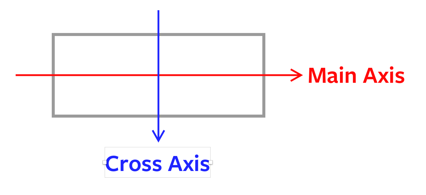
Each CSS Grid has two axes:
- The inline-axis
- The block-axis
When you justify something, you’re changing the alignment according to the inline-axis. When you align something, you’re changing the alignment according to the block-axis.
Here’s an easy way to identify the inline and block axes:
- Identify the direction of the language
- Inline-axis is the way you read the language
- Block-axis is the way you read after you read the end of the first line.
Let’s take English as an example. How do you read English?
- Left to right
- Top to bottom
So the inline and block axis is:
- Inline: left to right
- Block: top to bottom

Note: the inline and block axes change if you change the language direction with writing-mode.
Content, items, and self
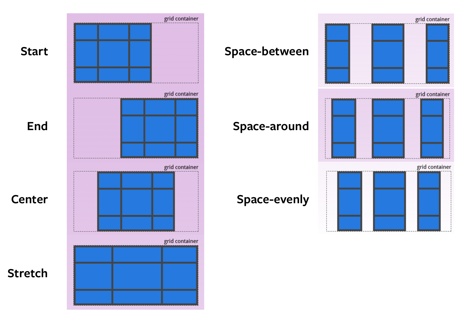
justify-content and align-content lets you align the grid itself to the available space outside of the grid. You will only need these properties if your grid is smaller than its defined area. (Which is rare).
.grid {
  justify-content:  /* some value *;
  align-content:  /* some value *;
}
You can pick from seven values:
- start: flush grid to the start of the axis
- end: flushed grid to the end of the axis
- center: align grid to the center of the axis
- stretch: grid fills the axis (this is the default value)
- space-between: spreads whitespace between grid items. No whitespace on at the ends
- space-around: spreads whitespace around each grid item
- space-evenly: spreads whitespace evenly around all grid items including the ends

The pictures above are taken from CSS Tricks’s A complete Guide to Grid. It explains what each value does in detail. You can read it for more information.
Our focus here is remembering the properties and how to use them. Let’s get back on track with the next set of properties.
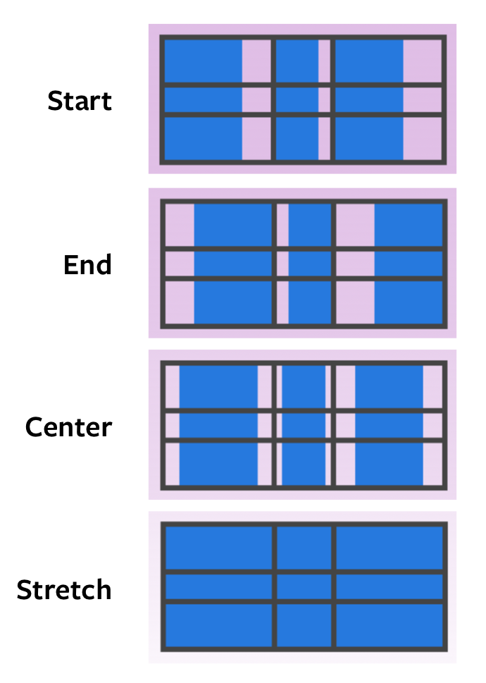
justify-items and align-items lets you align grid-items to any available whitespace in their respective cells. Most of the time, when you’re trying to align things, you’re looking for either justify-items or align-items.
.grid {
  justify-items:  /* some value *;
  align-items:  /* some value *;
}
You can pick from the same four values:
- start: flush item to the start of the axis
- end: flushed item to the end of the axis
- center: align item to the center of the axis
- stretch: fills the axis (this is the default value)

justify-self and align-self does the same thing as justify-items and align-items. The difference is it lets you change the alignment for only one grid-item.
.grid-item {
  justify-self:  /* some value *;
  align-self:  /* some value *;
}
Implicit Grid
Let’s say you created a CSS Grid, but you don’t have enough rows. In this example below, I only created an explicit grid for three items. (3 columns, 1 row)
.grid {
  display: grid;
  grid-template-columns: 1fr 1fr 1fr;
  grid-template-row: 3em;
}
But I have six items!
<div class="grid">
  <div class="grid-item"></div>
  <div class="grid-item"></div>
  <div class="grid-item"></div>
  <div class="grid-item"></div>
  <div class="grid-item"></div>
  <div class="grid-item"></div>
</div>
When you don’t have enough space in your explicit grid, CSS Grid will help you create additional grids automatically. By default, it’ll create more rows.
If you want to switch the grid direction, you’ll set grid-auto-flow to row.
This automatically created parts that are called the implicit grid.
You can adjust the automatically created column(s) or row(s) with these two properties:
grid-auto-columnsgrid-auto-rows
.grid {
  display: grid;
  grid-template-columns: 1fr 1fr 1fr;
  grid-template-rows: 3em;
  grid-auto-rows: 6em;
}
See the Pen Implicit gridby Zell Liew (@zellwk) onCodePen.
How to remember the implicit grid
auto is the keyword you want to watch out for.
templatecreates the explicit gridautocreates the implicit grid
I use the implicit grid a lot. I’ll share how I use CSS Grid in another article.
Wrapping up
That’s almost every CSS Grid property you need to know for 80% of your grids! Here’s a summary of the properties you learned:
- Creating a grid
- Explicit:
grid-template-columnsgrid-template-rowsgrid-template-areas
- Implicit:
grid-auto-columnsgrid-auto-rows
- Explicit:
- Gaps
grid-column-gapgrid-row-gapgrid-gap
- Positioning items in a grid
grid-columngrid-row
- Aligning things
justify-contentalign-contentjustify-itemsalign-itemsjustify-selfalign-self
I hope this helps you remember CSS Grid! All the best!