REM vs EM – The Great Debate
One of the best practices to typography on the web is to use relative units like rem and em.
The question is, which should you use? There’s been a longstanding debate between rem supporters and em supporters, believing that you should use one over the other.
In this article, you’re going to find my take on rem vs em. You’re also going to learn exactly what rem and em are, and how to use them to build modular components.
What is EM?
An EM is a unit of typography, equal to the currently specified point-size Wikipedia
This statement doesn’t make sense on the web since we don’t use point-size. It makes complete sense if we substituted point-size with font-size though.
What it means is: 1em = 20px if a selector has a font-size of 20px.
h1 { font-size: 20px;} /* 1em = 20px */p { font-size: 16px;} /* 1em = 16px */The em unit can be used to declare font-sizes. In fact, it’s a best practice to use relative units like em for font-size.
Consider the following:
h1 { font-size: 2em;} /* What does this even mean?! */What’s the actual size of the h1 selector here?
We have to look at the parent element in order to compute the <h1>’s font-size. Let’s say the parent element is <html>, and its font-size is set to 16px.
When put this way, we can see that the computed value of <h1> is 32px, or 2 * 16px.
html { font-size: 16px;}h1 { font-size: 2em;} /* 16px * 2 = 32px */Although this is possible, it’s often a bad idea to set font-size in the <html> to a pixel value because it overrides the user’s browser settings.
Instead, you can either choose to use a percentage value, or leave out the font-size declaration entirely.
Note: font-size will be set to 100% if you left it out entirely.
html { font-size: 100%;} /* This means 16px by default*/For most users (and browsers), a font-size of 100% would default to 16px unless they change the default font-size through their browser settings. It’s rare that anyone would do that though.
Okay so far? Let’s come back to em.
em can also be used to specify values for other properties in addition to font-size. margin and padding are two of such properties that are commonly sized in ems.
This is where many people start to get confused with em values.
Consider the following code. What should the margin-bottom value be for both the <h1> and <p> elements? (Assume font-size of <html> is set to 100%).
h1 {  font-size: 2em; /* 1em = 16px */  margin-bottom: 1em; /* 1em = 32px */}
p {  font-size: 1em; /* 1em = 16px */  margin-bottom: 1em; /* 1em = 16px */}
Are you surprised that the computed value of 1em on margin-bottom is different in these two scenarios`?
This phenomenon occurs because 1em is equal to its current font-size. Since the font-size in <h1> is now set to 2em. Other properties computed with em in <h1> would see that 1em = 32px.
What throws people off is that 1em can take on different values in different parts of the code. It can be confusing if you’re just starting out with ems.
Anyway, that’s em. Let’s find out what rem is next.
What is REM?
rem means Root EM. It’s been built to provide some relief to the em computational problem that many people face.
It is a unit of typography equal to the root font-size. This means 1rem is always equal to the font-size defined in <html>.
Consider the same code above, written in rems instead. What are the computed margin-bottom values now?
h1 {  font-size: 2rem;  margin-bottom: 1rem; /* 1rem = 16px */}
p {  font-size: 1rem;  margin-bottom: 1rem; /* 1rem = 16px */}
As you can see, 1rem would always take on the value of 16px no matter where you set it (unless you changed the font-size of <html>).
It’s dependable. It’s simple to understand.
That’s rem. Pretty easy to get once you know what em is, don’t you agree?
Now, let’s get into the meat of this article. rem or em?
REMs or EMs?
It’s highly debatable.
Some developers avoid rem entirely, claiming that using rem makes their components less modular. Others use rem for everything, preferring the simplicity that rem provides.
Oddly, I fell into the trap of strictly only rem or em at different points in my development career. I loved how em helped me make modular components, but I loathed the complexity it brought to my code. I also loved how rem made calculations simple, but I hated the hacks I used to make my components modular.
Turns out, rem and em have their strengths and weaknesses. They should be used differently, depending on the circumstances.
How? I have two simple rules:
- Size in
emif the property scales according to itsfont-size - Size everything else in
rem.
A tad too simple? Well, let’s consider writing a simple component (a header element) either using rem or em, and you’ll see how these two rules play out nicely.
Using Only REMs to Make a Header Element
Say you have a header element (<h2>) that looks like this:

The header’s styles should be similar to the following if you sized everything in rem:
.header { font-size: 1rem; padding: 0.5rem 0.75rem; background: #7f7cff;}So far so good.
Next, let’s create a slightly bigger header element since it’s common to have differently-sized elements on the same website. While doing so, let’s try to inherit as many styles as possible.
The markup of the bigger header element might be something like this:
<a href="#" class="header header--large">header!</a>The CSS would be:
.header {  font-size: 1rem;  padding: 0.5rem 0.75rem;  background: #7f7cff;}
.header--large {  font-size: 2rem;}
Unfortunately, the code doesn’t turn out well. You can see that there’s too little breathing space between the edge and text of .header--large.

If you insist on using only rems, the only way to fix this problem is to redeclare the padding on the large header:
.header {  font-size: 1rem;  padding: 0.5rem 0.75rem;  background: #7f7cff;}
.header--large {  font-size: 2rem;  padding: 1rem 1.5rem;}
Notice the pattern here? .header--large’s font-size is twice as large as .header’s. Consequently, padding on .header--large is twice as large as padding on .header.
What would happen if we have more headers of different sizes, or if the headers have to change in size? You can already see how coding the entire site in rem can cause duplication and super complex code.
We can simplify the code such that there’s no need to redeclare padding on .header--large if we don’t mind using both em and rem:
.header {  font-size: 1rem;  padding: 0.5em 0.75em;  background: #7f7cff;}
.header--large {  font-size: 2rem;}
As you can see, em can be incredibly helpful when you have a property that needs to scale with it’s font size. This is where the first rule was born.
Next, let’s take a look at what happens if you use an em only approach for the same header.
Using Only EMs to Make a Header Element
An em implementation isn’t far from the rem code we left off. All we have to do is change rem to em.
.header {  font-size: 1em;  padding: 0.5em 0.75em;  background: #7f7cff;}
.header--large {  font-size: 2em;}
Both .header and .header--large will look exactly the same as their rem counterparts.
Is that it?
Nope!
It’s highly unlikely that your website contains only one header element. We have to consider how this header interacts with other elements on your page.
It’s common to see other elements before or after the header, like this:

The markup for this set of elements is:
<div class="header header--large">A Header Element</div><p>A paragraph of text</p><div class="header">A Header Element</div><p>A paragraph of text</p>For the styles, we need to add some margins to the left and right of the <p> tags.
p { margin-left: 0.75em; margin-right: 0.75em;}
padding on the large header doesn’t align with the text Nooo! :(
The padding on the left and right of .header--large is too big!
If you insist on using only em, the only way to fix this problem is to redeclare the padding-left and padding-right properties on the large header:
.header {  font-size: 1em;  padding: 0.5em 0.75em;  /* Other styles */}
.header--large { font-size: 2em; padding-left: 0.375em; padding-right: 0.375em; margin: 0.75em 0;}Notice the pattern here? The font-size of .header--large is twice the size of the font-size of .header. Yet, the padding-left and padding-right of .header--large are half the padding-left and padding-right of .header!
Like in the above case, we can simplify the code if you are open to using a combination of rem and em in your code. Specifically, rem for left and right padding and em for top and bottom padding:
.header {  padding: 0.5em 0.75rem;  font-size: 1em;  background: #7f7cff;}
.header--large {  font-size: 2em;}
As you can see, the em unit is useful when you need to scale a property with it’s font-size. However, you’ll run into problems if you need to size the property accordingly to the root font-size.
It’s much clearer to see how rem and em can work together in a component now, isn’t it?
Now, let’s take it a notch further and see how the header and paragraph interacts with a grid.
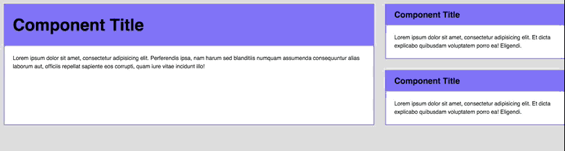
Components on a Grid
Before we move on, let’s combine the header and paragraph elements together into a component:

<div class="component"> <div class="component__header">A header element</div> <p>Some paragraph text</p></div>The basic styles for this component are:
.component {  background: white;  border: 2px solid #7f7cff;}
.component__header {  font-size: 2em;  padding: 0.5em 1.5rem;  background: #7f7cff;  margin: 0;}
.component p {  padding-left: 1.5rem;  padding-right: 1.5rem;  margin: 1.5rem 0;}
So far so good. This was everything we covered in the earlier sections.
Moving on, this component can be found in different areas of a website. Potential areas include:
- The main content area
- The sidebar
- In a 1/3 grid layout
- …

The header element might be rendered with a smaller font-size when the component is placed in a narrow location, like the sidebar.

We can create a variant for this by modifying the component’s class. The markup would look like this:
<div class="component component--small"> <!-- Contents of the component. --></div>And the style for this variant is:
.component--small .component__header { font-size: 1em;}Now, on to the component’s styles. The same two rules still apply:
- Size in
emif property should scale according to it’sfont-size - Size everything else in
rem.
As with the header element, you can identify which properties to size in em by seeing if they interact with the rest of the page. There are two different ways to think about building this component:
- Properties of all inner elements scale with the component’s
font-size. - Properties of some inner elements scale with the component’s
font-size.
Let’s build the component in both ways and you’ll see what I mean.
Case 1: Properties of all Elements Scale With The Component’s Font-Size
Let’s begin with an example of what such a component looks like:
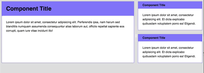
Notice how the font-size, margin and padding of all elements within the component change at the same time?
If your component behaves in this manner when resized, you need to size everything in em. The code then becomes:
.component {  background: white;  border: 2px solid #7f7cff;}
.component__header {  font-size: 2em;  padding: 0.5em 0.75em; /* Changed padding into em */  background: #7f7cff;  margin: 0;}
.component p {  padding-left: 1.5em; /* Changed padding into em */  padding-right: 1.5em; /* Changed padding into em */  margin: 1.5em 0; /* Changed margin into em */}
// Small variant.component--small .component__header {  font-size: 1em;  padding-left: 1.5em; /* Added em-sized padding */  padding-right: 1.5em; /* Added em-sized padding */}
Then, to activate the change in sizes, all you have to do is to change the component’s font-size property.
.component { // Other styles @media (min-width: 800px) { font-size: 1.5em; }}So far so good.
Now, let’s bring the complexity up a bit.
Imagine if you had a grid like this. The vertical and horizontal spaces between each grid item needs to remain the same across all devices (for good aesthetics).

The markup for this grid is:
<div class="grid">  <div class="grid-item">    <div class="component"><!-- component --></div>  </div>
  <div class="grid-item">    <div class="component component--small"><!-- A --></div>    <div class="component component--small"><!-- B --></div>  </div></div>
I’ve set the gutter width between each grid item to be 2em at a root font-size of 16px. In other words, the computed width of the gutter is 32px.
The challenge in this grid is to separate small component A and small component B with a margin of 32px. We can try setting a margin-top of component B to be 2em for start.
.component {  /* Other styles */  @media (min-width: 800px) {    font-size: 1.25em;  }}
.component + .component {  margin-top: 2em;}
Unfortunately, this doesn’t turn out well. The margin between small component A and small component B is larger than the gutter width at a viewport above 800px.

Boo :(
This happens because the font-size of the component is 1.5em (or 24px) when the viewport is larger than 800px. Since the font-size is 24px, the computed value of 2em becomes 48px, which is different from the 32px we were looking for.
Grrrrr! (╯°□°)╯︵ ┻━┻
Thankfully, we can solve this issue simply by sizing in rem since we know where the gutter width needs to be sized according to the root font-size.
.component + .component { margin-top: 2rem;}
Tada! Problem solved :) Here’s a Codepen for you to play with.
See the Pen REM vs EM – Case 1 by Zell Liew (@zellwk) on CodePen.
Note: You need to use Flexbox to build this grid. I won’t explain how I built it since it’s way out of scope. Check out this article if you’re interested in finding out more about Flexbox
Oh by the way, I didn’t come up with this technique. Chris Coyier wrote about it (he’s a genius).
Anyway, are we good so far? If yes, let’s move on to case 2. If not, feel free to leave a comment and I’ll figure a way to explain this further.
Case 2: Properties of Some Elements Scale With The Component’s Font-Size
Case 1 is easy to understand. The downsides though, are that it’s tough for you to stay true to your modular scale, maintain good vertical rhythms and ensure that every component is sized well AT the same time (especially when building responsive websites).
Sometimes you just need to tune a small section of your component instead of resizing everything at once. For example, you might want to change only the header font-size at a larger viewport.
Let’s start styling this case by taking a look at the basic styles we wrote above:
.component {  background: white;  border: 2px solid #7f7cff;}
.component__header {  font-size: 2em;  padding: 0.5em 1.5rem;  background: #7f7cff;  margin: 0;}
.component p {  padding-left: 1.5rem;  padding-right: 1.5rem;  margin: 1.5rem 0;}
.component--small .component__header {  font-size: 1em;}
Since we’re only changing the header’s font-sizes at 1200px, we can safely size every property in rem (with the exception of the header’s padding-top and padding-bottom properties)
.component {  background: white;  border: 2px solid #7f7cff;}
.component__header {  font-size: 2rem; /* Sized in rem instead */  padding: 0.5em 1.5rem; /* Sized in rem instead */  background: #7f7cff;}
.component p {  padding-left: 1.5rem; /* Sized in rem instead */  padding-right: 1.5rem; /* Sized in rem instead */  margin: 1.5rem 0; /* Sized in rem instead */}
.component--small .component__header {  font-size: 1rem; /* Sized in rem instead */}
You can then change the header’s font-size at different viewports by simply adding a media query on them:
.component__header {  font-size: 2rem;  @media (min-width: 1200px) {    font-size: 3rem;  }}
.component--small .component__header {  font-size: 1rem;  @media (min-width: 1200px) {    font-size: 1.5rem;  }}
Tada! Notice how only the header font-size changes as we resize the browser now? That’s how you build for case 2 :)
One more thing.
Since it’s a best practice to use only a handful of typography sizes, I often abstract the font-size property away from the component. This way, it becomes easy to ensure that your typography remains consistent across all components.
h2 {  font-size: 2rem;  @media (min-width: 1200px) {    font-size: 3rem;  }}
h3 {  font-size: 1rem;  @media (min-width: 1200px) {    font-size: 1.5rem;  }}
.component__header {  @extend h2;}.component--small .component__header {  @extend h3;}
That’s it for case 2! Here’s a Codepen for you to play with:
See the Pen REM vs EM – Case 2 by Zell Liew (@zellwk) on CodePen.
Here’s a question you’ll probably ask, so I thought I’ll answer it first: Which method should you use?
I’ll say it depends on your design.
Personally, I find myself working with Case 2 more often than Case 1 since I prefer abstracting away typography into a file of its own.
Wrapping Up
So, should you use rem or em? I think that’s not the right question to ask. Both rem and em has their strengths and weaknesses, and they can be used together to help you make simple, modular components!
On to you now! What’s your take on this debate? I’d love to hear what you think it! :)
