How to Create Off Canvas Layouts with Susy
Off-canvas layouts have became an increasingly common design pattern for many websites. They are often used to create additional space in most mobile layouts. Quite a few articles on the web have explained how to code these layouts with CSS and JavaScript. Today, let’s have a quick look at how to do the same using Susy.
What Are Off-Canvas Layouts?
First, you may be wondering where the term “off-canvas” came from. Canvas (when referred to art) are pieces of material that painting is done on. In other words, it’s the drawing board of the art piece.
In the web world, you can think of the viewport of your browser as the canvas (It’s not the HTML5 canvas element, in case you were wondering).
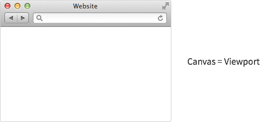
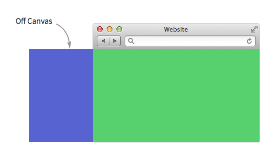
There are no absolute boundaries on any side of the canvas and you can move it anywhere to reveal previously unseen spaces. The term “off-canvas” is used to refer to these spaces that are outside of the visible canvas.
You’re really missing out if you haven’t seen the vast number of use cases for off-canvas layouts. I suggest popping by this smashing magazine article to get a feel of what these layouts can potentially do. Luke Wroblewski also has a dedicated article on off-canvas layouts that I suggest you check out as well.
For today, we will be focusing on coding a navigation item off the canvas. That should set the basics right for you to create any other off-canvas layouts.
Before we move into building off-canvas layouts with Susy, we have to start off by understanding how they are created via pure HTML and CSS. This will be the layout we’ll be creating in this tutorial.
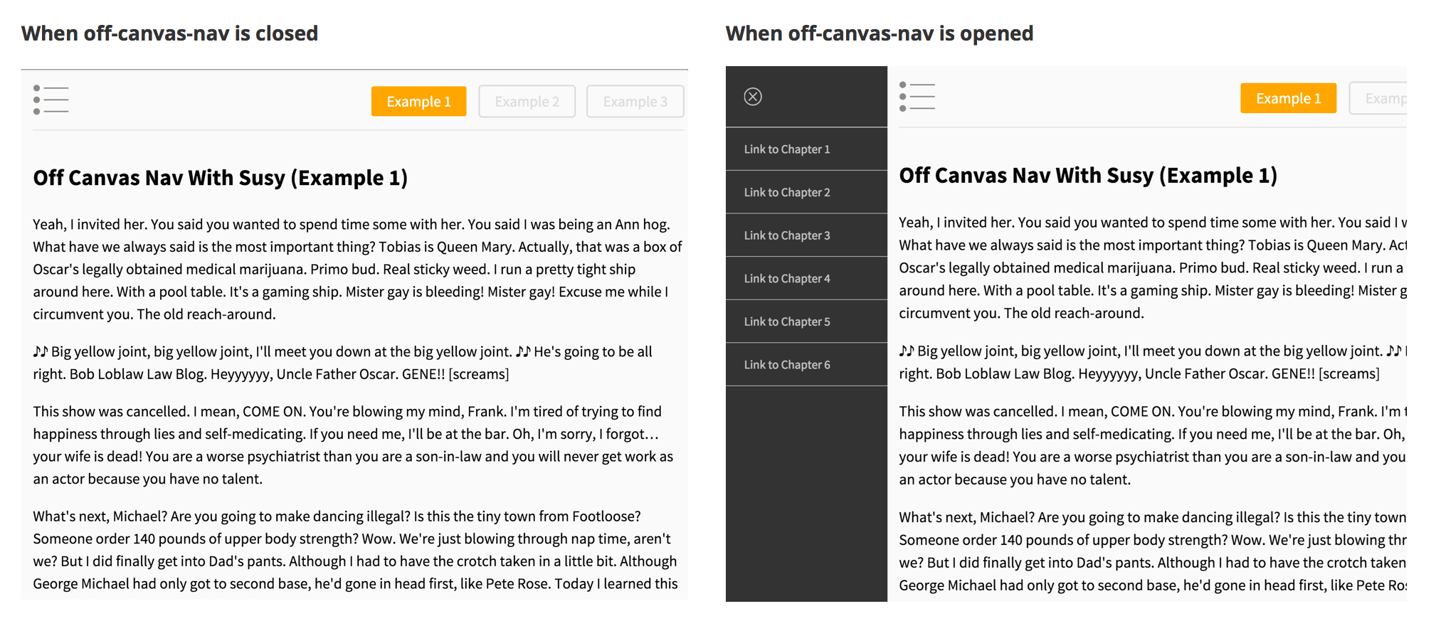
View Demo
Let’s begin.
The Anatomy of an Off-Canvas Layout
Things may seem to be a little confusing initially when you code your first off-canvas layout. The very first problem you may encounter is coding the markup. And that is where we will begin.
Firstly, we know the off-canvas element is definitely going to be wrapped within a separate <div> from the main canvas. You might write something like this:
<div class="off-canvas"></div><div class="main"></div>This is a great start. We can position .off-canvas outside of the normal canvas with a negative absolute position to the left.
.off-canvas { position: absolute; width: 260px; left: -260px; top: 0; bottom: 0;}We are unable to see how .off-canvas looks like now, since it has been placed off the canvas. We need to push the element back from the left to view it.
One possible way to move this particular item back is to add a transform property to it.
.off-canvas { transform: translate3d(260px, 0, 0);}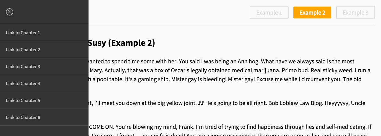
Do take note that 3D transformations are not supported in IE9, and 2D translations are not supported in IE8. Try changing the margin-left property instead of using transformations if you have to support these browsers. For the rest of the tutorial, I’m going to assume that 3D transformations work for your browser.
The only problem with translating .off-canvas alone, is that part of .main is now hidden by .off-canvas.
We can resolve this by translating .main as well, but we are introducing two different movements with this method, and that’s not very ideal. A better way is to translate the body instead.
body { transform: translate3d(260px, 0, 0);}
Translating the body seems to work well (at first glance). The off-canvas item has appeared and main is now pushed to the right. There is, however, one major problem.
Users can scroll to the left and right of the screen. If you’re on Internet Explorer, you’ll probably find the horizontal scrollbar showing up as well.
We need to fix this issue, and one way to fix it, is by adding two extra divs to the markup.
<div class="container"> <div class="transformer"> <div class="off-canvas"></div> <div class="main"></div> </div></div>These two divs each have their own special purpose. The .container will have an overflow: hidden property to prevent people from scrolling horizontally while the .transformer div will be the one which translates when .off-canvas is shown.
We also want to show .off-canvas only when the user specifically requests for off-canvas. One of the best ways to do so is to use an additional class for this. We will be using the .is-open class in this tutorial.
.container {  overflow: hidden;}
.transformer.is-open {  transform: translate3d(260px, 0, 0);}
We ensured that .off-canvas only shows when .transformer has an .is-open class in the CSS above. Now, we need a button to let the user choose to show or hide .off-canvas.
<div class="container"> <div class="transformer"> <div class="off-canvas"></div> <div class="main"> <!-- adding the button in the header --> <header> <div class="menu"> <img src="" alt="" class="menu-toggle" /> </div> </header> </div> </div></div>The first click on .menu-toggle should reveal .off-canvas while the next click should hide it.
The simplest way to do so is to use the toggleClass() function in jQuery when .menu-toggle is clicked on.
jQuery(document).ready(function ($) {  var $transformer = $('.transformer'),    $menuToggle = $('.menu-toggle')
  // Attaches event handler when .menu-toggle is clicked  $menuToggle.on('click', function (event) {    event.preventDefault()    $transformer.toggleClass('is-open')  })})
That’s all we need for an off-canvas layout. Let’s do a quick summary before we move onto adding Susy to the mix.
You need to:
- Create two separate divs to hold the off-canvas content and the main content
- Add the
.containerand.transformerdivs to the markup and CSS - Add translate to
.transformerwhen a.menu-togglebutton is clicked on
Let’s add Susy into the mix now. As always, we will start by identifying where the Susy container should be.
Where Should You Declare The Susy Container?
There are two possible locations that can be used as the Susy container.
- On the
.transformerelement. - On the
.mainelement.
Once again, there are no hard and fast rules for this. Both locations work quite well and can be used for different purposes. Let me bring you through three different examples where these areas are used as the container.
No matter where you choose to locate the Susy container, you’ll still have to set the global settings correctly. Let’s set the number of columns to 12 in this case. We’re also going to change the box model to border-box.
$susy: (  columns: 12,  global-box-sizing: border-box,  debug: (    image: show-columns,    output: overlay,    toggle: bottom left,  ),);
@include border-box-sizing;
Off-canvas Layouts With Susy (Example 1)
In this example, we will declare the Susy container on the .transformer element.
.transformer { @include container();}This method can work very well if you wanted the off-canvas layout to be part of the grid.
The pros of declaring the Susy container on .transformer is that both the child elements of .transformer (.off-canvas and .main) will have the same context. We can make use of this context to create an off-canvas item that has the proportions of the grid.
Let’s just say that the off-canvas item takes up 3 of 12 columns. Here’s what the code would look like.
.transformer { @include container(); transition: transform 0.3s ease; &.is-open { transform: translate3d(span(3 wide), 0, 0); }}.left { position: absolute; width: span(3 wide); left: -span(3 wide); top: 0; bottom: 0;}.main { padding: 0 gutter();}Since we’re repeating span(3 wide) 3 times, we can replace it with a variable to make it slightly DRYer.
$off-canvas-width: span(3 wide);.transformer { @include container(); transition: transform 0.3s ease; &.is-open { transform: translate3d($off-canvas-width, 0, 0); }}.left { position: absolute; width: $off-canvas-width; left: -$off-canvas-width; top: 0; bottom: 0;}.main { padding: 0 gutter();}If you noticed, we did not even use the span mixin while building the off-canvas layout. This is because we didn’t need the extra float and margin properties created by the span mixin. We only used the span function to calculate the width of the off-canvas item.
Now if you resized the browser down to a smaller screen, you’ll realize that sometimes the links on the left will extend to two lines instead of one.
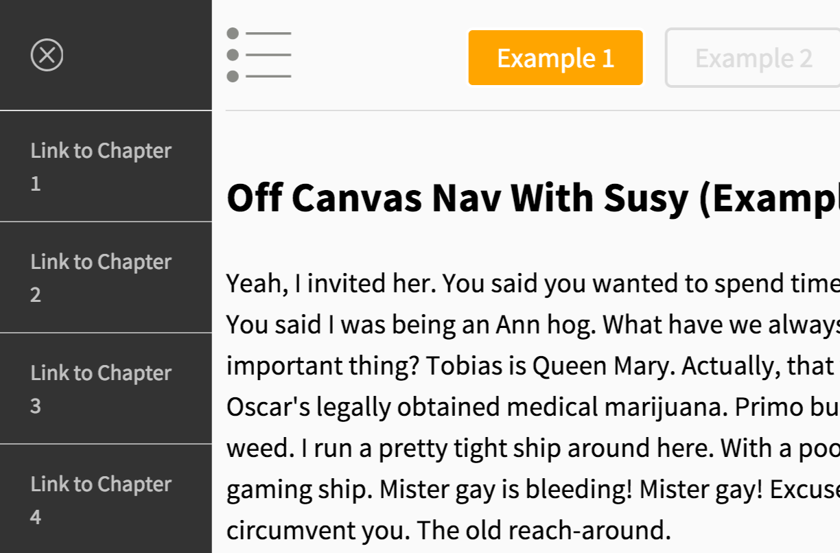
This happens because we are using percentage widths for .off-canvas. Since the canvas width is smaller, it’s natural that the width of .off-canvas will be smaller as well.
Sometimes that is not entirely ideal, especially if you had a specific design to work with. For this particular design, I didn’t want the links to pop down into two rows. It would be much better if I had a fixed-width .off-canvas instead. That brings us to the next example.
Off-canvas Layouts With Susy (Example 2)
The approach to .off-canvas in example 2 will almost be the same as the one we discussed within the anatomy section. We are going to skip the things mentioned above and go straight to using Susy.
The difference here is that we will be adding the Susy container to .main, and that allows us to use Susy as we normally would.
You can also optionally include paddings in .main to provide some breathing space for the text.
.main { @include container(); padding-left: gutter(); padding-right: gutter();}We get the exact same layout as example 1. The only exception is that the off-canvas item now has a fixed width.

The full Sass code for example 2 is:
$off-canvas-width-2: 300px;
.container {  overflow: hidden;}// .transformer {@include trans-prep;transition: transform 0.3s ease;&.is-open {  transform: translate3d($off-canvas-width-2, 0, 0);}// }.left {  position: absolute;  width: $off-canvas-width-2;  left: -$off-canvas-width-2;  top: 0;  bottom: 0;}.main {  @include container;  padding-left: gutter();  padding-right: gutter();}
From this point onwards, you could treat .main as your usual Susy container and create your layout as you normally would.
The two examples above are great implementations for simple off-canvas items. They would not do as well if you needed something more complex. The Squarespace blog has a perfect of example what I meant by a complex off-canvas item.

You want to code this? Then this brings us to example 3.
Off-Canvas Layout With Susy (Example 3)
Example 3 has a very different use case compared to example 1 and example 2 above as you may have imagined. The implementation for the off-canvas layout however, is exactly the same.
Let’s take a look at what we’re making for example 3 before we dive in.
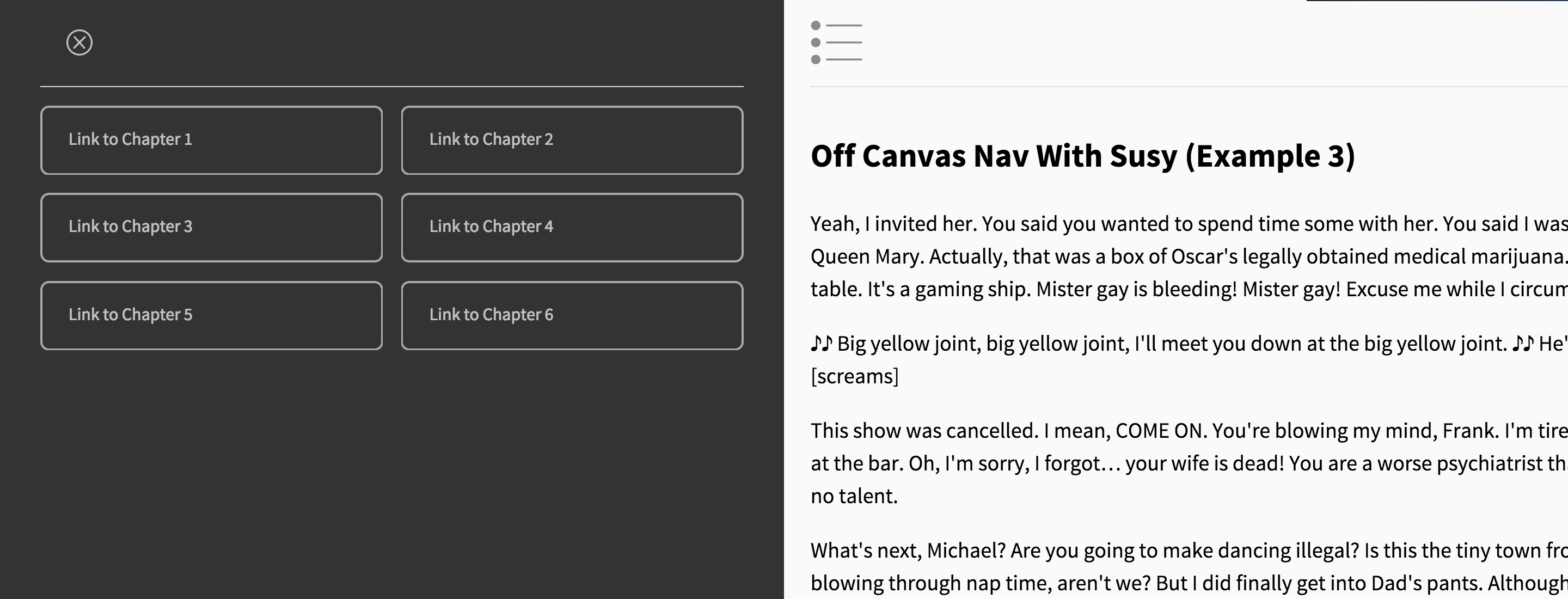
The very first thing to notice in example 3 is that the off-canvas item occupies 50% of the viewport when opened up. The width that we have to translate here is hence 50% of the viewport.
$off-canvas-width-3: 50%;
.transformer.is-open {  transform: translate3d($off-canvas-width-3: 50%, 0, 0);}
.off-canvas {  position: absolute;  width: $off-canvas-width-3: 50%;  left: -$off-canvas-width-3: 50%;  top: 0;  bottom: 0;}
With a simple change in percentage, we managed to get the off-canvas item to occupy 50% of the viewport when it is opened.

Since there is a grid for both on and off-canvas, we can declare a Susy container on each of them.
.off-canvas {  @include container();}
.main {  @include container();  margin: 0 gutter();}
Once we have the container, you may begin to output the navigation items on the off-canvas item just as you would normally do when using Susy. It would be quite clear that each item takes up 6 columns in our case.
.off-canvas { li { @include gallery(6); }}And that’s it!

Feel free to view the demo and grab the source codes for this layout :)
Conclusion
We have gone a very long way today in looking at off-canvas layouts. We dug deep into the code and found out how to code these layouts without Susy. Then we proceeded to add Susy into the mix.
You should also have realized by now that there are many different ways you can add Susy to an off-canvas layout. There are no hard and fast rules on this and I hope that this post has helped you bridge the gap on creating these layouts.
If the post has been helpful, leave a comment below saying how it helped you!
