Making a nice neon button
When I was building the Magical Dev School website, I accidentally stumbled on a way to make Neon buttons look good.
There are three important elements:
- A little bit of glow around the text
- A larger glow around the button
- A nice zoom effect
Making the text glow
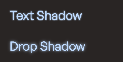
The trick here is to use drop-shadow instead of text-shadow to create the glow effect.
drop-shadow works better because it creates a softer and more enveloping blur - very much like how a soft light source would fall into its surroundings.
text-shadow is too harsh.

We only want to use drop-shadow on the text, so we need to change the markup a little bit to include an extra span element.
<button> <span class="text">Text goes here </span></button>And we can include the drop-shadow like this:
.text { filter: drop-shadow(0 0 1px currentcolor);}Making the larger glow around the button
We can make a larger glow around the button with drop-shadow and box-shadow. In this case, I prefer box-shadow over drop-shadow because I can control the spread.
This lets me cast a harsher shadow that accentuates the border.

The code for drop-shadow is simpler because you can attach it directly to the button.
button { filter: drop-shadow(0 0 1rem var(--purple-300));}The code for box-shadow is slightly harder because you’ll have to use a pseudo-element to make smooth animation. That’s because transitioning box-shadow creates jank.
button {  position: relative;  z-index: 1;  /* ... */}
button:after {  content: '';  position: absolute;  z-index: -1;  inset: 0;  border-radius: inherit;  opacity: 0.6;  box-shadow: 0 0 1em 0.5em var(--purple-300);}
A nice zoom effect
The third and final piece is to jell everything together with a little bit of animations.
Here, I opted to:
- Change the
background-color - Change the
color - Make the button bigger (as if it’s floating outwards)
- And make the background glow a little bit stronger by changing the
opacity
Codepen Link
Here’s Codepen for you to play around with this neon button.
