How to create sites with winding SVG paths
I saw an article by Sarah Drasner about how she created Netlify’s million-developers site on CSS Tricks. I was intrigued by how the site was created. (Not the Vue parts, but she coded up the paths on the site).
What paths?
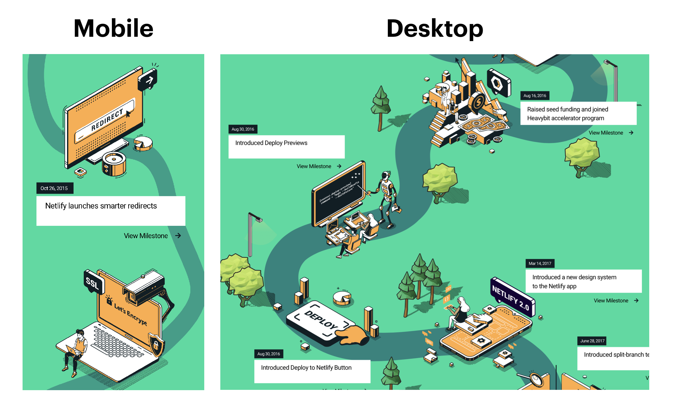
Here’s the Mobile and Desktop view, side by side. I’m talking about the winding paths that lead from one set of content to another set of content.

I always wanted to create a site with curved elements, similar to this. So I took the chance to inspect the code. What I realised blew my mind 🤯.
I found out that these two paths were actually different SVGs! I was able to extract them into a pen for you to explore.
Why does this seemingly simple thing blow my mind so much?
My brain works in a weird way. When I build frontend stuff, I always try to create ONE version that works on all browser sizes. After all, that’s what responsive design was all about, isn’t it?
But nope.
My worldview was shattered today because Sarah showed me its okay to build mobile and desktop versions separately. This opens up a whole realm of exploration because I don’t have to create complicated code anymore! I simply have to create more assets.
Of course, performance may be a concern if I need to create more assets. But I don’t have to worry in this case. Why? Because SVGs are kinda like HTML anyway. They’re fast and efficient. I can create more SVGs without worrying about performance.
I can’t express how much this changed the way I think about designs. I think I’l have fun exploring building websites with more SVG curves going forward.
I can’t wait to get a chance to design something 🤩.
Stuff I found interesting but didn’t understand
Three things.
How Sarah decided to hide the Desktop Path
I noticed Sarah hid the desktop path by changing the viewbox attribute.
<!-- Desktop path on Mobile --><svg id="timeline" viewBox="0 -500 600 18500">...</svg>
<!-- Desktop path on Desktop --><svg id="timeline" viewBox="0 -500 2000 8300">...</svg>
Wouldn’t it have sufficed to set display: none and call it a day? 🤔.
The Creation of Paths
I noticed paths were created different.
- Mobile version was created with
stroke - Desktop version was created with
fill
.mobile-path {  stroke: rgba(23, 132, 126, 0.7);  stroke-linecap: round;  stroke-miterlimit: 10;  stroke-width: 10px;}
.desktop-path {  fill: rgb(21, 132, 125);}
Again, not sure why Sarah doesn’t use the same treatment for both paths. (You can already see how my brain is wired for chasing consistency and patterns here).
My hunch is Sarah didn’t overthink this. She simply took the SVGs she received from the designer and ran with it.
This is another reminder for me – that I don’t have to do things perfectly. Sometimes it’s okay if things are a little inconsistent. What matters is the job is delivered on time and has good quality.
So I need to learn to be okay with less polish.
Path Color
One final thing I didn’t understand. Why is there a need for different path colors? 🤔.
.mobile-path {  stroke: rgba(23, 132, 126, 0.7);  stroke-linecap: round;  stroke-miterlimit: 10;  stroke-width: 10px;}
.desktop-path {  fill: rgb(21, 132, 125);}
This one really messes with my mind.
That’s it for this article. I hope you found this useful somehow!
