Make your website more professional with 1 simple step
One of the blocks I had while I designed my first website was how much space should I leave after my headings or paragraphs. Along the same question, how much space should I give within the line of text themselves. My first approach to this whole process was to eyeball it. You might have done the same
There’s nothing wrong with eyeballing the amount of space and setting it according to your gut feeling. However, there is a much better approach to setting this amount of space and we’re going to cover it in this article today.
So how do I set the amount of space?
Imagine right now you are trying to write on a blank piece of paper instead of designing for the web (I know, a piece of paper is totally unlike the web. Bear with me for a sec). More often than not, the handwriting will turn out terrible and words good all over the place.
Now instead of writing on a blank piece of paper, recall the times in school where we had to write on notebooks with lines. Compared to the writing on a blank piece of paper, don’t your writing look nicer? (I know mine did).
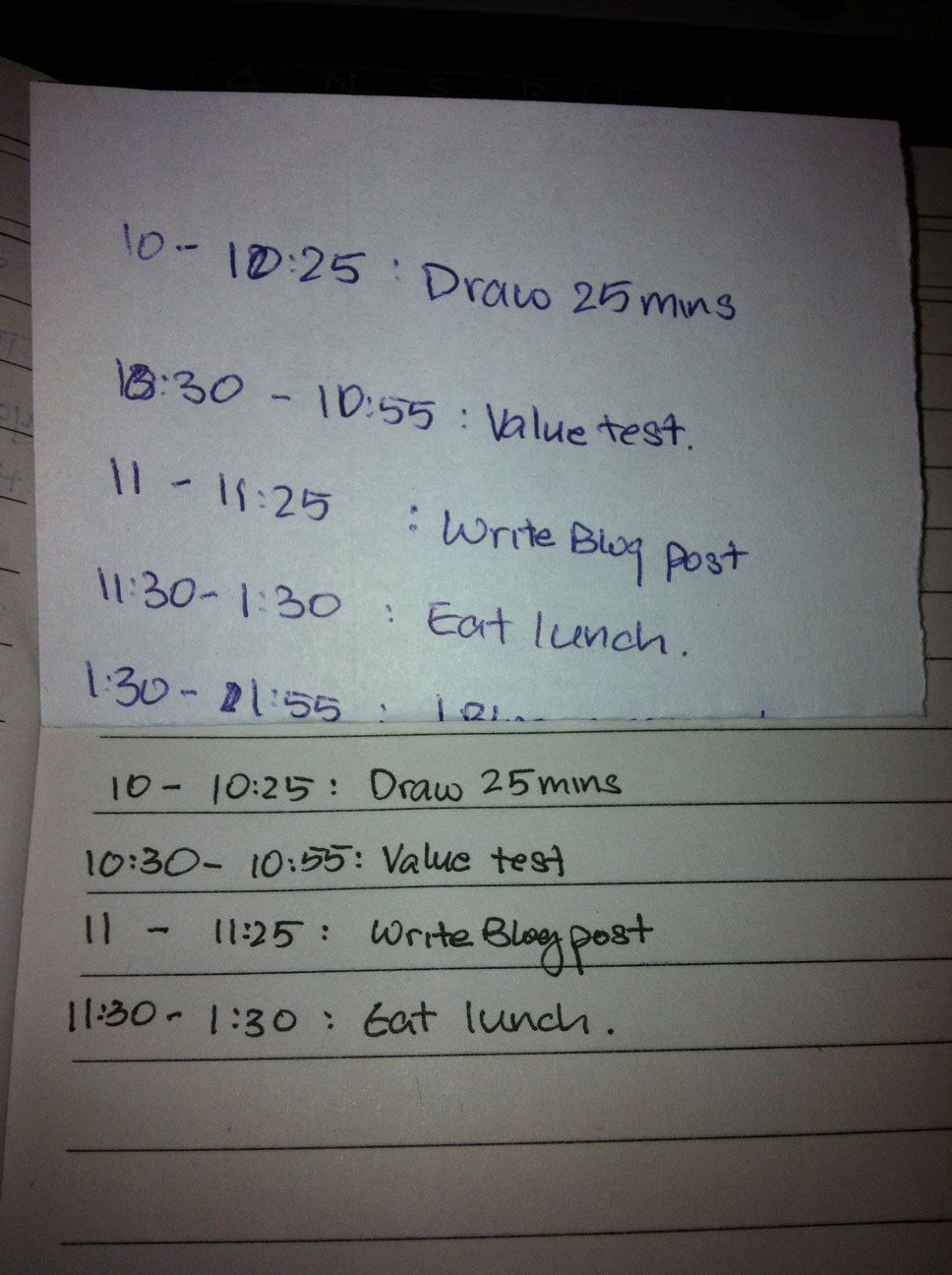
The concept of setting lines is called Vertical Rhythm. Vertical Rhythm has been echoed numerous times previously in the print design industry. It has withstood the test of time and has now found its way into web design.
Why is Vertical Rhythm so important?
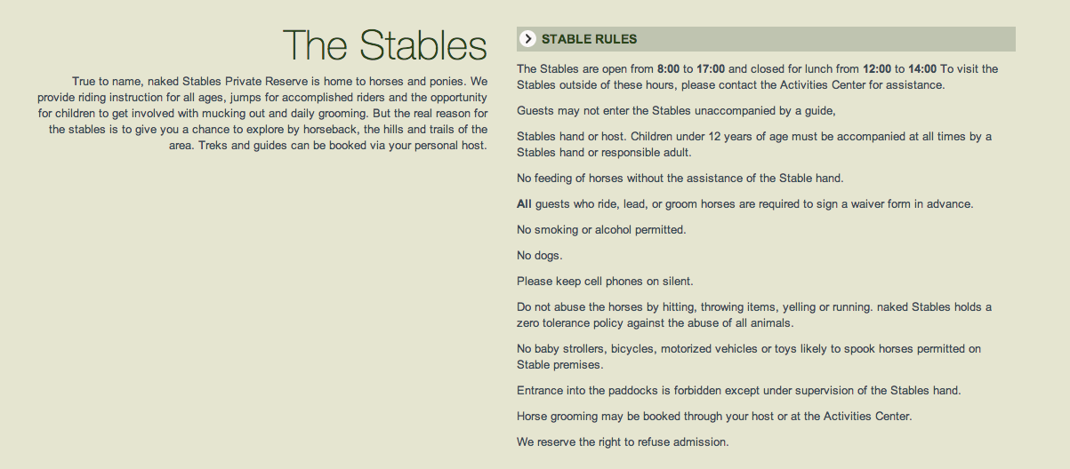
No amount of writing will beat examples. Right in the next image is a screenshot of a webpage I took that is constructed without a proper vertical rhythm.
Here is another screenshot where I did a little bit of correction with Vertical Rhythm set in place
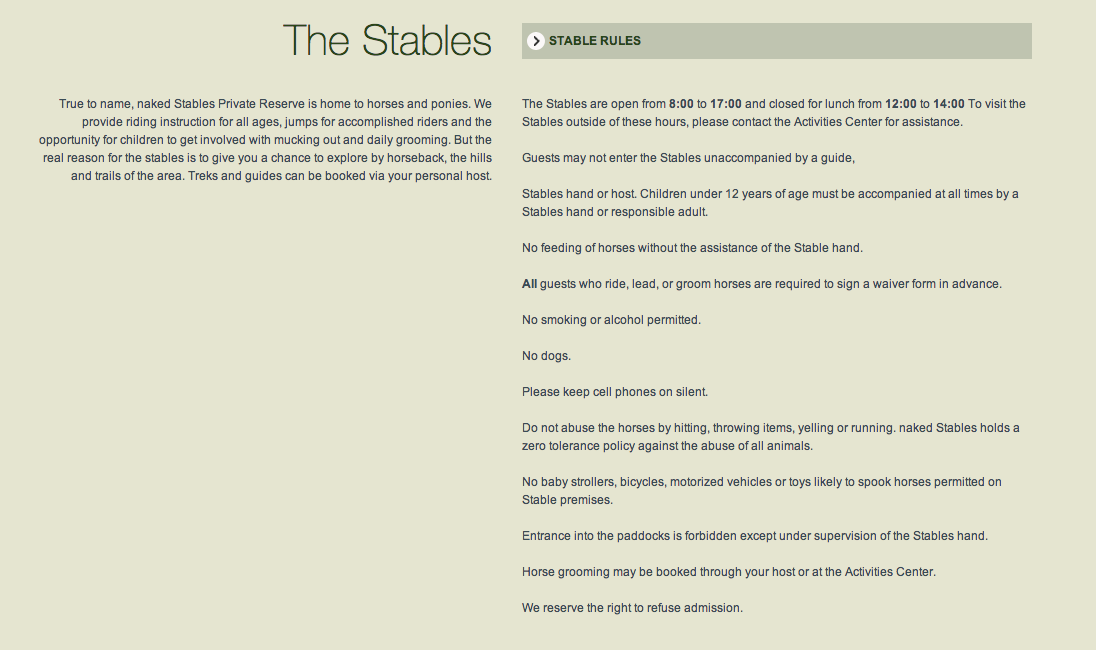
I only changed a few things in this example. Here is what I changed:
- Changed the spacing between heading and body text.
- Changed the spacing between bullet points and body text.
- Changed the spacing within the small header on the top right
Thats it.
Minor changes in the spacing between text, paragraphs and headings play a very big part in how we read things. If the space provided is not similar, we get disrupted, and it is tiring for us to continue reading further.
There are other things that can be improved with other design principles, but thats a topic for another day.
So how do I use vertical rhythm in my website?
Understanding what is vertical rhythm first is paramount to using it in your website.
The first step to creating a vertical rhythm is to establish a baseline. A baseline simply refers to the guide lines as with the writing analogy above. As designers, we have the power to change this property and it is important for us to use it wisely.
The baseline is determined by the line height of one of your website text. Most use the body text line height to determine the baseline. A general rule to setting this line height is that it should be approximately 1.2 to 1.5times the font size of whatever you chose as the proxy. I personally feel that a line height of at least 1.4 times the font size looks alot more appealing.
For example, I used a font size of 20px in my website and a line height of 30px.
The second step is to ensure what all vertical margins, paddings and borders used adds up to a multiple of the line height
In our example, the sentence means that all top or bottom margins, paddings and borders must add up to a multiple of 30px.
These margins, paddings or borders can be used in any combination as long as it adds up to such a multiple. You can make margin-top to be 20px while margin-bottom 10px to achieve the same effect.
Not all is well though.
Lets say you have a heading size of 36px. Setting a line height of 30px means that the second line of text will overlap the first line of text, not pretty. If a line height of 60px was used instead, then the spacing between the lines gets too large.
During these situations, the vertical rhythm rules seems to be a little too rigid. Some say that it is impossible to establish a perfect vertical rhythm as we can not possibly know how many lines of text a given heading would consist of.
Instead, I’ll love to expand the rules of vertical rhythm just a tiny bit. to accommodate multiples of 0.5.
In our example, 36px heading could have a 45px line height, problem solved. If its still not good, consider increasing the font size of your heading text.
The system seems to be wonderful and allows me to deal with most situations without a hitch. Thats what I found so far after creating 2-3 websites. I might be wrong, please feel free to argue this point.
By following these two simple steps, we have website that has a consistent rhythm that flows and it aids our users in reading our content.
In summary, the steps are:
- Establish a baseline
- Make all top or bottom paddings, margins, borders and line heights add up to a 0.5 multple of the line height.
Do all professional web designers use a vertical rhythm?
They all establish a vertical rhythm, but they dont strictly adhere to the rigid definitions set above.
As we all know, rules are meant to be broken, but it is only advisable to break the rules once you know how to use them.
Here’s an example of how Typecast decided to create its vertical rhythms.
**Note: They use em as measurement, but I’m gonna convert to pixels to help better understand their process. **
**Note2: These are my interpretations **
Lets begin by first looking at an overview of one of typecast’s posts.
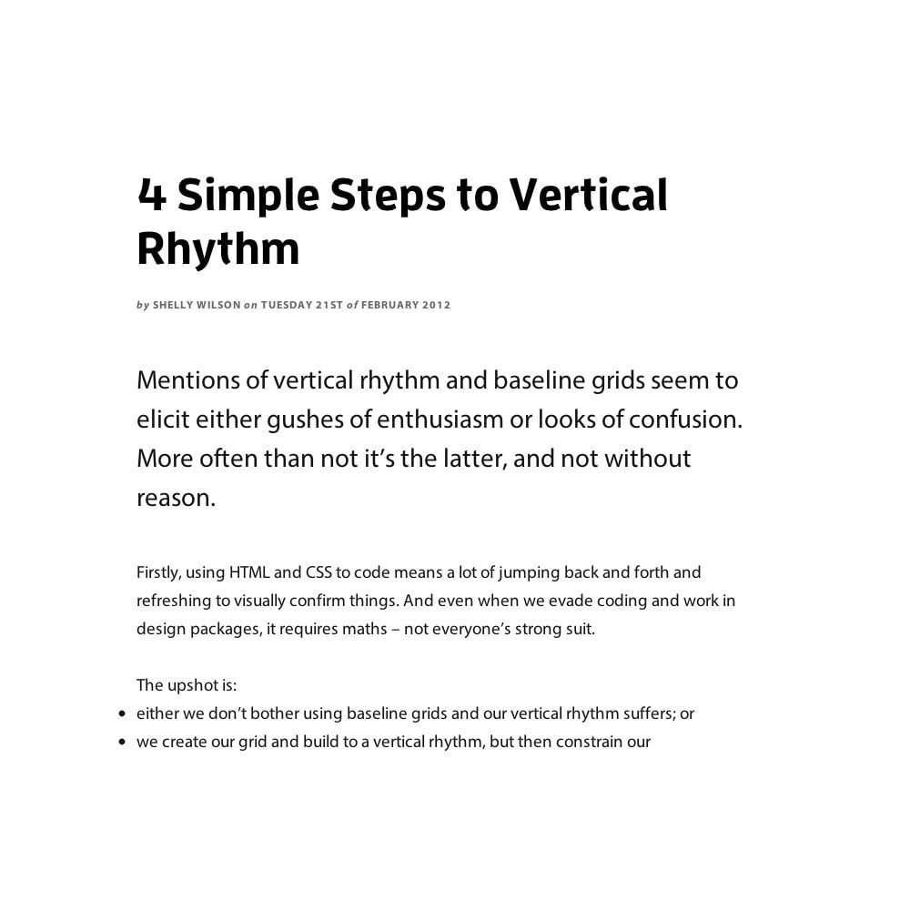
The first step to looking at vertical rhythm is to determine the baseline. I’m assumming that Typecast uses the body text as baseline as follows
Step 1: Find the baseline
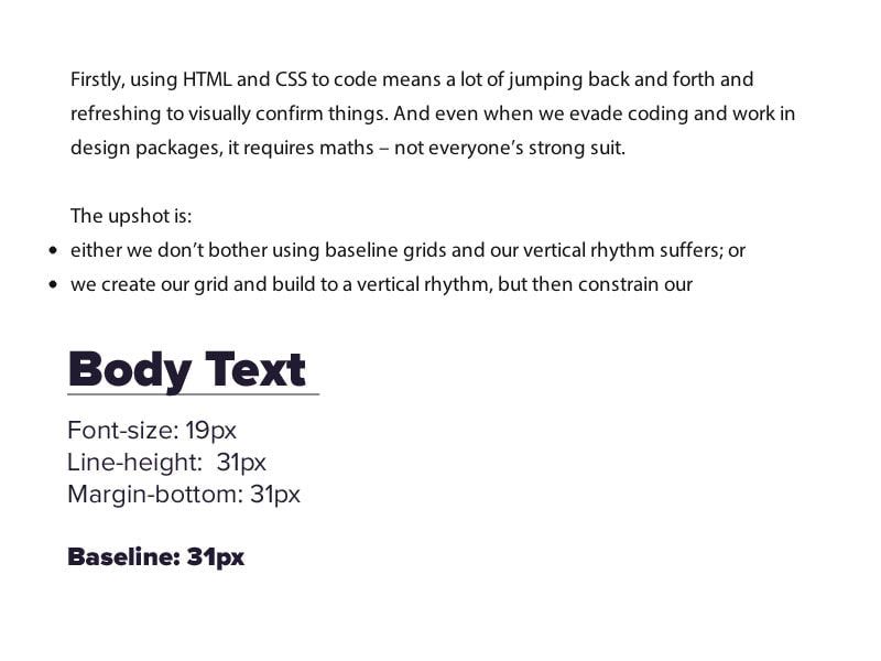
In the screen shot shown above, there are two main areas where type is different. I’m going to call them “Hero text” for the portion where the first paragraph is shown and “Heading” for the header plus meta text.
Step 2: Determine whether other text adheres to the baseline
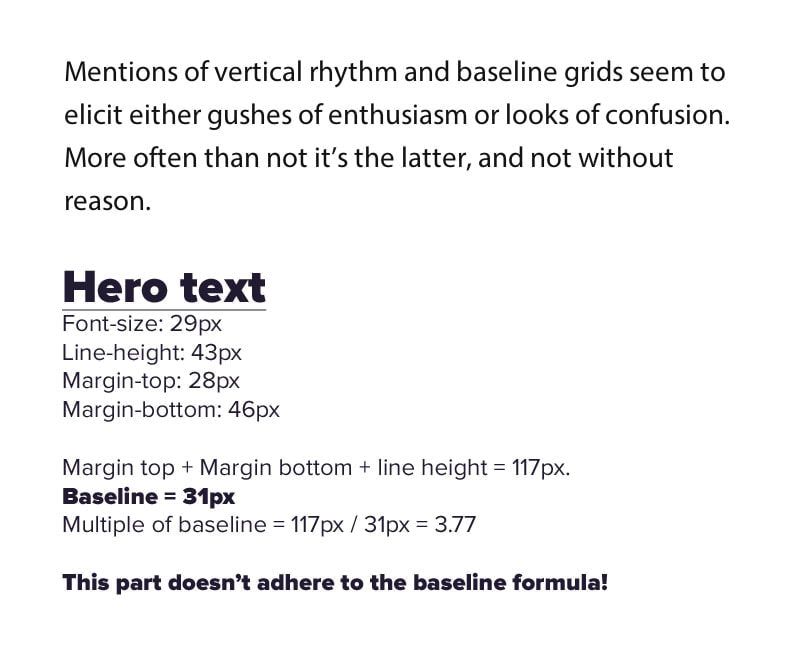
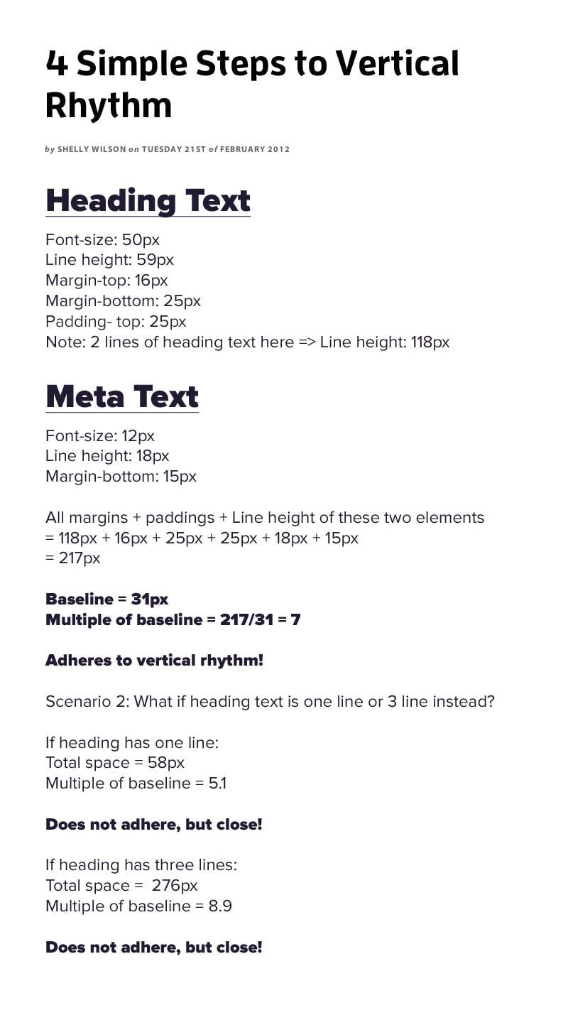
In Typecast’s case, it does seem that they have a standard vertical rhythm fixed into the website at 31px. However, they do not strictly obey the standard and there is one area where the rhythm is broken at the hero text.
What does this all mean?
Spaces between text plays a very important role in helping readers feel comfortable while reading in a page. Thus, when there is some sort of vertical rhythm built into a page, it looks alot more professional that one that is simply hacked together.
Vertical rhythm is important, but there is no need to rigidly follow the fixed rules. As long as you are experienced with building a good rhythm on a page, feel free to break the rule, but only after you’ve understood it completely!
Have you tried building a webpage with a vertical rhythm built in? Let me know how it goes!
