Leading Trim is in the works!
I saw an article about Leading Trim and I AM THRILLED. I hope Leading Trim gets into production soon!
What is Leading Trim?
Leading Trim is a part of a new CSS Specification (currently being written by @fantasai) for improving text layout. leading-trim together with text-edge lets you trim away extra whitespace from a font.
This changes everything about Web Typography.
Note: Some images (like this one above) are taken directly from the Leading Trim article by Ethan Wang. I highly recommend reading Ethan’s article to get up to speed with what Leading Trim is all about.
Below, I’ll give a summarised version + some of my thoughts.
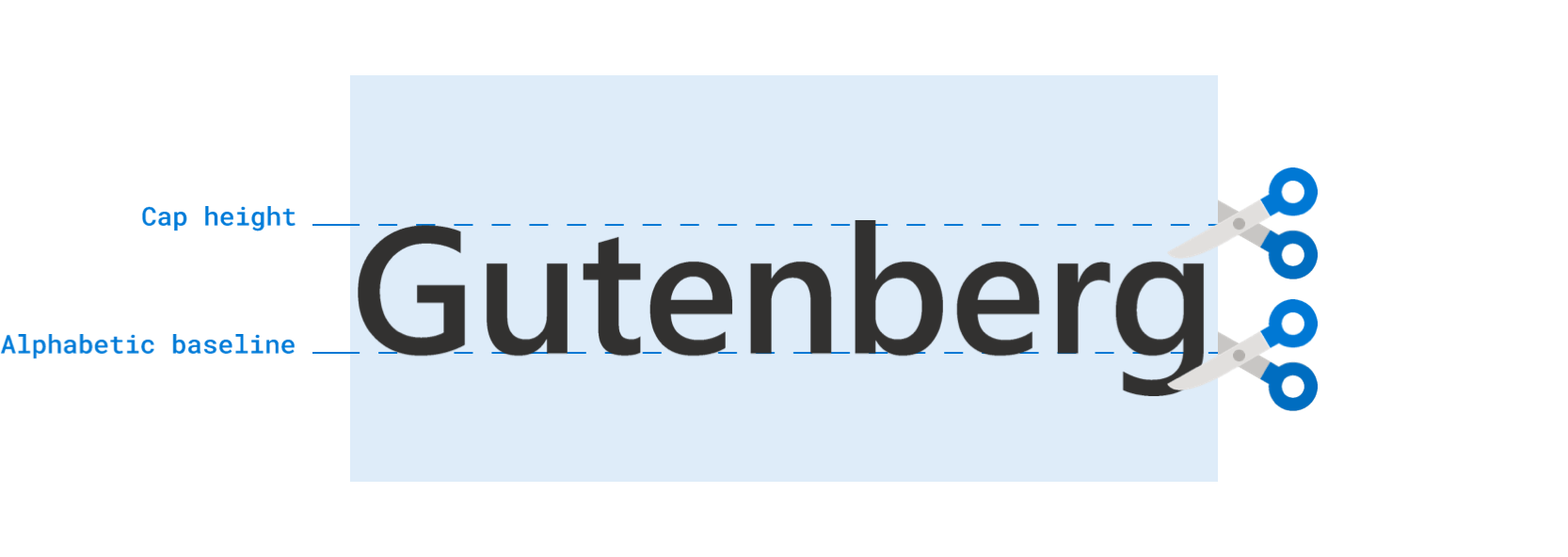
What does Leading Trim change?
Web Typography, as we know it today, uses line-height to determine the height of a line of text. This line-height splits leading up into two halves.

The problem with the current line-height system is it makes it impossible for text to follow a baseline-grid. A baseline-grid is an imaginary grid where you draw lines on a text’s baseline. It looks like this:

It’s hard to align text on the baseline grid because you need to hack things around. One process requires you to add/remove margins or paddings. A second (alternate) process requires you to use position: relative to nudge the text in place.
/* Example with margin */h1 {  margin-top: 6px;}
/* Example with position */h1 {  position: relative;  top: 6px;}
It’s extremely hard to align text completely to the baseline grid. It’s close to impossible if you need to deal with multiple columns of text.
This is a pity because the baseline grid helps us create better Typography by creating better Vertical Rhythm.

On the left is Print Typography – where we align text to the baseline grid. On the right is Web Typography – where we align text to the middle of the grid (since we use line-height).
You can see the spaces in Print Typography are more consistent than the spaces in Web Typography. This creates a more pleasing effect in Print Typography compared to Web Typography.
So we should align text to the baseline grid if possible.
Initially, I felt this was important too. I even tried using solutions like Sassline in my early days. Unfortunately, the CSS created from these approaches (as I mentioned above) is too complicated and bloated for me. I wrote an article about this too.
I ended up using fundamental design principles (like repetition) to improve Web Typography as much as I can. I compiled my practices into a course – Mastering Responsive Typography – if you’re keen to hear more.
But leading-trim and text-edge change the ENTIRE story! We will be able to make text align to the baseline PLUS make the code easy to read when those two properties are implemented by major browsers.
So I’m super excited about this.
