Faux Subgrid
I was super excited when CSS Grid landed in major browsers back in March/April 2017. I thought CSS Grid was going to change the way we make layouts; it did. We gotta thank Rachel Andrew and Jen Simmons for teaching all of us us about CSS Grid.
Unfortunately, even though CSS Grid has landed, subgrid (which I consider one of the most important CSS Grid features) didn’t.
But thankfully, there’s a way to create subgrids with pure CSS (no hacks at all!). This method works with all browsers that support CSS Grid.
Why are subgrids important?
When we design websites, we don’t often think about how we write HTML. We usually slap boxes into a grid in our design tool and decide that’s how we want our sites to look.
Most of the time, the HTML structure is straightforward. Let’s say you have a 3x2 grid in a component. You can style your grid this way:

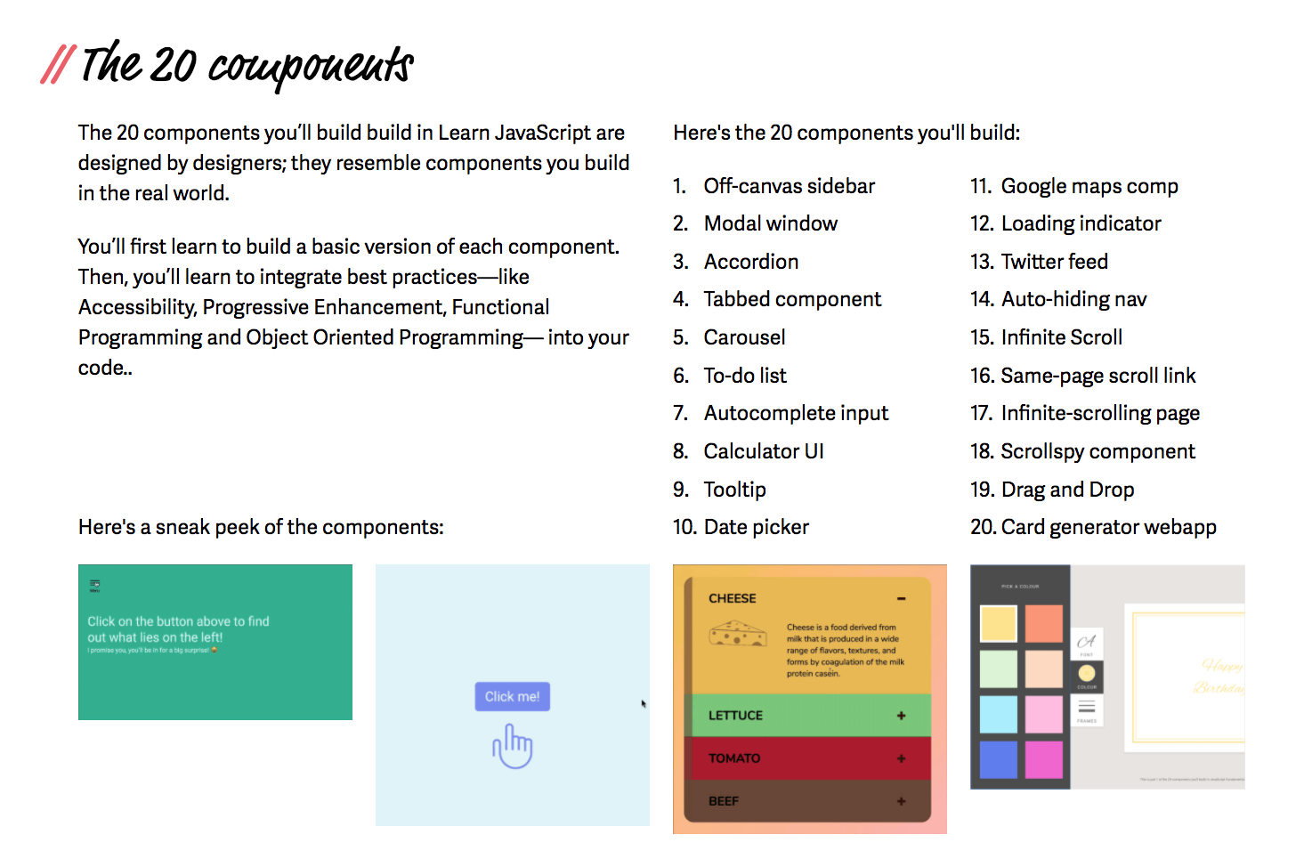
<div class="kats"> <h3>Kats! Kats!</h3> <ul class="kats-grid"> <li><!-- ... ---></li> <li><!-- ... ---></li> <li><!-- ... ---></li> <li><!-- ... ---></li> <li><!-- ... ---></li> <li><!-- ... ---></li> </ul></div>.kats-grid { display: grid; grid-template-columns repeat(3, 1fr); grid-gap: 1em;}But sometimes, your design may call for a complicated nested HTML structure. I ran into one such case when I built Learn JavaScript. Here’s the design of the component that I had troubles with:

From the design, you can tell that I need a nested HTML structure that resembles the following.
<div class="component">  <h3>The 20 components</h3>  <div class="grid">    <div class="text"><!-- ... ---></div>
    <div class="list-of-components">      <ol>        <!-- ... -->      </ol>      <ol>        <!-- ... -->      </ol>    </div>
    <div class="sneak-peek-text"><!-- ... --></div>
    <ul class="examples">      <li><!-- ... --></li>      <li><!-- ... --></li>      <li><!-- ... --></li>      <li><!-- ... --></li>    </ul>  </div></div>
Since grid-column and grid-row properties can only be used in direct descendants of an element with the display property set to grid, I couldn’t create the design directly without subgrid. I had to provide workarounds.
One way to circumvent the issue is to flatten the HTML. If I did so, my HTML would lose it’s semantic meaning. (Don’t do this; both Chris Coyier and Rachel Andrew have warned us about flattening our HTML).
<!-- Flattened HTML. Don't do this! --><div class="component">  <h3>The 20 components</h3>  <div class="grid">    <div class="text"><!-- ... ---></div>
    <ol class="list-of-components-1">      <!-- ... -->    </ol>    <ol class="list-of-components-2">      <!-- ... -->    </ol>
    <div class="sneak-peek-text"><!-- ... --></div>
    <div class="example-1"><!-- ... --></div>    <div class="example-2"><!-- ... --></div>    <div class="example-3"><!-- ... --></div>    <div class="example-4"><!-- ... --></div>  </div></div>
Another way is to force .list-of-components and .examples to be CSS Grid items with display: grid. This is the only viable method I know of.
.list-of-components {  grid-column: span 6 / -1;  display: grid;  grid-template-columns: repeat(6, 1fr);  grid-gap: 1em;}
.examples {  grid-column: 1 / -1;  display: grid;  grid-template-columns: repeat(12, 1fr);  grid-gap: 1em;}
If we had subgrid, the above code could be simplified to the following:
.list-of-components {  grid-column: span 6 / -1;  display: subgrid;}
.examples {  grid-column: 1 / -1;  display: subgrid;}
We can then style items in .list-of-components and .examples as if they’re normal grid items:
.list-of-components > ol {  grid-column: span 3;}
.examples > li {  grid-column: span 3;}
Here’s a Codepen for you to play with:
Automating the “subgrid” creation process
When I created the “subgrid” above, I gave it two pieces of information—the grid-gap value and the grid-column value. Both values are vital to creating subgrids automatically with CSS.
The grid-gap value creates grid gutters (the whitespaces between grid items). If you want the “subgrid’s” gutters to be the same value as the parent’s gutters, you can set grid-gap to inherit.
.examples { /* other properties */ grid-gap: inherit;}The grid-column value tells the “subgrid” two things:
- The number of columns to take up.
- The position of the “subgrid”
If your grid contains columns of equal widths, the number of columns can be used to create the grid-template-columns property. It should become obvious if you look at this code closely.
.examples { /* 12 columns */ grid-column: 1 / -1; display: grid; /* Create a 12-column grid */ grid-template-columns: repeat(12, 1fr); grid-gap: inherit;}We can rewrite grid-column: 1 / -1 with a column number for clarity:
.examples { /* 12 columns */ grid-column: 1 / span 12; display: grid; /* Create a 12-column grid */ grid-template-columns: repeat(12, 1fr); grid-gap: inherit;}This meant we can use a faux-subgrid mixin to create the “subgrid”.
@mixin faux-subgrid($columns) { grid-column-end: span $columns; display: grid; grid-template-columns: repeat($columns, 1fr); grid-gap: inherit;}.examples { @include faux-subgrid(12);}
.examples > li { grid-column: span 3;}Here’s a Codepen to see faux-subgrid in action.
Positioning “subgrids” with finesse
If you need a smaller subgrid item, like what I needed for .list-of-components, you can still use faux-subgrid. The difference is you need to position the subgrid item with grid-column-start.
.list-of-components { @include faux-subgrid(6); grid-column-start: 7;}Here’s a codepen to see this in action. (Pay attention to the two purple items on the right).
The faux-subgrid mixin
In case you missed it, here’s the faux-subgrid mixin again.
@mixin faux-subgrid($columns) { grid-column-end: span $columns; display: grid; grid-template-columns: repeat($columns, 1fr); grid-gap: inherit;}Limitations of the faux-subgrid
This faux-subgrid mixin is quite limited. It only works with grids with equal-width columns.
If you need to work with grids with unequal-width columns, you might want to wait for real subgrid support to come.
Note: faux-subgrid can also support grid-rows. Use the same methodology to extend the mixin if you need it.
Wrapping up
CSS Grid is awesome; it’ll be even more awesome if we had support for subgrid. Luckily, CSS Grid level 2 specifications are out; it seems like we’ll get subgrid support soon!
(I just hope it lands in 2018 or 2019).
In the meantime, try using the faux-subgrid mixin I cooked up! :)
