Element.focus vs aria-activedescendant
When you build JavaScript components, you need to manage focus for both keyboard users and screen readers. The WAI-ARIA specs say there are two ways to manage focus:
- Using
element.focusandtabindex - Using
aria-activedescendant
Which should you use and why?
I did in-depth research on these two methods and I’d like to share my findings in this article. Take a seat and grab some popcorn because it’s going to be a long article.
First, let’s take a look at aria-activedescendant since it’s foreign to most developers (other than accessibility people).
aria-activedescendant
aria-activedescendant is commonly placed on a container element. It lets screen readers identify (and hence say) the element that’s supposed to be active.
You need to do four things to make aria-activedescendant work.
- Add the
aria-activedescendantto an ancestor element. This ancestor element can be a composite widget. If the element is not a composite widget, it must have atextbox,group, orapplicationrole. - Make this ancestor element focusable
- Set
aria-activedescendantto theidof the active item. - Style the active item so users can see a difference visually
There are 9 composite widgets according to the spec: combobox, grid,
listbox, menu, menubar, radiogroup, tablist, tree, and treegrid
Let’s put aria-activedescendant into context by building something together. We’ll let a user choose a character from a list of characters.
The correct role for this list is a listbox. Items in a listbox are selectable while items in a list aren’t. Children of listboxes should have the option role.
Here’s the HTML.
<ul role="listbox" tabindex="0"> <li role="option" id="mickey">Mickey</li> <li role="option" id="minnie">Minnie</li> <li role="option" id="donald">Donald</li> <li role="option" id="daisy">Daisy</li> <li role="option" id="goofy">Goofy</li></ul>When a user selects a character, we need to set aria-activedescendant on listbox to the id of the selected character.
For example, let’s say the user selects Minnie. The correct HTML would be:
<ul role="listbox" tabindex="0" aria-activedescendant="minnie"> <li role="option" id="mickey">Mickey</li> <li role="option" id="minnie">Minnie</li> <li role="option" id="donald">Donald</li> <li role="option" id="daisy">Daisy</li> <li role="option" id="goofy">Goofy</li></ul>We also need to change the CSS so users know (visually) that Minnie got selected. We can only do this reliably through a class.
<ul role="listbox" tabindex="0" aria-activedescendant="minnie"> <li role="option" id="mickey">Mickey</li> <li role="option" id="minnie" class="is-selected">Minnie</li> <li role="option" id="donald">Donald</li> <li role="option" id="daisy">Daisy</li> <li role="option" id="goofy">Goofy</li></ul>For now, let’s allow users to select characters by clicking on them. The JavaScript for this widget can be:
const listbox = document.querySelector('[role="listbox"]')const characters = [...listbox.children]
listbox.addEventListener('click', event => {  const option = event.target.closest('li')  if (!option) return
  // Sets aria-activedescendant value  listbox.setAttribute('aria-activedescendant', option.id)
  // Change visual appearance  characters.forEach(element => element.classList.remove('is-selected'))  option.classList.add('is-selected')})
We need to test the widget with screen readers. In this case, both Voiceover and NVDA were able to say the active item.
There are tiny differences between what each screen reader says. It’s not important to normalise what they say. What’s important is ensuring all screen readers say the active item.
This is only level 1. Blind users won’t be able to click on elements. We need to let them select options with Up and Down arrow keys.
Onward to level 2.
Selecting options with arrow keys
Let’s make things easier by setting the first element as the active descendant.
<ul role="listbox" tabindex="0" aria-activedescendant="mickey"> <li role="option" id="mickey" class="is-selected">Mickey</li> <li role="option" id="minnie">Minnie</li> <li role="option" id="donald">Donald</li> <li role="option" id="daisy">Daisy</li> <li role="option" id="goofy">Goofy</li></ul>If the user presses Down, we want to set Minnie as the active descendant. To do this, we listen to a keydown event.
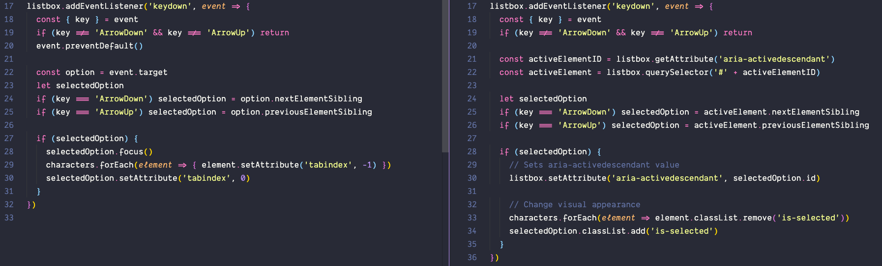
listbox.addEventListener('keydown', event => { const { key } = event if (key !== 'ArrowDown') return // ...})We check for the currently active descendant element. This should be Mickey.
listbox.addEventListener('keydown', event => { // ... const activeElementID = listbox.getAttribute('aria-activedescendant') const activeElement = listbox.querySelector('#' + activeElementID)})Then, we find the next element.
listbox.addEventListener('keydown', event => { // ... const selectedOption = activeElement.nextElementSibling})Then, we set the active descendant to this new element.
listbox.addEventListener('keydown', event => {  // ...  const nextElement = activeElement.nextElementSibling  if (nextElement) {    // Sets aria-activedescendant value    listbox.setAttribute('aria-activedescendant', selectedOption.id)
    // Change visual appearance    characters.forEach(element => element.classList.remove('is-selected'))    selectedOption.classList.add('is-selected')  }})
We do the same thing if the user presses the Up arrow key. Here’s the complete code.
listbox.addEventListener('keydown', event => {  const { key } = event  if (key !== 'ArrowDown' && key !== 'ArrowUp') return
  const activeElementID = listbox.getAttribute('aria-activedescendant')  const activeElement = listbox.querySelector('#' + activeElementID)
  let selectedOption  if (key === 'ArrowDown') selectedOption = activeElement.nextElementSibling  if (key === 'ArrowUp') selectedOption = activeElement.previousElementSibling
  if (selectedOption) {    // Sets aria-activedescendant value    listbox.setAttribute('aria-activedescendant', selectedOption.id)
    // Change visual appearance    characters.forEach(element => element.classList.remove('is-selected'))    selectedOption.classList.add('is-selected')  }})
Again, both Voiceover and NVDA were able to say the active item.
Element.focus + tabindex
Let’s build the same thing above. This time, we’ll use element.focus to move DOM focus instead of relying on aria-activedescendant.
First, we want to create the HTML. For this HTML, we don’t need to give each option an id since we won’t be using the id.
<ul role="listbox"> <li role="option">Mickey</li> <li role="option">Minnie</li> <li role="option">Donald</li> <li role="option">Daisy</li> <li role="option">Goofy</li></ul>When a user clicks on an option, we want to move DOM focus to that option. To move DOM focus, we need to make sure each option is focusable. The easiest way to do this is to add tabindex to each option.
We’ll set tabindex to -1.
<ul role="listbox"> <li role="option" tabindex="-1">Mickey</li> <li role="option" tabindex="-1">Minnie</li> <li role="option" tabindex="-1">Donald</li> <li role="option" tabindex="-1">Daisy</li> <li role="option" tabindex="-1">Goofy</li></ul>We can use the focus method to select the option. Here’s the JavaScript:
const listbox = document.querySelector('[role="listbox"]')
listbox.addEventListener('click', event => {  const option = event.target.closest('li')  if (!option) return
  option.focus()})
We also need to change the visual style of the selected item. We can use the :focus pseudo-selector to help us do this.
li:focus { background: aquamarine;}Both Voiceover and NVA were able to say the active item.
Let’s move on to Level 2.
Selecting options with arrow keys
As before, let’s make things easier by selecting the first element. In this case, we can “select” an element by setting tabindex to 0.
By setting a tabindex to 0, we allow users to Tab to the element as we enter the listbox. We can also use the tabindex="0" to style the CSS.
<ul role="listbox"> <li role="option" tabindex="0">Mickey</li> <li role="option" tabindex="-1">Minnie</li> <li role="option" tabindex="-1">Donald</li> <li role="option" tabindex="-1">Daisy</li> <li role="option" tabindex="-1">Goofy</li></ul>/* Styles the selected option */li[tabindex='0'] { background: aquamarine;}If the user presses Down, we want to select Minnie. To do this, we need to listen to a keyboard event.
listbox.addEventListener('keydown', event => { const { key } = event if (key !== 'ArrowDown') return // ...})We can find Minnie immediately with nextElementSibling.
listbox.addEventListener('keydown', event => { // ... const option = event.target // This is Mickey const selectedOption = option.nextElementSibling // This is Minnie})Then we change the tabindex values to select Minnie.
listbox.addEventListener('keydown', event => {  // ...  if (selectedOption) {    // Focus on next element    selectedOption.focus()
    // Roving Tabindex    characters.forEach(element => {      element.setAttribute('tabindex', -1)    })    selectedOption.setAttribute('tabindex', 0)  }})
I found it useful to prevent the default behavior of arrow keys. This prevents Voiceover from activating “Next Item” when we press the Down arrow key.
listbox.addEventListener('keydown', event => { // ... if (key !== 'ArrowDown') return event.preventDefault() // ...})We’ll do the same steps if the user presses the Up arrow key. Here’s the completed code (with some cleanup):
listbox.addEventListener('keydown', event => {  const { key } = event  if (key !== 'ArrowDown' && key !== 'ArrowUp') return  event.preventDefault()  const option = event.target
  let selectedOption  if (key === 'ArrowDown') selectedOption = option.nextElementSibling  if (key === 'ArrowUp') selectedOption = option.previousElementSibling
  if (selectedOption) {    selectedOption.focus()    characters.forEach(element => {      element.setAttribute('tabindex', -1)    })    selectedOption.setAttribute('tabindex', 0)  }})
Again, both Voiceover and NVDA were able to say the selected item.
Comparing code between the two options
The spec says aria-activedescendant is an alternative method to manage focus without moving DOM focus among descendant elements. This hints that aria-activedescendant can be easier to use compared to the element.focus + tabindex combination.
However, this doesn’t seem to be the case in practice. I found the aria-activedescendant version longer and more complicated.
Problems with aria-activedescendant and Voiceover
On further testing, I realised that Voiceover doesn’t say the active element when used on combobox and grid roles. Let’s talk about my findings on comboboxes first.
Combobox
A combobox is an element that contains two things:
- A single-line
textbox - A popup box that helps a user set the value of the
textbox. This popup box can belistbox,grid,tree, ordialog.
A Typeahead (often called Autocomplete) is an example of a combobox.
I tried setting aria-activedescendant on the Combobox element. When I did this, Voiceover refuses to say elements that are selected with aria-activedescendant.
But it works on NVDA.
Combobox Take 2
There’s a second way to use aria-activedescendant with Comboboxes. We can set aria-activedescendant on the textbox. When we do this, we must also set aria-owns to indicate that the textbox owns the listbox.
<div role="combobox"> <input type="text" id="text" aria-owns="listbox" aria-activedescendant="mickey" /> <ul role="listbox" id="listbox"> <li role="option" id="mickey" class="is-selected">Mickey</li> <li role="option" id="minnie">Minnie</li> <li role="option" id="donald">Donald</li> <li role="option" id="daisy">Daisy</li> <li role="option" id="goofy">Goofy</li> </ul></div>Both Voiceover and NVDA were able to say the active descendant when the input is empty.
However, Voiceover does not say the active descendant if the input is filled.
It works on NVDA though.
Grid
For grids, we can let users select one of these:
- Select the entire row
- Select a single cell
When I allowed users to select the entire row, Voiceover says “2 rows selected” regardless of the content.
NVDA announces the selected row.
When I allowed users to select one cell, Voiceover says nothing.
NVDA says the cell content, row, column header, and column.
Comboboxes and grids with element.focus + tabindex
Voiceover doesn’t say the active descendant when we used aria-activedescendant on comboboxes and rows. This is a big problem since Voiceover has a large share of the market.
How does the element.focus + roving tabindex method fare? Let’s find out.
Combobox
Both Voiceover and NVDA says the item with DOM focus when the input is empty.
There were also able to say the active item when the input is filled.
Grid
When I allowed users to select the entire row, Voiceover announces the first cell in the row.
NVDA announces the selected row.
When I allowed users to select one cell, Voiceover says the cell contents.
NVDA says the cell contents, the row, the column header, and the column number.
Codepen links
I created a collection of pens (one for each test) if you’d like to run the experiments yourself. Here’s the link to the collection.
Conclusion
There is only one reliable method for managing focus: element.focus + roving tabindex.
Don’t use aria-activedescendant. It doesn’t work on grid and combobox with Voiceover. I don’t know how aria-activedescendant works with other composite widgets since I didn’t test them. If you decide to use aria-activedescendant, make sure you test your code with screen readers before putting it into production.
I don’t see the benefits of using aria-activedescendant since the amount of code required for element.focus + roving tabindex is similar to the amount of code required for aria-activedescendant.
After my experiments, I can’t help but think aria-activedescendant is poop (just like how Heydon Pickering considers aria-controls poop). Of course, if I’m wrong about my conclusions, please reach out and educate me! Thanks!