How to get better at design (for developers)
As a web developer, you need to be able to design.
Why? Because of three simple reasons — and all of them help to further your career in different ways.
The reasons are:
- If you can design, you’ll be able to create attractive portfolio pieces and get client work
- You’ll be able to become an indie maker and build applications that others use for a living — without having to depend on anyone else
- You’ll be able to communicate with a designer effectively as they hand off their designs to you — which means it’s easier for you to get more work too.
Like it or not, people judge books by their covers. And yes, people judge your work by how it looks.
If you can’t design, you’ll get stuck since you won’t be able to create nice stuff — and you won’t be able to proudly show off the work you’ve done.
If you’re someone who wishes to further your career by improving your design skills, read on.
I’m going to share with you resources that I’ve used to help me get better at design over the years. I’m also going to review these resources and tell you how they’ve helped me (or screwed with my head).
Three design resources I recommend
These resources are either books or courses because I’ve found that the best way to learn design is to go through a course and have someone guide you
Books and courses are much better than reading design articles online because most of these articles are a waste of time. In fact, many design resources teach you the wrong things and screw with your head so you’ll never be able to design properly…
Without further ado, here are the three resources I recommend:
- Design for non-designersby Robin Williams
- Refactoring UI by Steve Schoger
- Learn UI by Erik Kennedy
I recommend going through all three resources because they teach you different things.
But here’s how to choose between them (in a nutshell) if you’ve got some constraints:
-
If you’re just starting and wish to dip your toes into the whole design thing, Design for non-designers is the best choice.
-
If you wish to become an expert quickly, go for Learn UI because it gives you all the fundamentals and thinking models you need to create great designs for both websites and UI without second-guessing yourself all the time.
-
If you already know you want to design apps, Refactoring UI can provide you with some great ideas. But I’d say you should only get this if you’re more advanced.
With that, let me share my reviews of each of these books and courses with you — so you can make a more informed choice on which you’ll pick to further your understanding.
Design for non-designers
I first picked up the book over 10 years ago at the beginning of my career. I read this book because I, like you, wanted to become better at design. And I decided to start by reading books.
Design for non-designers is a great book that gives you the fundamental thinking models you’ll need to create good designs.
It’s been over 10 years since I read this book, but I still remember the timeless principles that have helped to shape many of the design decisions I make today.
The four foundational principles are:
- Alignment
- Contrast
- Proximity
- Repetition
Once you master these four principles, you’ll see them being used everywhere.
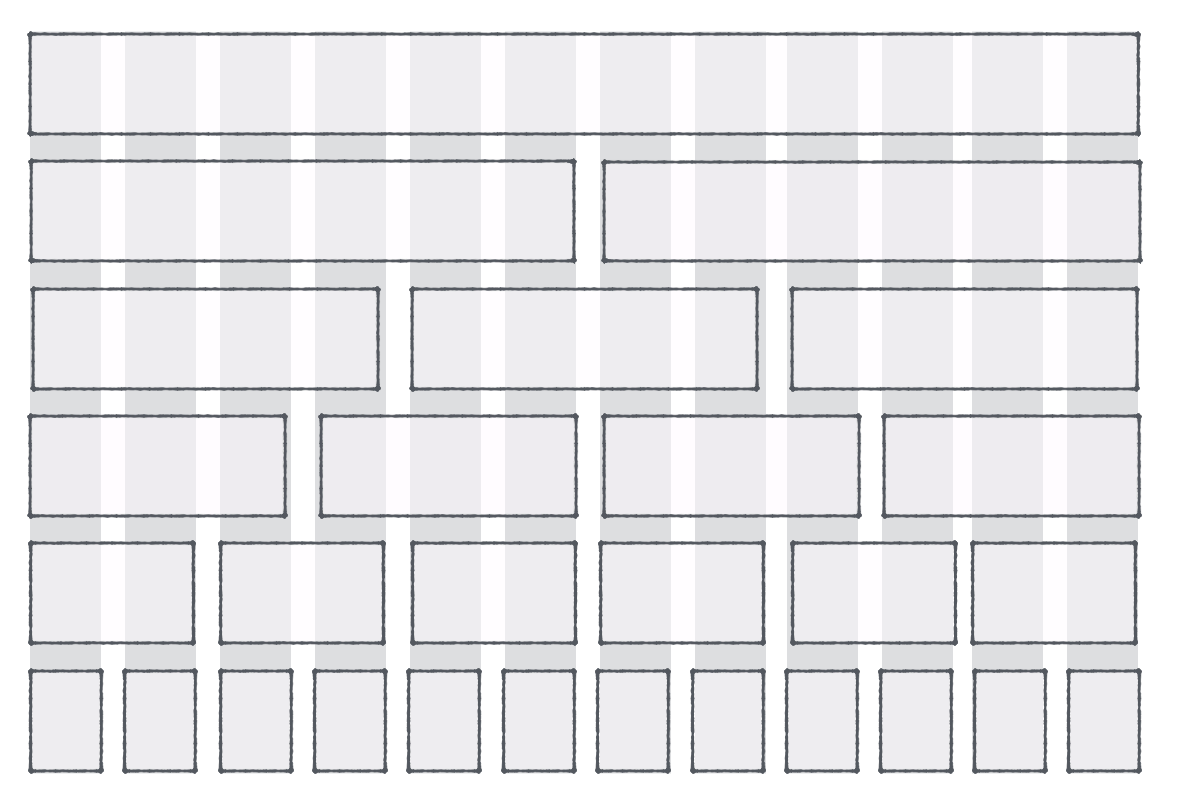
For example, Grids are popular in design because they provide strong alignment. But once you know how to align things, you don’t have to be at the mercy of grids…

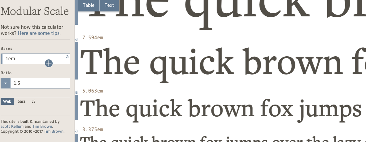
Another example: The Modular Scale is popular for choosing font sizes because it ensures that each size has enough contrast.

If you’ve used the Modular Scale before, you would have noticed how limited they can be (because the sizes would always be either too big or too small and never just right).
Well, the good news is once you learn enough about contrast, you can ditch the Modular Scale, use your judgment, and you’ll get even better results than before.
Now, I can talk about proximity and repetition too. Once you understand this you’ll also begin to see why the commonly-touted “Vertical Rhythm” practice isn’t that great (and how to make it better).
Ultimately, here’s one thing you should know before you continue reading any further.
Each of these principles that Robin wrote about is important — far more important than choosing typefaces and colours. So beginning with this book is ideal if you’ve never studied design before.
Erik Kennedy’s Learn UI
Erik’s Learn UI is hands-down the best design course I’ve taken.
In Learn UI, Erik walks you through everything you need to know to become great at design, step by step, kinda similar to how I teach JavaScript in Learn JavaScript.
So if you’ve taken my JavaScript course because, you know how well I teach, and because I pay a lot of attention to teaching, I can tell who are the great teachers and who are likely going to be: bullshitters.
Erik is a great teacher.
Many years ago, when I first through the introductory modules of Learn UI, I was able to level up enough to create a pretty-nice-looking design for one of the components I teach in Learn JavaScript.
This week, I went through the course again and it helped level up my design skills even more. At the same time, I felt a lot of my insecurities were removed as I learned more about colours, pairing fonts, designing UI, and many other design details.
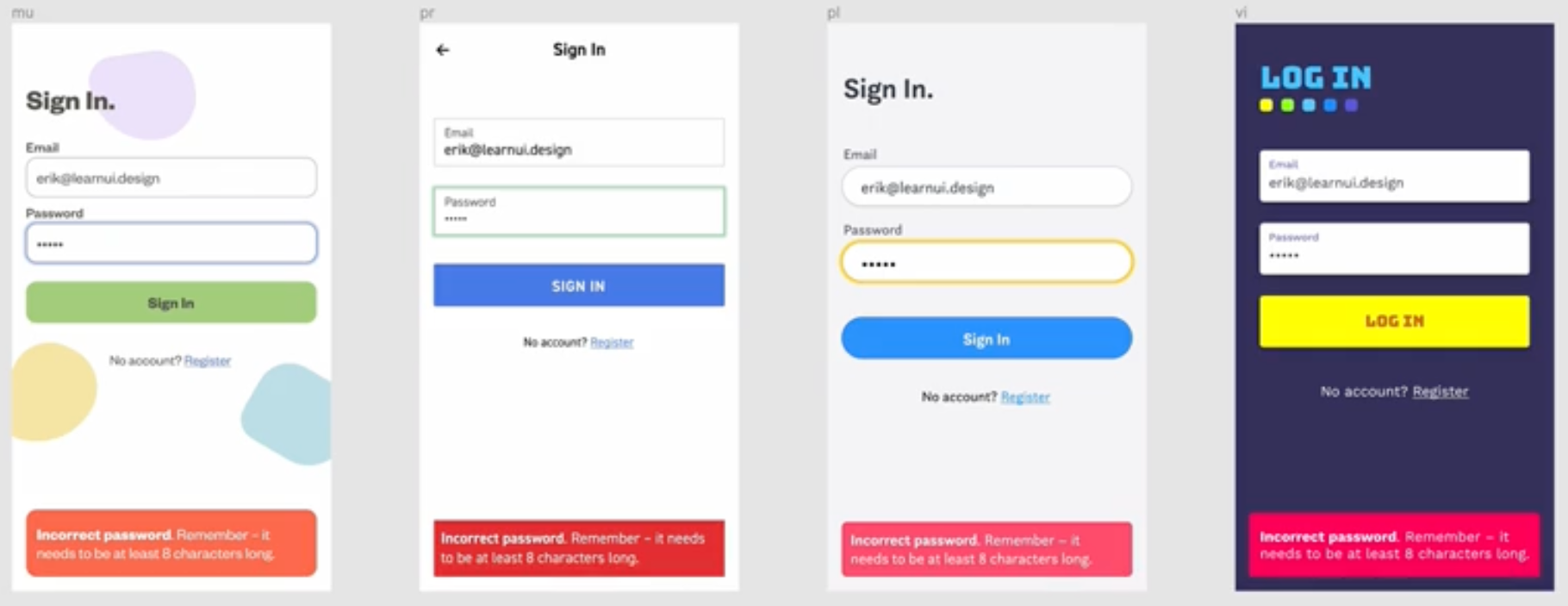
Here are some example screenshots I took when I was watching videos.

In this course, Erik shows you how to pick colours so you never have to rely on Adobe Kuler or any of the other colour palette generators out there.
Once of the things I learned when watching this module, is that different palettes can have different shades of red! Armed with the knowledge Erik gave me through the course, I’m now able to to pick variations of colours that match what I’m trying to convey even better than before.
I also love the way he shows you the subtlety of design (which is rarely taught but is very important).
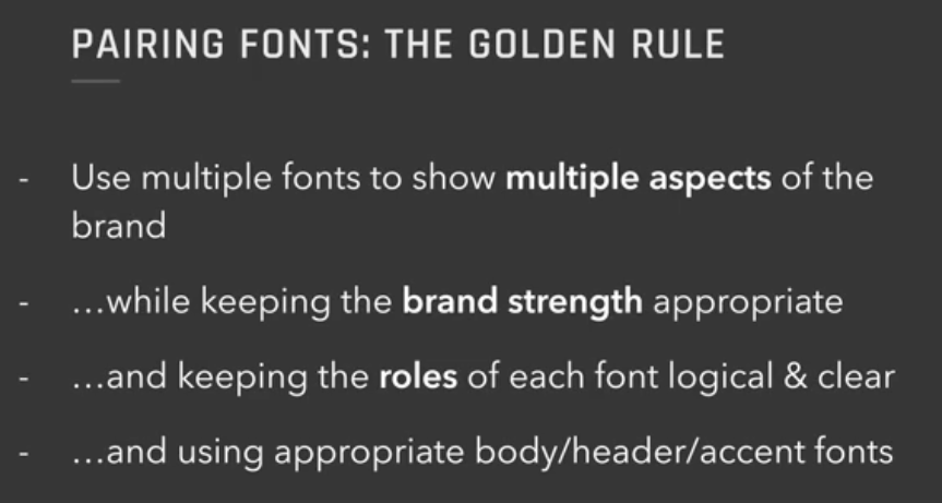
Here’s another picture about pairing fonts.

Most advice online would tell you to pick a serif font and a sans-serif font. Instead of doing just this, Erik goes many steps further and shows you how to pair typefaces and even use many typefaces in the same design.
I can spend all day talking about the details Erik teaches, but it’s probably best for you to read about them yourself. The bottom line is: If you want to become great at design, Erik’s course is a no-brainer.
It’s expensive, but the skills you gain in return is worth every penny of the investment.
In addition, if you want to become a great web designer, you may also want to consider Erik’s Learn UX course which shows you everything you need to know about good UX.
Refactoring UI by Steve Schoger
Refactoring UI is an amazing book that Steve Schoger compiled about various ways to make UI much nicer.
You’re missing out if you never heard of Refactoring UI. It’s one of the best resources for learning to design better interfaces.
There are many subtle examples which include varying shades of gray, switching hue colours, and others.
Since this is a book about designing UI, you will see lots of examples that will help you become better at designing apps. But there aren’t many examples that’ll help you design better websites.
My only warning about getting Refactoring UI is that you need to be a pretty good designer before you begin testing these theories out.
If you don’t, you may fall into the trap of thinking what Steve provides you with is the holy grail. It’s not.
Refactoring UI simply provides you with a bunch of tactics you can use to beef up your designs, but it doesn’t give you the skills to understand and use each of these tactics.
One of the problems I got from reading this is thinking I need to create an entire colour palette before designing anything.
Steve doesn’t say it that way, but I mistakenly believed that I need to create the entire colour palette because Steve recommended having at least 9 variations of each colour. 😱 (Plus, many design systems used similar approaches).
This thought paralysed me for a long time… and I wasn’t able to design anything because it seemed like such a huge and impossible task to get all the colours right.
I only became able to design again when I stopped thinking about creating the whole colour palette at once — because the truth is, there’s no way to know how each colour works unless you see them when they’re being used!
Now, even though I encountered some problems after reading Refactoring UI, I would say it’s still a very good book. This is why I’m still recommending it to you (and giving you a warning at the same time).
Become better at design today!
Whether you choose one (or three!) of the above resources is entirely up to you.
The key is to know that there are resources that can help you get better at design, while most other resources drive you into a rabbit hole of mediocrity if you don’t know what you should know.
I hope you use these resources and help yourself get better at design, and find your way into a better career!
As always, I hope this was helpful. Let me know if you have any questions and I’ll be happy to answer them to the best of my abilities.
