How to add Flexbox fallback to CSS Grid
I shared how to build a calendar with CSS Grid in the previous article. Today, I want to share how to build a Flexbox fallback for the same calendar.
How to provide support
Generally, there are three ways to provide support when it comes to CSS.
First method: Write fallback code. Overwrite fallback code.
.selector { property: fallback-value; property: actual-value;}Second method: Write fallback code. Overwrite fallback code in CSS Feature Queries (@supports). Reset properties inside @supports if you need.
.selector {  property: fallback-value;}
@supports (display: grid) {  .selector {    property: actual-value;  }}
Third method: Write everything in @supports.
@supports not (display: grid) {  .selector {    property: fallback-value;  }}
@supports (display: grid) {  .selector {    property: actual-value;  }}
These three methods are listed in order of decreasing-complexity. (If you need to overwrite code, it’s more complicated). This means writing everything in @supports is the simplest of the three.
How you choose to support your project depends on browser support for:
- The feature
- The fallback feature
- Support for Feature Queries
Checking for support
The best place to check for support is caniuse. Here, I see that support for CSS Grid is decent. Browsers I have to worry about are:
- Opera Mini: 1.42% global usage
- Android Browsers 2.1 to 4.4.4: 0.67% global usage
- Blackberry browser: 0.02% global usage (Not gonna worry about this one).

Support for the fallback (Flexbox) is also good.
But we have a problem: Flexbox fallback wouldn’t work for Android 2.1 to 4.3 (it doesn’t support wrapping). Global usage for Android 2.1 to 4.3 is 0.37%.
Here, I have to decide:
- Is providing Flexbox fallback for Opera Mini (1.42%), Android 4.4.4 (0.3%), and Blackberry (0.02%) worth the effort?
- Should I change fallback from Flexbox to an older feature to support Android 2.1 to 4.3 (another 0.37%)?

Let’s assume, for this project, I decide that Flexbox fallback is sufficient. I’m not going to worry about Android 2.1 to 4.3.
Next, I want to check whether browsers support CSS Feature Queries.
Here, I see:
- Opera Mini supports Feature Queries
- Android 4.4.4 supports Feature Queries
- Blackberry browser doesn’t support Feature Queries
- IE 11 does’t support Feature Queries

Deciding how to write fallback code
Earlier, I mentioned there are three ways to write fallback code for CSS:
- Write fallback code. Overwrite fallback code.
- Write fallback code. Overwrite fallback code in
@supports. - Write everything in
@supports.
If I write everything inside @supports, I can provide support for:
- Opera Mini (1.43%)
- Android 4.4.4 (0.3%)
But I lose support for:
- IE 11 (2.3%)
- Blackberry (0.02%)
I do not want to forsake the 2.3% of IE users, which means Method 3 (write everything in @supports) is out.
If I use Method 2 (Write fallback code. Overwrite fallback code in @supports), I can provide support for:
- IE 11 (2.3%)
- Opera Mini (1.43%)
- Android 4.4.4 (0.3%)
- Blackberry browser (0.02%)
That’s everything I need. That’s why I’m gonna go with Method 2.
Note: If you want to code along, you can use demo from my previous article as the starting point.
Disabling Grid code
First, we park the CSS Grid code under @supports (like we discussed above).
@supports (display: grid) {  .day-of-week,  .date-grid {    display: grid;    grid-template-columns: repeat(7, 1fr);  }
  .date-grid button:first-child {    grid-column: 6;  }}
We can disable the CSS Grid code by setting display to an invalid value (not grid). This disables the entire block of code.
(Thank Rachel Andrew for this neat trick. I believe I learned it from her 😄).
@supports (display: gridx) { /*...*/}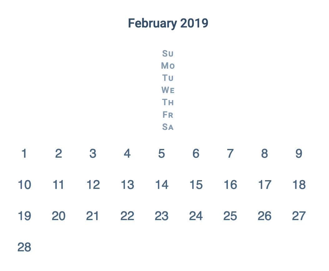
Writing Flexbox code
We need to build the same seven-column grid with Flexbox. The first thing we need to do is acknowledge that Flexbox and Grid work differently. We won’t be able to get a perfect replica, but we can get close.
The first thing is set display to flex.
.day-of-week,.date-grid { display: flex;}
We need the buttons in .date-grid to wrap, so we set flex-wrap to wrap.
.date-grid { flex-wrap: wrap;}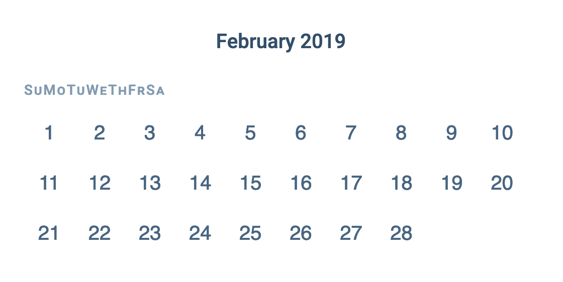
We need to replicate the seven-column grid. An easy way to do this is calculate the width of the grid according to the width of each button. Here, I have already set each button to 4.5ch. This means the width of the grid should be 7 x 4.5ch.
(We can use CSS Calc to do the math for us).
.day-of-week,.date-grid { max-width: calc(4.5ch * 7);}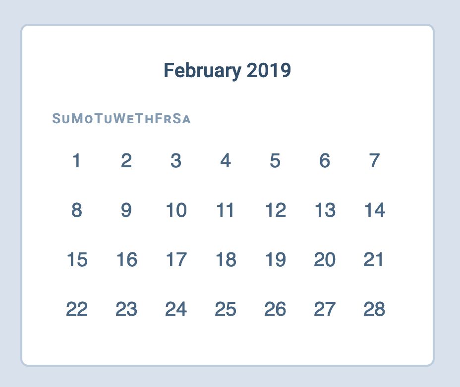
We need the elements in .day-of-week to spread out across the available width. One simple way is to set justify-content to space-between.
.day-of-week { justify-content: space-between;}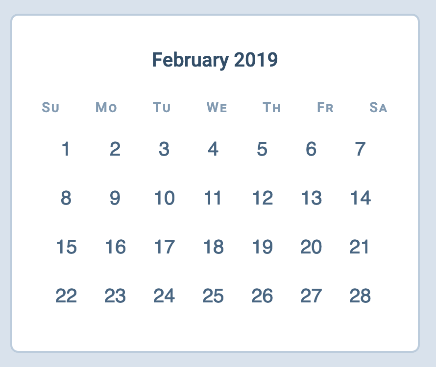
Here, we can see that elements in .day-of-week extend past the grid. This extension happens because we let Flexbox calculate flex-basis for us. If we want every element in .day-of-week to be have the same width, we need to set flex-basis ourselves.
In this case, the easiest way is to set flex-basis to the width of one grid item (or 4.5ch). Note: I adjusted font-size of each item in .day-of-week to 0.7em (for visual aesthetics). We have to account for this change.
.day-of-week > * { flex-basis: calc(4.5ch / 0.7);}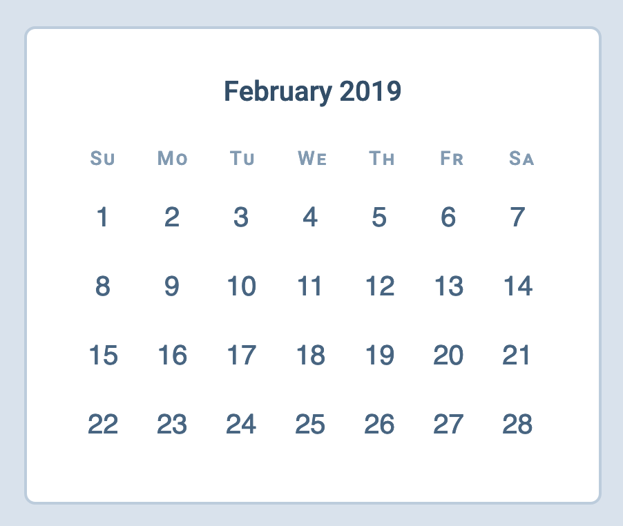
Finally, we need to push the 1 February to Friday. (Five columns). Since column is 4.5ch, we simply push it by 4.5ch x 5.
(Again, we can use CSS Calc to help us with this).
.date-grid button:first-child { margin-left: calc(4.5ch * 5);}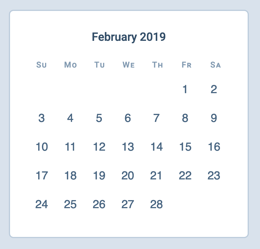
Fixing the CSS Grid version
We can reactivate the CSS Grid code and make any necessary changes now.
@supports (display: grid) { /* ... */}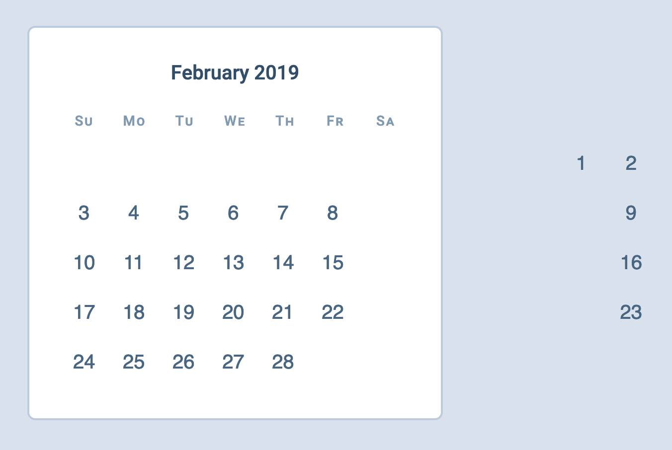
Here, we see some values fly far out to the right. This happens because we added margin-left to the first grid item. We need to reset the added margin.
@supports (display: grid) { /* ... */ .date-grid button:first-child { grid-column: 6; margin-left: 0; }}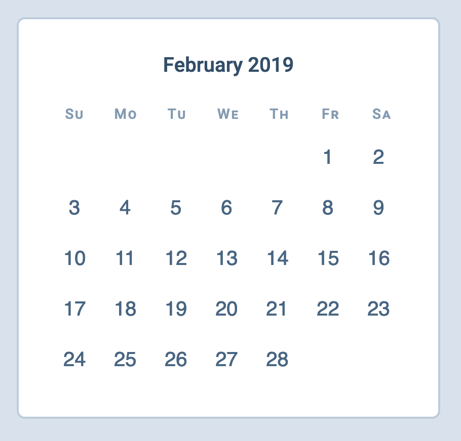
Another thing: We can remove max-width because we don’t need it in the CSS Code. (Even though this doesn’t affect the CSS Code, we still want to remove it. Always better to have less properties).
@supports (display: grid) {  .day-of-week,  .date-grid {    display: grid;    grid-template-columns: repeat(7, 1fr);    max-width: initial;  }
  /* ... */}
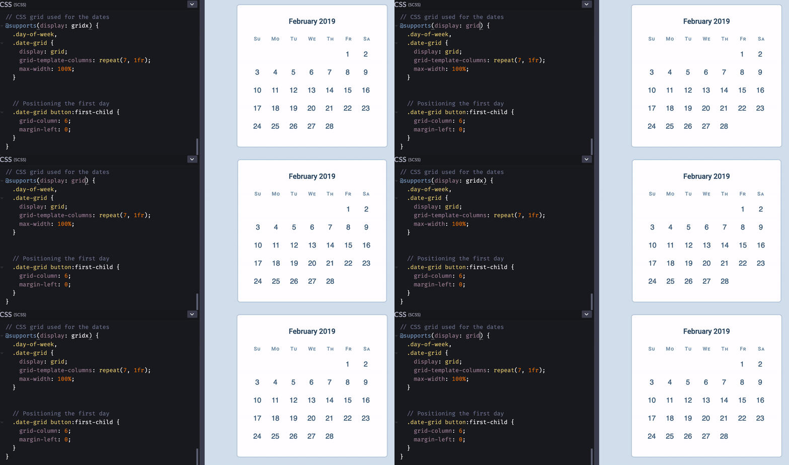
Here’s the visual difference between the Flexbox and CSS Grid versions. Not too bad!
One fun thing
CSS Grid is cool because it follows writing direction. We can easily change the flow from left-to-right to right-to-left.
Note: I don’t know if calendars are read from right to left in rtl languages. I just thought it’ll fun to mention this 😜).
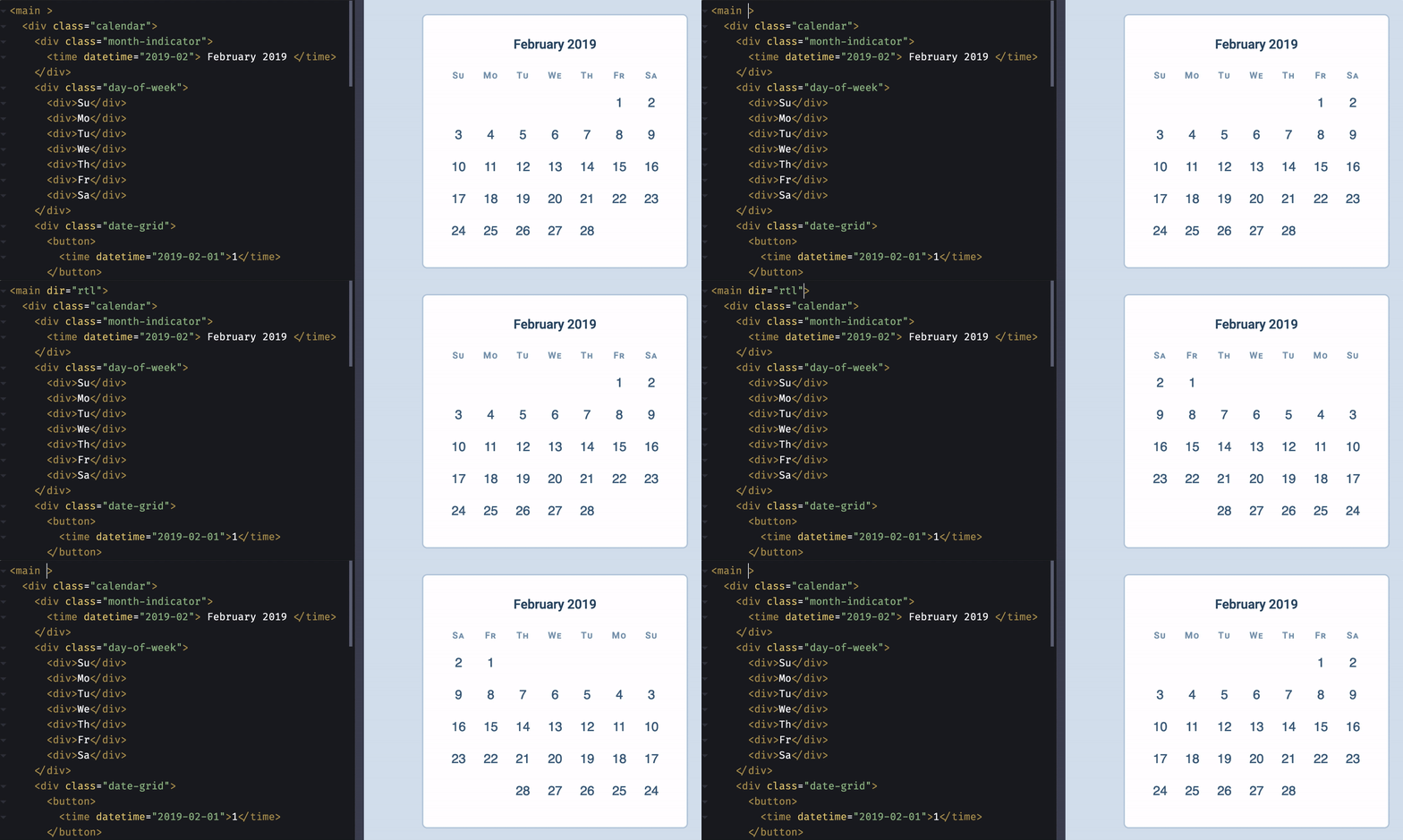
Our code for CSS Grid supports this behaviour naturally. If you want to support the same behaviour with Flexbox, you need to use CSS Logical Properties.

Since support for CSS Logical Properties is not-so-great, we need to provide fallback for it. (Best way is to through Method 1: Write fallback; overwrite fallback).
.date-grid button:first-child {  margin-left: calc(4.5ch * 5);  margin-inline-start: calc(4.5ch * 5);}
@supports (display: grid) {  /* ... */  .date-grid button:first-child {    grid-column: 6;    margin-left: 0;    margin-inline-start: 0;  }}
That’s it! Here’s a Codepen for the final code:
