Data Table Accessibility in 2024
A comment from Estelle Weyl sparked this whole article.
I know the
displayproperty would override the native semantics of a table, like settingdisplay: grid, but I am not sure if that is still the case.”
(Emphasis mine).
This prompted me to do some research.
Screen Readers Tested
I’ve tested the following screen readers on the stated browser versions:
- Voiceover (Chrome 126 + Firefox 127 + Safari 17)
- NVDA (Chrome 124 + Firefox 125)
Note: These tests should be supplemented with other screen readers like JAWS to be more conclusive, but I don’t have access to JAWS and other screen readers so I didn’t test them.
Tables That I Tested
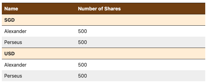
Before constructing this test, I was already interested in how scope="rowgroup" and colspan works so I constructed a table that looks like this.

In doing this test, I was interested in how screen readers would speak about tables in four different settings:
<table>as it should be<table>withdisplay: grid(to test Estelle’s question)<div role="table>along with its aria counterparts to see how this fares against<table><div role="grid">to see the difference between this and<div role="table>.
I’ve added the markup for these four table elements into Codepen.
See the Pen Data Table Accessibility Tests by Zell Liew (@zellwk) onCodePen.
If you’re curious about how I styled this complex table with CSS Grid easily
(with subgrid), check the codepen or wait for me to explain in a future
article. It’s gonna be a solid
recipe!
Summary of My Findings
I’ll first present my findings for a basic table (without invoking scope="rowgroup" and colspan properties).
<table>- All screen readers were able to recognize the table, rows, and columns. (Which should by expected, eh?).
<table>withdisplay: grid- Table semantics was not stripped out by screen readers in most browsers. They were able to announce table, rows, and columns accurately.
- The only exception was Voiceover + Safari which announced a table but no rows and columns
[role="table"]and[role="grid"]- Voiceover + Firefox introduces a “clickable” term on
rowheaderelements. This “clickable” term was not present in NVDA nor Voiceover in other browsers
- Voiceover + Firefox introduces a “clickable” term on
Now if we include scope="rowgroup" and colspan, things become a bit more complex.
Findings about scope="rowgroup"
<table>- NVDA doesn’t speak
rowgroupinformation - Voiceover Chrome doesn’t speak
rowgroupinformation.
- NVDA doesn’t speak
<table>withdisplay: grid- NVDA doesn’t speak
rowgroupinformation - Voiceover Chrome speaks about
"scope="rowgroup"(by stating the items in all row groups)
- NVDA doesn’t speak
role="tableandrole="grid"- Voiceover Safari doesn’t recognize
rowgroup. When included, it strips out all rows and columns from the table. 🙃
- Voiceover Safari doesn’t recognize
Findings about colspan and aria-colspan
<table>- All screen readers speak
colspaninformation
- All screen readers speak
<table>withdisplay: grid- NVDA doesn’t speak
colspan
- NVDA doesn’t speak
role="table"androle="grid"- NVDA doesn’t speak
aria-colspan - Voiceover speaks
aria-colspanin Safari only
- NVDA doesn’t speak
Additional peculiar findings
scope="rowgroup"andscope="columngroupdoes not have aria counterparts.role="columnheader"replacesscope="col"role="rowheader"replacesscope="row"- But there are no roles or aria properties that replaces
scope="rowgroup"andscope="columngroup"
- When
role="grid:- Voiceover speaks “table” instead of “grid”. I’m not sure if this is the default behaviour but it was surprising for me when I first heard it.
- Screen reader keyboard shortcuts can navigate in all
role="grid"as if they were all tables — this seems to go against WCAG recommendations that you have to create all keyboard shortcuts for therole="grid".
Implications From These Findings
I’m not pretending to be an accessibility expert over here. I’m just curious about the current state of things, so I did my research and published my findings.
Please take the following words with a strong pinch of salt — and use the findings above to form your own conclusions.
Implication 1: For a Basic Table (without cells spanning multiple columns or rows), you might be able to display to grid on the <table> element, depending on your accessibility risk appetite.
I say this because:
- All screen readers were able to recognize the table, rows, and columns when
displayisgrid. - The only exception is Voiceover + Safari which seems to include only a very small minority of screen reader users (9.7%).
- However, we do have to be very careful because most screen reader users (71%) use Voiceover on Mobile. Of these, 58.2% use Safari while 27.9% use Chrome. (But we know Chrome is still based on Safari on iOS).
So here’s what I would recommend:
- If your accessibility risk appetite is low, stick to
<table>element or use<role="table">like what most accessibility experts recommend. - If your accessibility risk appetite is high, use
<table>withdisplay: griddirectly if you wanna style it withgrid.
Implication 2: For advanced tables with cells that span multiple rows or columns, it’s still best to stick with the standard <table> element.
I say this because:
- Screen readers don’t speak
colspanoraria-colspaninformation in other set ups. - Screen readers don’t speak
scope="rowgroupin other set ups. - There is no aria replacement for
scope="rowgroup"andscope="colgroup"
That’s all I have to share.
I hope this gives you a better understanding of the state of accessibility of Data Tables in 2024.