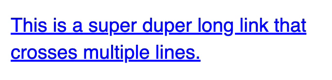
Multi-line gradient links
When I saw the CSS Tricks redesign, I was hooked. I loved the links with gradients. I told myself I’m going to use gradient links for my next project.
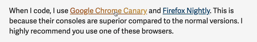
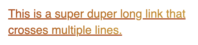
That’s what I did for Learn JavaScript’s course portal. The links look like this:
I want to share what I learned about creating gradient links
Creating Gradient Text
Chris Coyier wrote an article on creating gradient text back in 2012. The article is old, but it’s still valid. He gave the following snippet in the article:
.gradient-text {
  background: -webkit-linear-gradient(#eee, #333);
  -webkit-background-clip: text;
  -webkit-text-fill-color: transparent;
}
linear-gradient is now supported across all browsers. We don’t need to add the -webkit prefix anymore. The code shortened can be shortened to:
.gradient-text {
  background: linear-gradient(#eee, #333);
  -webkit-background-clip: text;
  -webkit-text-fill-color: transparent;
}
Creating a slanted gradient
We can provide an angle to linear-gradient to change the angle of the gradient. After playing around for a bit, I decided to use 120deg as the angle.
.gradient-text {
  background: linear-gradient(120deg, #ab4e19, #c99a2e);
  -webkit-background-clip: text;
  -webkit-text-fill-color: transparent;
}
Multi-line gradient text
The snippet above supports multi-line gradient text on Chrome, Firefox, and Edge. But it doesn’t work on Safari. Text that goes into the second (or later) rows become completely transparent.
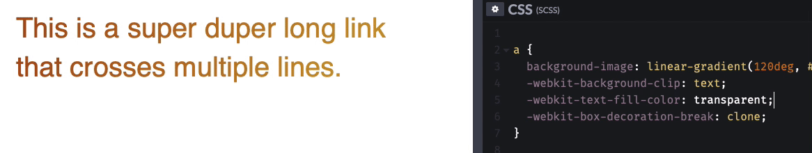
I didn’t understand why, so I inspected the links on CSS Tricks. I noticed they used a box-decoration-break property. The multiline gradient text works on Safari after I set box-decoration-break to clone.
.gradient-text {
  background: linear-gradient(120deg, #ab4e19, #c99a2e);
  -webkit-background-clip: text;
  -webkit-text-fill-color: transparent;
  -webkit-box-decoration-break: clone;
}
Underlines
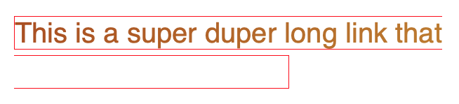
Links should have underlines. The underlines make it obvious that links are links.
I tried putting the .gradient-text snippet onto links, but I discovered there weren’t any underlines.
Why?
I dug around and realised that -webkit-text-fill-color changes the text-decoration-color. When we set -webkit-text-fill-color to transparent, we also set text-decoration-color to transparent.
So the easiest way to bring back the underline is to change text-decoration-color.
a {
  background-image: linear-gradient(120deg, #ab4e19, #c99a2e);
  text-decoration-color: #ab4e19;
  /*...*/
}
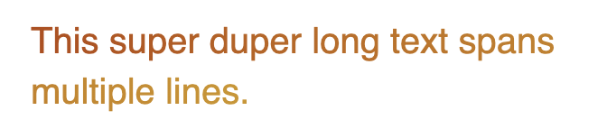
Gradient underlines
I thought about creating a gradient underline since the text contains a gradient. Unfortunately, it’s not possible. 😢.
You can only create gradient underlines with background-image. (See ”styling underlines for the web” for a list of possible methods to create underlines). We can’t use background-image to create gradient underlines since we used it to create the gradient text.
But the underline looks ugly!
The text-decoration underline looks ugly at large font sizes. But when they’re ok when they’re at normal font sizes.
I suggest you don’t add text-decoration underlines to large text. Consider creating
underlines with a different method instead.
Gradient + Focus
Gradient links look amazing with focus outlines. Just saying.