A Complete Tutorial to Susy 2
Susy is a helper tool that lets you created ultra customizable grids on the fly easily.
Its been a while since Susy 2 is officially released. If you loved Susy 1, you will definitely love to use Susy 2 because it offers so much more flexibility.
This is a two part tutorial for Susy 2, and in this tutorial, I will be sharing with you how to create the Complex AG Grid with Susy 2.
Why Susy?
As I mentioned, Susy is a helper tool that lets you create any kind of grids easily without the need do a ton of math. The beauty about Susy is that it separates presentational CSS from the HTML.
If you have used traditional grid frameworks like Foundation and Bootstrap before, you already know that the grids that come with these frameworks already have fixed widths and breakpoints. Furthermore, classes have to be added to the HTML if you decide to change your layout.
Susy removes this layer altogether. You can immediately target any css class and apply a grid to it.
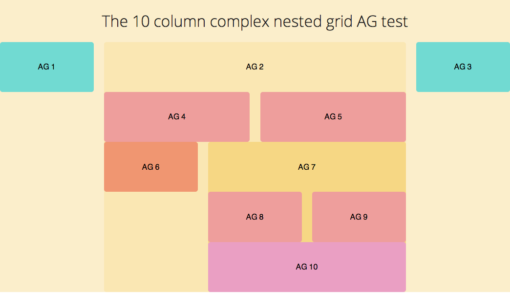
Yeah I know this is totally abstract and its difficult to grasp. Instead of only talking about theory, we are going to use Susy 2 to help us build a complicated grid system devised by Arnaud Guera (AG) that uses 10 columns. This grid looks like this
Installing Susy 2
If You Don’t Already Have Susy Installed
Susy requires you to have both Sass installed. If you don’t have them installed, you can install them with the following commands
sudo gem install sass
sudo gem install susy
If You Already Have Susy Installed
If you already have Susy installed and have Ruby RVM on your system, you can update the gems.
sudo gem updateIf this doesn’t work, it means you need to try the next method , or install Ruby RVM first.
The second method to installing Susy 2 is a little more manual. Its to uninstall the two gems mentioned above and reinstall them. Its the best way to avoid any errors if you didn’t go by the update route.
gem uninstall susy
gem uninstall sass
gem install sass
gem install susy
Now that you’re done installing Susy 2, we can now begin setting Susy 2 up.
Setting Up Susy 2
Likewise to the previous version, you need to require susy in the config.rb file if you were to use Susy 2.
# config.rb
require 'susy'
You now need to import and use Susy in your stylesheets.
// Importing Susy
@import 'susy';
Susy 2 has list of global defaults that are built into it. You can change the defaults with the code
// Configuring Susy 2 Global Defaults
$susy: (
  key: value,
);
You’ll want to play around with the defaults and try them out depending on how you want to work with Susy. I’ll go a little deeper regarding these defaults in another tutorial. You can use Susy with the defaults immediately now, but since I love working with border-box and rem units, I’m going to change some defaults.
$susy: (
  global-box-sizing: border-box,
  use-custom: ( rem: true, ),
);
Note that Susy uses a fluid layout by default. This means that width of the outer containing element will be 100%.
If you like to use Susy with fixed widths at certain breakpoints instead, change the math key to static. The major difference between these two modes come in when responsifying your styles, which will be covered in another tutorial.
Also note that you’ll have to include normalize and compass into the project as well. In all, the initial configuration up to this part should be this.
@import 'normalize';
@import 'compass';
@import 'susy';

// Configuring Susy Defaults
$susy: (
  global-box-sizing: border-box,
  use-custom: ( rem: true, ),
);

@include border-box-sizing;
HTML And CSS For The AG Grid
Since we’re going to create the same AG Grid as with the Susy 1 Tutorial , the html will remain exactly the same as before.
<div class="container">
  <h1>The 10 column complex nested grid AG test</h1>

  <div class="ag ag1">
    <h2>AG 1</h2>
  </div>
  <!-- /ag1 -->

  <!-- ag4 to ag7 are nested within ag2.-->
  <div class="ag ag2">
    <h2>AG 2</h2>
    <div class="ag ag4">
      <h2>AG 4</h2>
    </div>
    <div class="ag ag5">
      <h2>AG 5</h2>
    </div>
    <div class="ag ag6">
      <h2>AG 6</h2>
    </div>

    <!-- ag8, ag9 and ag10 are nested within ag7 -->
    <div class="ag ag7">
      <h2>AG 7</h2>
      <div class="ag ag8">
        <h2>AG 8</h2>
      </div>
      <div class="ag ag9">
        <h2>AG 9</h2>
      </div>
      <div class="ag ag10">
        <h2>AG 10</h2>
      </div>
    </div>
    <!-- /ag7 -->
  </div>
  <!-- /ag2 -->

  <div class="ag ag3">
    <h2>AG 3</h2>
  </div>
  <!-- /ag3 -->
</div>
<!-- /container -->
Simply speaking, whenever something is found within another div, you should nest it within the previous div.
In this case, AG 4 to AG 7 will be nested under AG 2 while AG 8, AG 9 and AG 10 are nested under AG 7.
The CSS for the grid backgrounds will remain the same as well.
/**
 * Styles for AG grids & Container
 */

.container {
  background-color: #fbeecb;
}

.ag1,
.ag3 {
  background-color: #71dad2;
}

.ag2 {
  background-color: #fae7b3;
}

.ag4,
.ag5,
.ag8,
.ag9 {
  background-color: #ee9e9c;
}

.ag6 {
  background-color: #f09671;
}

.ag7 {
  background-color: #f6d784;
}

.ag10 {
  background-color: #ea9fc3;
}

/**
 * Text Styles
 */
h2 {
  text-align: center;
  font-size: 1rem;
  font-weight: normal;
  padding-top: 1.8rem;
  padding-bottom: 1.8rem;
}
Now that we’re all prepped up, we can dive into the some more Susy details.
Important Susy 2 Mixins and Functions
Before diving straight into using Susy 2 for the grid, lets go through three very important mixins and functions used in Susy. If you understood these things, you can do anything with Susy.
The Container Mixin
The first thing you need to do is to define a container for Susy to do its magical calulations.
// The Container Mixin
@include container([<length>]);

// Note: Optional arguments are enclosed in []
The container mixin has an optional length argument, with allows you to set a max width to the container. If this number is not found, Susy will default to max-width: 100%; instead.
If you are using static grids, Susy advises that you should make it auto instead and let Susy calculate the max width for you.
To keep it auto, you can omit the length argument.
@include container;Span (Mixin)
The span mixin is the heart of Susy layouts. Susy made it extremely flexible.
I generally follow the Susy way for writing my layouts.
@include span(<width> [<wide / wider>] of <layout> [<last>]);If you used Susy 1, you would have noticed that this is very similar to the span-column mixin, with very subtle differences.
Let me break this down and full explain whats happening here.
<width>refers to the number of columns the element going to take up.[<wide / wider>]is a optional argument lets you expand the width of the column to include 1 or 2 more gutters respectivelyofis a keyword to let Susy know that the layout is coming up.<layout>is the context of the container, along with other optionals that define the layout. (Context refers to the number of columns the parent container is made up of).[<last>]is an optional argument that tells Susy that this element is supposed to be the last item in the row.
An example of this at work is
// This has a width of 3 columns + 1 gutter, out of 9 columns and is supposed to be the last item within the context.
.some-selector {
  @include span(3 wide of 9 last);
}
Span (Function)
The Span function is similar to the span mixin, with the exception that it only returns the width of the element. You will only need the <width>, <wide/ wider> and <layout> here.
// This has a width of 3 columns out of 9 columns
.some-selector {
  width: span(3 of 9);
}
This span function makes life a ton easier by not having the need to remember any margins or padding mixins that susy previously uses. Now, you can just use the span function to get the correct width to pad.
// This has a padding of 1 column out of 9 columns
.some-selector {
  padding-left: span(1 of 9);
}
Gutter Function
The gutter function takes only one argument, the context.
// This outputs margin that equals to 1 gutter width in a 9 column layout
.some-selector {
  margin-right: gutter(9);
}
These are all the important functions you need to know when using Susy 2.
Building The AG Grid With Susy 2
The first the to do when using Susy is to establish the container. Our container in this case is .container.
.container {
  @include container;
}
Since we also know that the container is going to hold floated elements, we’re gonna give it a clearfix.
.container {
// This is the default clearfix from Compass. You can opt to use other clearfix methods
@include clearfix;
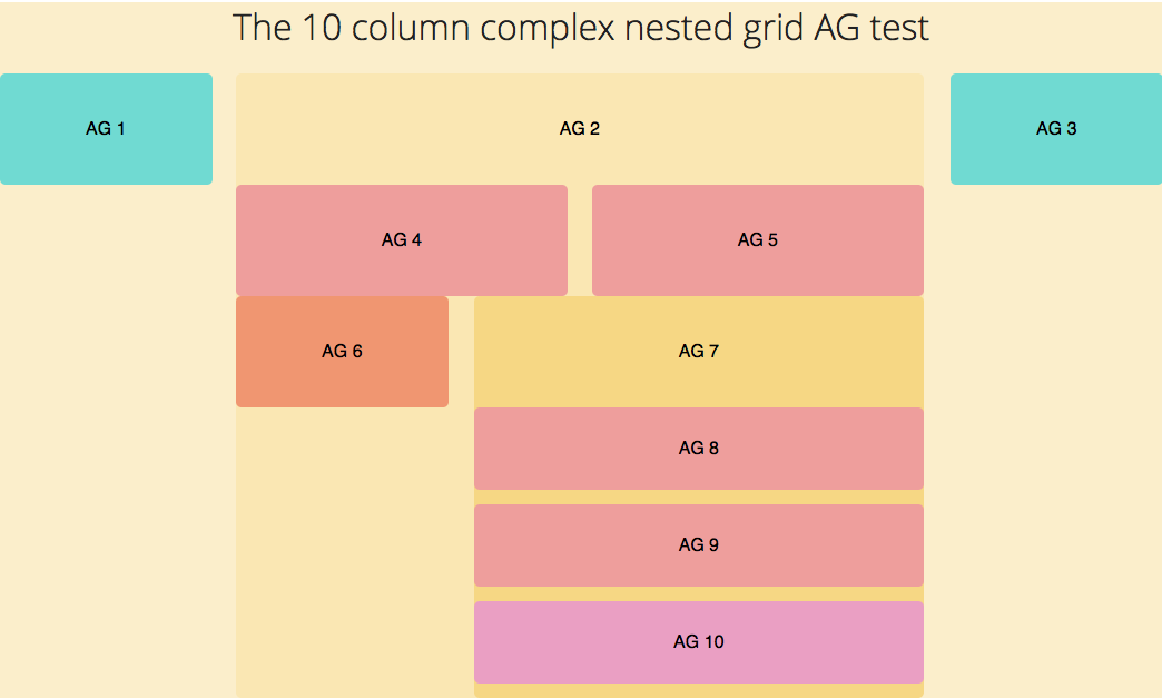
}We first need to create the layouts on AG1, AG2 and AG3. Upon inspection, the whole container is supposed to take up 10 columns, where AG1 and 3 are to take up 2 columns each and the rest is taken up by AG2. AG2 needs a clearfix as well since its going to be a container for AG 4 to AG 10.
.ag1 {
  @include span(2 of 10);
}

.ag2 {
  @include span(6 of 10);
  @include clearfix;
}

.ag3 {
  @include span(2 of 10 last);
}
If you take a look at the output now, you should see this
AG4 and AG5 are nested within AG2 and they each hold a width of 3 columns each
.ag4 {
  @include span(3 of 6);
}

.ag5 {
  @include span(3 of 6 last);
}
Alternatively, you can make use of the last mixin and write it this way. The last mixin just changes that element to be the last in the row.
.ag4,
.ag5 {
  @include span(3 of 6);
}
.ag5 {
  @include last;
}
AG4 and AG5 should now fall nicely in place.
AG6 holds 2 columns and AG 7 holds 4 columns, and AG 7 is the last item in the row. You should probably know the drill by now.
.ag6 {
  @include span(2 of 6);
}

.ag7 {
  @include span(4 of 6 last);
  @include clearfix;
}
And lets finish up the last few items for the AG Grid
.ag8 {
  @include span(2 of 4);
}

.ag9 {
  @include span(2 of 4 last);
}

.ag10 {
  clear: both;
  // Alternatively, you can now use the span mixin with the full keyword to tell Susy this should be a 100% width
  // @include span(full);
}
That was how you could use Susy 2 in the nutshell.
In the next article, we will go through how to build a responsive template with Susy 2 using the AG Grid as an example as well.
I hope this was helpful for you. If you have any comments or questions, leave them down and I’ll reply as soon as I can.