Migrating From Bootstrap to Susy
One of the most asked questions I get about migrating from Bootstrap to Susy is this: “How do I build a Bootstrap-like grid with Susy?”
I feel that if I answer this question, I’ll be leading you down a path that I don’t agree with. That’s why I hesitated with answering this question previously.
In this article, I want to tell show you why this is a wrong question to ask, and what to do instead.
Why shouldn’t you build a Bootstrap grid with Susy?
Here’s a question I want you to ask yourself before you read on:
Why are you migrating from Bootstrap to Susy?
Many people I know switch to Susy because they’re sick of the bloated HTML that Bootstrap forces on them. They want a cleaner HTML for a change. They also want the flexibility that Susy provides.
Ponder this question. Then read on if you are migrating from Bootstrap to Susy for the same reason.
We need to look at the two types of grid systems out there in order to answer the question. I call them HTML grid systems and CSS grid systems.
Bootstrap is an exemplary example of a HTML grid system. These systems come with predefined classes that you need to put into your markup. Another popular example is Foundation.
Here’s an example of a markup with Bootstrap:
<div class="gallery">
  <div class="col-lg-8">Gallery Item</div>
  <div class="col-lg-4">Gallery Item</div>
</div><br />
CSS grid systems, on the other hand, allow you to make your grids with any HTML tag, class or even attributes. The markup for CSS systems are often cleaner, like this:
<div class="gallery">
  <div>Gallery Item</div>
  <div>Gallery Item</div>
</div>
Notice how we don’t need to add .col- classes in here? That’s where a CSS Grid system shine.
Susy is a tool that falls into the CSS grid system category. Yet, at the same time, it has the power and flexibility for you to create a HTML grid system (if you want to).
I say it’s a wrong question to ask because you’re trying to write a HTML grid system with Susy when you dislike the bloatness that comes with a HTML grid system.
On the contrary, I highly recommend you use Susy as a CSS grid system because they’re so much more powerful than HTML ones. Here’s why I think so:
Why CSS grid systems better than HTML grid systems
My argument boils down into two criteria: maintainability and speed.
Speed refers to how quickly you can setup your grid for the first time.
Maintainability, on the other hand, refers to how easy it is for you to add, change or remove grids from your website.
Let’s explore speed first.
Criteria #1: Speed
Assuming you have no knowledge of both HTML and CSS grids, you’ll find that you’ll make websites more quickly with HTML grids on the get go.
This is because properties are already created for you, and you just have to follow their classes to make your grids.
This only applies to simple websites though. Responsive websites are whole different story. They can become difficult to handle quickly since you have to deal with lots of grid classes.
Let’s imagine we’re creating the following grid layout.
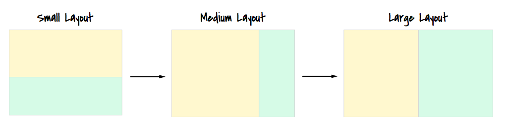
If you write grid classes with Bootstrap, your markup would look like this:
<div class="row">
  <div class="col-md-8 col-lg-6"></div>
  <div class="col-md-4 col-lg-6"></div>
</div>
If you write grid classes with CSS based systems, your markup would look like this:
<div class="content"></div>
<div class="sidebar"></div>
I just want to point out two things here.
First, when you write markup with HTML grids, you have to think of the layout as you work through the markup. If you aren’t exactly sure how this website is going to respond yet, you’ll have a hard time figuring out what classes you need.
When you write HTML with CSS grids, all you have to do is write content for that page. You don’t have to be distracted and work on other things at the same time.
This, I feel, is one of the most important benefits you get from CSS grids. You can focus on one thing at a time.
Second, you’ll find CSS grids challenging at first, especially if you have never wrote a layout manually before. You may find it so challenging that you’d think that it’s far easier to write HTML grids.
Well, that’s normal at first. You won’t be awesome at something you’re doing for the first time.
However, once you get the basics down flat, it might even come to a point where you build websites far quicker with CSS based grids. I experienced it personally.
The crux is that you need to know the foundations of creating a layout. You have to learn things like floats, clearfixes, mobile-first media queries …
Once you learn these foundations, you’d be free to create any kind of layout you want to.
FYI, I’ll help you build your foundations in Learning Susy if you’re looking for a faster way to master them. If you’re not interested, feel free to browse around the web and form your own conclusions.
Next, let’s talk about maintainability.
Criteria #2: Maintainability
Maintainability is important. To me, it’s more important than speed. This is because you’ll be maintaining websites most of the time. You’ll either be changing grids around, or you’ll be adding new grids.
Now, what happens if you had to change the above layout mid-way into your project such that the content is on the right, and the sidebar is on the left instead?
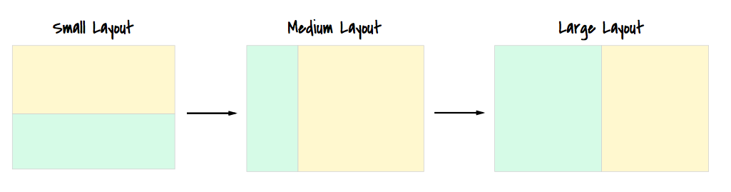
If you worked on a HTML-based grid, you’ll have to change the markup.
<div class="row">
  <div class="col-md-4 col-lg-6"></div>
  <div class="col-md-8 col-lg-6"></div>
</div>
There’s one big problem with this markup. You’ll show the sidebar content, followed by your main content when people visit your websites on the mobile. That’s not what you want… right?
Anyway, if you used a CSS grid instead, you don’t have to do anything to the markup.
<div class="content"></div>
<div class="sidebar"></div>
All you have to do is change the CSS. (Note: I’m writing SCSS here)
.content {
  @media screen (min-width: 900px) {
    width: /* width of 8 columns here */
    float: right;
  }
}

.sidebar {
  @media screen (min-width: 900px) {
    width: /* width of 4 columns here */
    float: left;
  }
}
Note: I’m not using Susy in the above code to make it easier to understand. This is also the underlying code that Susy will create for you if you want such a layout.
Cool. We established that it’s much easier to maintain CSS grids. There’s however, one major concern you should know about – You need rock-solid foundations on CSS layouts to write and maintain CSS grids. This means you have to educate people on CSS layouts if you want them to help you maintain your grids.
Final Words
So, if you want to migrate to Susy because you’re sick and tired to HTML grid systems, you should learn the foundations to CSS layouts and not hope to write Bootstrap-like classes with Susy.
It’s going to be tough at first. But it’s the only (and best) way I know to migrate completely over from Bootstrap to Susy. If you are interested in learning the foundations and how to use Susy, I highly recommend you check out my book, learning susy.
Note: This article is my personal opinion. Miriam and the others at Susy are much less opinionated about how people use Susy.
If you still want to build Bootstrap-like grids after reading through this article, I’m sure you have a very good reason to do so. In that case, I’ve whipped up a quick demo on Codepen that you can use as a base to build your classes. I’ll explain how this works in a separate article.
Oh yes, please share your reason with me in the comments below. I’d love to hear them :)